tutorials #1 and #2
These tutorials use selective coloring, color burn, and exclusion. I used Adobe Photoshop 7.0.
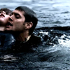
to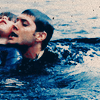
Excuse my lack of cutting things out properly. THIS TOOK SO LONG. XD
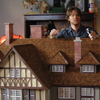
Here is your base.

1. Duplicate your base twice. Set one to SCREEN 100%, and the other to SCREEN 53%.
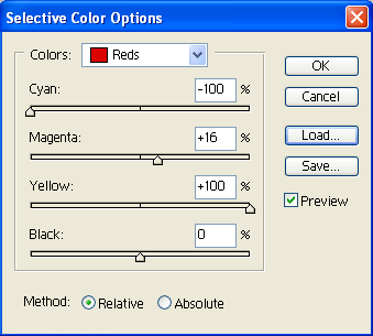
2. Make a selective coloring layer at these settings.
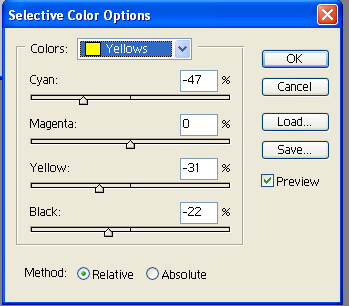
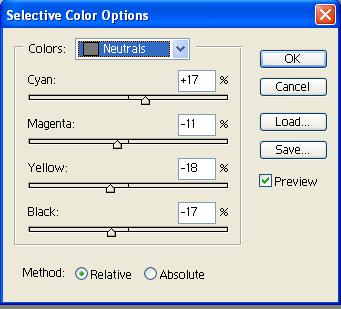
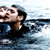
Your icon should now look like this.
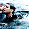
3. Make another selective coloring layer at these settings.
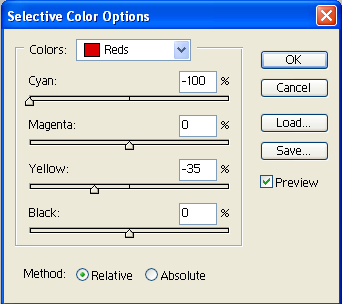
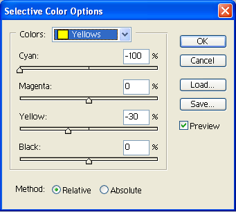
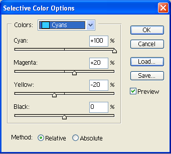
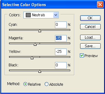
Your icon should now look like this.
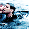
4. Make another selective coloring layer at these settings.
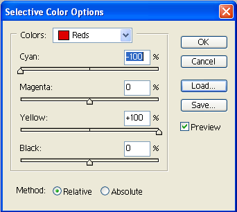
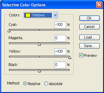
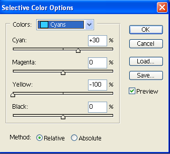
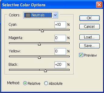
Your icon should now look like this.
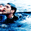
5. Make a new layer and fill it with this orange/peach color (F69679). Set that to COLOR BURN at 25%.

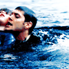
6. Make a new layer and fill it with this dark blue color (003663). Set that to EXCLUSION at 33%.

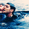
7. Place this texture on top and set it to MULTIPLY at 100%.
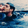
8. If it needs sharpening, click on the SCREEN 53% layer and go to Filter >> Sharpen >> Sharpen Edges.

And you're done!
to
Onto the next one.
THE SELECTIVE COLORING SETTINGS ARE EXACTLY THE SAME AS THE PREVIOUS ONE. I've duplicated them below. I use variations of these settings the most on my icons.
Here is your base.

1. Click on your base, and go to Image >> Adjustments >> Auto Contrast.
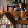
2. Duplicate your base twice. Set one to SCREEN 100%. Set the other to SOFT LIGHT 19%.
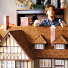
3. Make a selective coloring layer at these settings.


Your icon should now look like this.
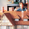
3. Make another selective coloring layer at these settings.


Your icon should now look like this.
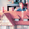
4. Make another selective coloring layer at these settings.


Your icon should now look like this.
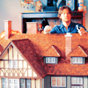
5. Make a new layer and fill it with this light blue color (6DCFF6). Set that to COLOR BURN at 63%.

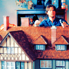
6. Make a new layer and fill it with this dark blue color (003663). Set that to EXCLUSION at 25%.


7. If it needs sharpening, click on the SOFT LIGHT 19% layer and go to Filter >> Sharpen >> Sharpen Edges. You can do this more than once if you feel the need. You can also sharpen the SCREEN 100% layer, but that always looks oversharpened to me.
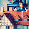
8. Add text. I used a font called TrashHand from dafont.com. It's size 30, strong.

9. It's hard to read, so I duplicated the text twice.

10. Select the first text layer.
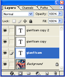
Highlight the text. Click on the black color swatch. Then move that text over one pixel to the right, and two pixels down.

And you're done!

to

Excuse my lack of cutting things out properly. THIS TOOK SO LONG. XD
Here is your base.

1. Duplicate your base twice. Set one to SCREEN 100%, and the other to SCREEN 53%.

2. Make a selective coloring layer at these settings.


Your icon should now look like this.

3. Make another selective coloring layer at these settings.


Your icon should now look like this.

4. Make another selective coloring layer at these settings.


Your icon should now look like this.

5. Make a new layer and fill it with this orange/peach color (F69679). Set that to COLOR BURN at 25%.


6. Make a new layer and fill it with this dark blue color (003663). Set that to EXCLUSION at 33%.


7. Place this texture on top and set it to MULTIPLY at 100%.


8. If it needs sharpening, click on the SCREEN 53% layer and go to Filter >> Sharpen >> Sharpen Edges.

And you're done!

to

Onto the next one.
THE SELECTIVE COLORING SETTINGS ARE EXACTLY THE SAME AS THE PREVIOUS ONE. I've duplicated them below. I use variations of these settings the most on my icons.
Here is your base.

1. Click on your base, and go to Image >> Adjustments >> Auto Contrast.

2. Duplicate your base twice. Set one to SCREEN 100%. Set the other to SOFT LIGHT 19%.

3. Make a selective coloring layer at these settings.


Your icon should now look like this.

3. Make another selective coloring layer at these settings.


Your icon should now look like this.

4. Make another selective coloring layer at these settings.


Your icon should now look like this.

5. Make a new layer and fill it with this light blue color (6DCFF6). Set that to COLOR BURN at 63%.


6. Make a new layer and fill it with this dark blue color (003663). Set that to EXCLUSION at 25%.


7. If it needs sharpening, click on the SOFT LIGHT 19% layer and go to Filter >> Sharpen >> Sharpen Edges. You can do this more than once if you feel the need. You can also sharpen the SCREEN 100% layer, but that always looks oversharpened to me.

8. Add text. I used a font called TrashHand from dafont.com. It's size 30, strong.

9. It's hard to read, so I duplicated the text twice.

10. Select the first text layer.

Highlight the text. Click on the black color swatch. Then move that text over one pixel to the right, and two pixels down.

And you're done!