In which I kindly request your help
Lately I'm getting the impression I may have some monitor calibration issues. I could launch into a lengthy explanation here of why I believe so, but I'll spare you the details (until you ask for them, anyway). Suffice it to say I'm aware that things aren't quite as they should be and that I'm now trying to determine how bad the situation is. Needless to say, I hope to be told it's not actually all that bad, but if it is, I'd rather know the truth than muddle on and produce photos which are just ever so slightly off colour- and contrast-wise.
Which is where you come in.
To determine whether I really do have a colour management problem, I've posted some of my recent photos behind a cut and added a few questions about their appearance. Now I tried to spare you the hassle of having to write out your answers by creating polls, so you'd only have to check a few boxes and be done with it. Unfortunately, LJ's poll format won't let me insert photos (...), so I've had to go about it another way. I've provided all the possible answers below, so while you'll still need to leave a comment in order to be of help to me, you'll only need to copy the right answers in that comment, rather than write them all out yourself. Would you please do that for me? Thank you very much in advance for your co-operation.
For practical reasons, I'm specifically inviting the good photographers and graphic designers in the audience (you know who you are!) to provide feedback, as they're the ones most likely to have properly calibrated monitors themselves. However, the more feedback, the better, so even if you're not an image-manipulating wiz, please spare a few minutes to tell me how these pictures appear to you, and by all means be honest. Who knows, you may even learn something about the calibration of your own monitor in the process. :-)
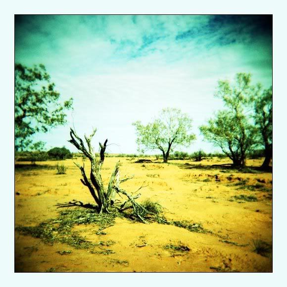
1: Check out the cross-processed pic above. How does the bottom half strike you colour-wise?
A: It's bright yellow. Wow!
B: It has a definite yellow cast but it could do with a little more saturation and brightness.
C: Actually, it has more of an orange cast.
D: Yellow? Orange? Hell no, it's green!
E: I can't really say it has any specific colour cast; it just looks... weird.
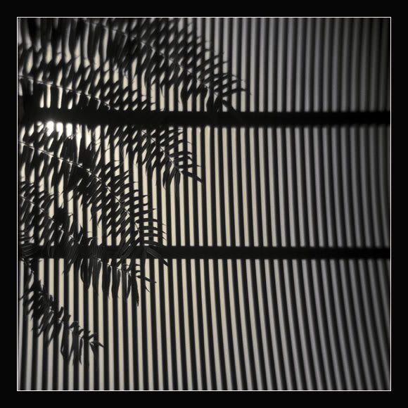
2: Have a look at the ferns-and-lines photo above. What do you think of the contrast?
A: The contrast is lovely. Just as it should be.
B: It's so contrasty it hurts my eyes. Ouch!
C: Actually, it could do with a little more contrast.
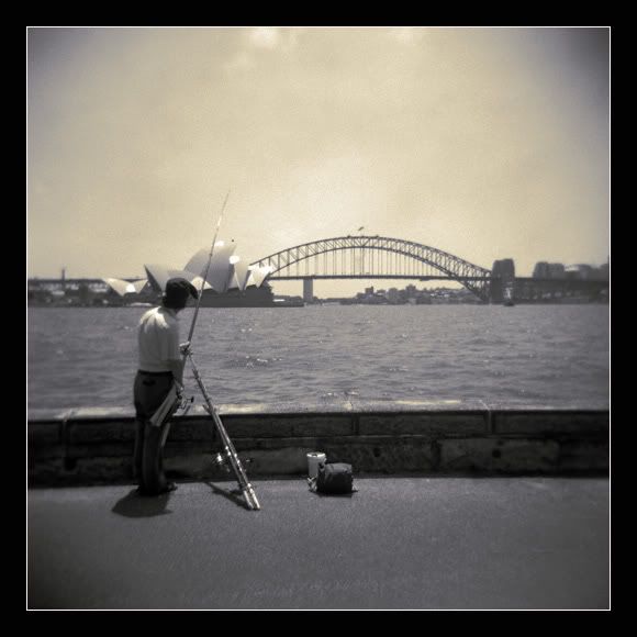
3: Next up, the black-and-white pic of the angler in front of the Sydney Harbour Bridge. What can you tell me about the toning of this image?
A: The highlights have a mild orange cast and the midtones appear to be somewhat blueish/greyish.
B: The highlights have a fiercely orange cast and the midtones are very blueish/greyish.
C: The highlights have a yellowish cast and the midtones are a bit greyish/brownish.
D: The whole picture has a bright, dark orange/brown cast. Ugh.
E: Toning? What toning?
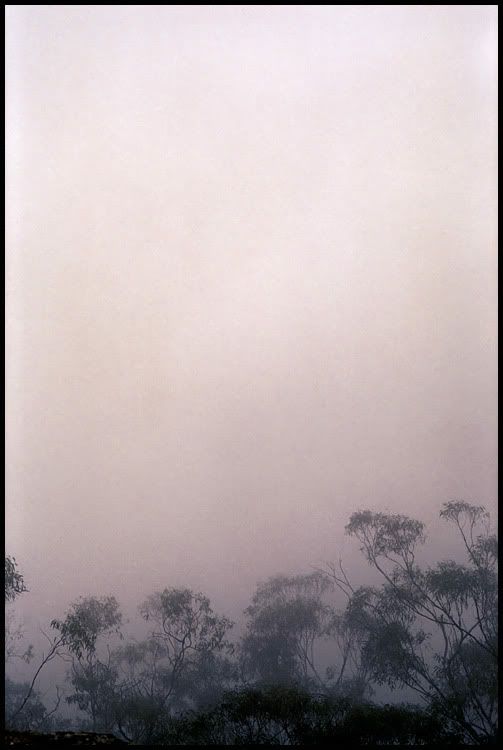
4: Now for the image of the trees in the mist. I tried to come up with something fairly subtle and ethereal here. Did I succeed?
A: Yep. The colours are lovely and the trees at the bottom aren't too dark. They appear dark blue/dark grey rather than black.
B: Kind of. The colours are a bit drab, though, and the trees at the bottom are a bit dark for my taste.
C: Sorry, no. I appreciate what you're trying to do here, but the trees at the bottom are far too black to be subtle.
Finally, three questions about this one...
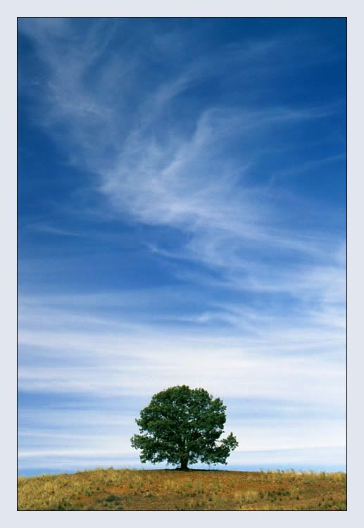
5: First of all, how about the colours? I'm specifically interested in the colours of the ground.
A: The ground has bright orange and bright yellow touches.
B: Actually, the ground looks more greenish to me.
C: Yellow, orange and green are represented about equally in the ground, but none of the colours are particularly vivid.
D: I can't really tell what colour the ground is supposed to be as the colours are rather drab.
6: How about the overall saturation?
A: The picture is a bit oversaturated.
B: Actually, the picture could do with a little more saturation.
C: The saturation is just right.
7: And what about the general brightness/darkness?
A: The picture is a little too dark.
B: The picture is a little too light.
C: The picture is just right.
Thanks for weighing in, everyone. Your help is much appreciated, and I'm sure some karmic reward will find its way to you eventually. :-)