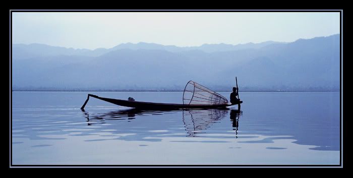
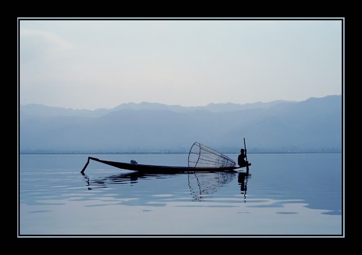
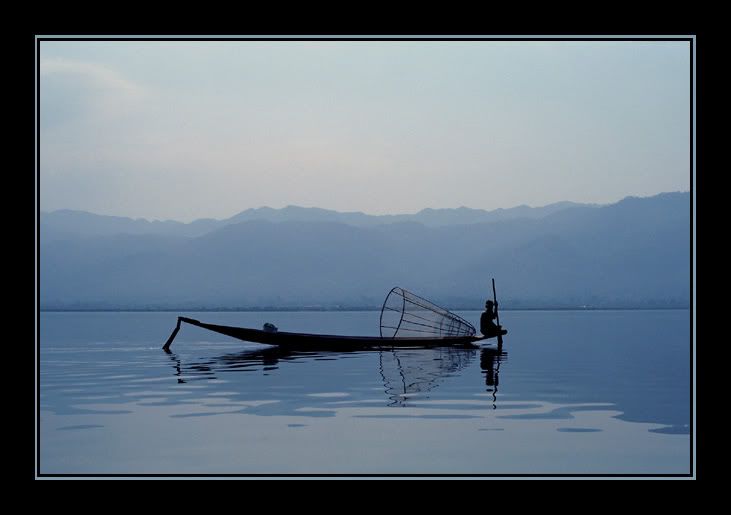
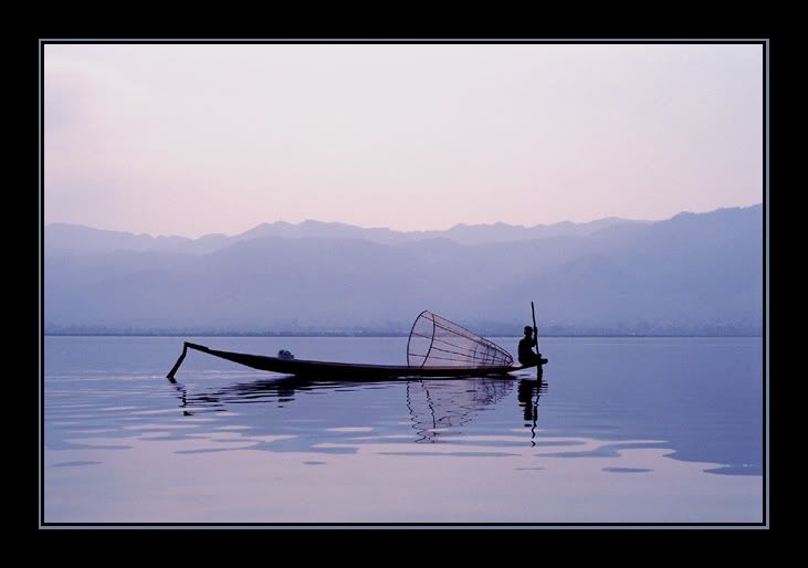
Blue, blue, blue and pink
I promise I won't make a habit of this, but would you please help me make up my mind once more? I made four different versions of this photo (which some of you have seen before, a long time ago), and can't for the life of me decide which one I like best. I think my favourite is No. 2, which is nice and bright and close to reality, but I'm not sure. What do you think? Which colour works best? Does the panorama format work at all, or should I keep it 2x3? Should I dodge/burn what little tonal variety there is in the sky, or will that only detract attention from the silhouette in the middle? Any other suggestions?
Thanks in advance for your feedback.


Inle Lake, Burma, 1998