First GIMP icon tutorial
Tutorial for this icon.
This is my first attempt at a tutorial. I use GIMP but hopefully this shouldn't be too difficult to follow in other programs.
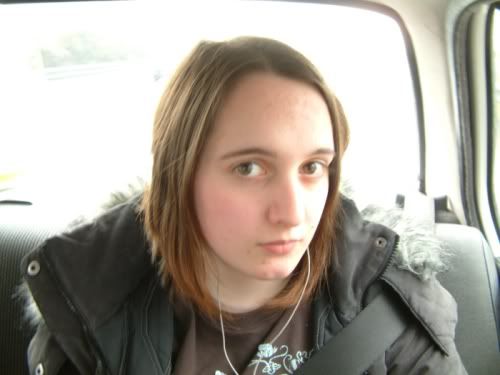
I started off with a photo of myself from a recent holiday. Actual size 2048 by 1536 and taken using a very nice 3.0 megapixel camera. The picture below is resized to quite a bit smaller though, just to show what it looked like.
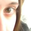
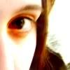
I cut out an area I liked for an icon - 303 by 303 pixels. Paste into new image and rescaled to 100 by 100 - having this.
Obviously I always duplicate the layer first and then turn it off by clicking the little eye icon in the layers dialgoue because it pays to have the duplicates of layers in case you stuff up.
Anyway I started to play around and made another duplicate layer to play with and decided I quite liked the burn 100% for second layer of my base, only it emphasised the nose and eyebrow too and ended up like so.
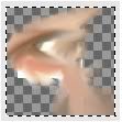
So I selected a rectanglur area around the eye, inverted selection and cut the rest of the second layer so it was transparent. Of course this left me with a blatant line around where I'd cut it so played around with the smudge tool on the layer. Pretty much trial and error here, smudging and unsmudging and resmudging with both layers turned on to see overall effecting.
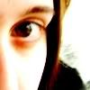
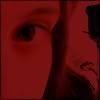
The resultant smudged layer looked like this.
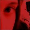
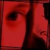
Not so pretty there but the overall effect was this.
Quite neat I felt but it didn't seem finished by far.
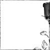
So I searched for a brush image to add. I found the following miscborder10 by absolute trouble but still it didn't fit.
What I did was this. Saved brush to separate RGB file (instead of the greyscale it was) and colourised the image; fiddling with hue, colour and saturation until I found a result I liked.
Then I added this as a layer setting it to 100% soft light. I also merge the first two layers and moved this the composite layer above the edited brush layer, setting it to 100% multiply. Result was this.
To soften the image further I duplicated the original base and then used gaussian blur on it.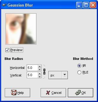
I put above the blurred layer above all the other layers, set to overlay 100%.
Now it was border time. I picked out 2 borders (10 and 15), both by BessyBoo (artistbynight on LJ)
that can be found here, each set as a new layer above the rest and at 100% multiply.

Why two borders? Mainly because I wanted the image to have a thin black border all the way round as one of them provides but also I found using both strengthened the frame, so I stuck with using both.
So far I have this.
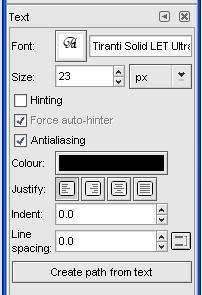
Better but not quite finished. Out comes the text. Finally I worked out my wording and placed a text layer on it not caring so much about placement since I then rotated layer 90 degrees CCW and moved selection across to where I wanted. Settings shown here.
That last, and possibly not necessary touch, was to duplicate the text layer where I smudged alot of it to get the misty underscore effect for the word, and put as top layer set to 100% grain merge.
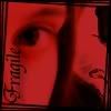
The final icon was this.
Hopefully this tutorial has helped a few people, if so I'd love to know. :)
Any suggestions for future tutorials or ways to improve this one would be welcomed.
This is my first attempt at a tutorial. I use GIMP but hopefully this shouldn't be too difficult to follow in other programs.
I started off with a photo of myself from a recent holiday. Actual size 2048 by 1536 and taken using a very nice 3.0 megapixel camera. The picture below is resized to quite a bit smaller though, just to show what it looked like.
I cut out an area I liked for an icon - 303 by 303 pixels. Paste into new image and rescaled to 100 by 100 - having this.
Obviously I always duplicate the layer first and then turn it off by clicking the little eye icon in the layers dialgoue because it pays to have the duplicates of layers in case you stuff up.
Anyway I started to play around and made another duplicate layer to play with and decided I quite liked the burn 100% for second layer of my base, only it emphasised the nose and eyebrow too and ended up like so.
So I selected a rectanglur area around the eye, inverted selection and cut the rest of the second layer so it was transparent. Of course this left me with a blatant line around where I'd cut it so played around with the smudge tool on the layer. Pretty much trial and error here, smudging and unsmudging and resmudging with both layers turned on to see overall effecting.
The resultant smudged layer looked like this.
Not so pretty there but the overall effect was this.
Quite neat I felt but it didn't seem finished by far.
So I searched for a brush image to add. I found the following miscborder10 by absolute trouble but still it didn't fit.
What I did was this. Saved brush to separate RGB file (instead of the greyscale it was) and colourised the image; fiddling with hue, colour and saturation until I found a result I liked.
Then I added this as a layer setting it to 100% soft light. I also merge the first two layers and moved this the composite layer above the edited brush layer, setting it to 100% multiply. Result was this.
To soften the image further I duplicated the original base and then used gaussian blur on it.
I put above the blurred layer above all the other layers, set to overlay 100%.
Now it was border time. I picked out 2 borders (10 and 15), both by BessyBoo (artistbynight on LJ)
that can be found here, each set as a new layer above the rest and at 100% multiply.
Why two borders? Mainly because I wanted the image to have a thin black border all the way round as one of them provides but also I found using both strengthened the frame, so I stuck with using both.
So far I have this.
Better but not quite finished. Out comes the text. Finally I worked out my wording and placed a text layer on it not caring so much about placement since I then rotated layer 90 degrees CCW and moved selection across to where I wanted. Settings shown here.
That last, and possibly not necessary touch, was to duplicate the text layer where I smudged alot of it to get the misty underscore effect for the word, and put as top layer set to 100% grain merge.
The final icon was this.
Hopefully this tutorial has helped a few people, if so I'd love to know. :)
Any suggestions for future tutorials or ways to improve this one would be welcomed.