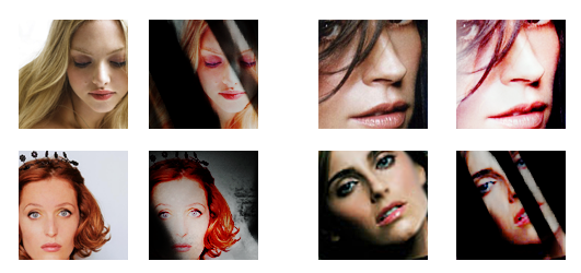
Tutorial #11
From 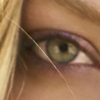
to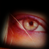
or make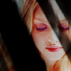
01. First prepare the base, sharpen it and/or screen it so it's bright
enough.
02. Layer -> New Fill Layer -> Solid Color #ffb3f7, softlight, 80%. This will make the icon more pink.
03. Next step is to make it less pink and make it look more natural.
Layer -> New Adjustment Layer -> Channel mixer, monochrome unchecked
Red: +120 -14 -18
Green: +2 +98 0
Blue: -6 0 +100
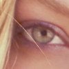
04. Now we'll make the red in the icon stronger.
Layer -> New Adjustment Layer -> Hue/Saturation
Reds: 0 +30 0
05. Duplicate your base and put it on top, desaturate it (Image -> Adjustments -> Desaturate) and put it on softlight, 81%. This is to give it more contrast and in the same time not make it too saturated.
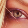
06. Lighten it up with a curves layer (Layer -> New Adjustment Layer -> Curves) Here is how it looks.
RGB:
Output: 116 Input: 84
Output: 181 Input: 148
07. Add this texture (by me) or similar mask textures on multiply, this makes it darker and gives the icon a nice frame.
08. This is optional, it will make the colors stronger.
Layer -> New Adjustment Layer -> Hue/Saturation
Master: 0 +15 0
09. Last step is to brighten the icon and give it even more contrast.
Layer -> New Adjustment Layer -> Curves, here is how it looks, put it on softlight.
RGB:
Output: 153 Input: 67
Output: 214 Input: 142

And you're done! As always every base is different, so play with the opacity of the layers and feel free to show me your results :)
Friend or join this community if you want.
Other examples


to

or make

01. First prepare the base, sharpen it and/or screen it so it's bright
enough.
02. Layer -> New Fill Layer -> Solid Color #ffb3f7, softlight, 80%. This will make the icon more pink.
03. Next step is to make it less pink and make it look more natural.
Layer -> New Adjustment Layer -> Channel mixer, monochrome unchecked
Red: +120 -14 -18
Green: +2 +98 0
Blue: -6 0 +100

04. Now we'll make the red in the icon stronger.
Layer -> New Adjustment Layer -> Hue/Saturation
Reds: 0 +30 0
05. Duplicate your base and put it on top, desaturate it (Image -> Adjustments -> Desaturate) and put it on softlight, 81%. This is to give it more contrast and in the same time not make it too saturated.

06. Lighten it up with a curves layer (Layer -> New Adjustment Layer -> Curves) Here is how it looks.
RGB:
Output: 116 Input: 84
Output: 181 Input: 148
07. Add this texture (by me) or similar mask textures on multiply, this makes it darker and gives the icon a nice frame.
08. This is optional, it will make the colors stronger.
Layer -> New Adjustment Layer -> Hue/Saturation
Master: 0 +15 0
09. Last step is to brighten the icon and give it even more contrast.
Layer -> New Adjustment Layer -> Curves, here is how it looks, put it on softlight.
RGB:
Output: 153 Input: 67
Output: 214 Input: 142

And you're done! As always every base is different, so play with the opacity of the layers and feel free to show me your results :)
Friend or join this community if you want.
Other examples
