086
I can't believe I haven't updated since August! D: They're not much but here, have a few icons anyway. I really ought to go renew my sub so I can get rid of these damn ads that keep popping up.
I hope you are all well. ♥
→ Merlin, Jane Eyre [2011], James McAvoy
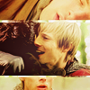
( Read more... )
I hope you are all well. ♥
→ Merlin, Jane Eyre [2011], James McAvoy
( Read more... )
The orange, green, blue, and yellow in the last icon make it look like some magical pop art piece
I am so delighted that you said because that is exactly what I was going for! I really hoped that would come across. :D
The Mr. Rochester icon has an insanely flawless crop
I did fuss a lot on the cropping of that because it seemed to work in a lot of different ways, but I'm really glad I went with that one. There was a lot of emotion in that cap and I really wanted to capture the look in his eye.
It honestly looks like a painting cuz it's got the right amount of blurriness that makes it dreamy and mysterious.
I must give credit to the Photoshop art filter I used on it called Topaz Clean. It's a beautiful tool and creates a lovely effect when used properly.
That whole scene between Jane and Rochester just gives me goosebumps, no matter whether I'm reading the book or watching an adaptation. I am glad I managed to do it justice! ♥
Honestly, I have to thank you again, this comment has given me so much confidence. I hope to be making some more icons very soon! ♥♥♥
Reply
Leave a comment