TUTORIAL: Coloring
Okay, so in my Requests Post (which could always use more, by the by), the lovely gilove2dance requested a simple coloring tutorial. Now! I like pretty simple things,nothing too fancy, so this just covers the basics (if you wanted something else, or the coloring on... I don't know, a particular icon, let me know! I don't mind doing another - I enjoy it). We shall go from the left icon to the right in a few really easy steps.
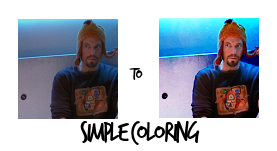
Program Used: Paint Shop Pro XI
NOTE: I wrote this so it would be accessible to anybody who was beginning; so it's not dumbed down or anything, I just wanted to be really, really clear.
• Step One: Find a screencap and make a base. I used this cap from killcolor of Jayne from Firefly. Now it's time to resize, sharpen and all that to get a base. I knew immediately from looking at the cap that the focus was going to be on Jayne (obviously), and I wanted him in the right third of the icon. Center crops are cool sometimes, but I generally prefer off-center a little. Anyway! I resized, cropped, sharpened a little, and wound up with this base.
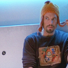
• Step Two: Now, I always try to look at the beginning base and try to figure out what's wrong, and then fix it from there. For this one, it's obviously too dark. Jayne's not the focus, the lighter left side is. We fix. This is really, really simple to do; just copy your base and paste it as a new layer, and set that to "Screen" as the blend mode. We wind up with this:
• Step Three: It's brighter, but now I want it to pop. I want contrast. So to get that, I decided to use a curves layer. Mine looks like:
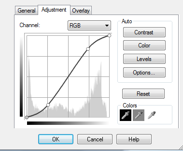
With points 66»39 and 189»213. The reason for those points is to bring contrast in - the top sector, at the right, makes it brighter. So I dragged the line up until I got to a point I liked. And the bottom controls dark - so to offset the light, I dragged that down until I got to a point I liked. After the curves layer, you end up with:
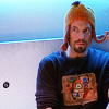
I actually like that okay, and it could almost be an icon on its own. (Or I guess it could, actually, depending on your taste. But I'm not done!
• Step Four: First off, I bumped up the saturation just a bit by going to the menu Layers->New Adjustment Layer->Hue/Saturation/Lightness (that'll be a little different for Photoshop, but still really easy to find). I bumped up the master saturation to about 6, then upped the Cyan and Yellow. That doesn't add much change (except to the top right corner, which the cyan subtly but noticably affects), but it does deepen the colors. You end up with this.
I want to deepen the colors even more, though. I could add more saturation, or add a Brightness/Contrast layer, or maybe even a Soft Light layer. But I really like the little doorknob detail on the left, as well as the seeping darkness at the top of the cabinet door. So I want to enhance that. (It's a little nubbly because of the screencap, but you can soften that or leave it like I did. I add a texture later that adds grunge anyway, though.) So I copy a merged layer (which in PSP is Ctrl+Shift+C) and paste it on top. This just flattens all your layers into one so you can work on it as a whole without getting rid of all your previous layers. (I hope that makes sense.) Anyway, I did that and set that to the Burn blend mode. This makes the blue super bright, and the door look pretty cool, but it also leaves you with Orange!Monster!Jayne - like this.
Now, I took the smudge tool and push tool and just nudged down the blue above the cabinet down a little bit, too, just to bring a bit more color down.
Okay! So, to get rid of the icky orange over Jayne you can erase, but I find there's too much room for error there. I just used a layer mask. That's a really handy adjustment layer - you can choose which parts of a specific layer to show or hide. With the Burn layer selected, go up to Layers->New Mask Layer->Show All. That won't change anything, but it will bring up the mask - which looks like a white fill layer. Take black and paint over Jayne. I generally use a slightly bigger, softer brush for the middle, and then a smaller, harder brush for the edges. For this, I was at about 80% hardness or so, and then - because that was just a little too harsh, and it's difficult/tedious to get a really clean line unless you're patient or just really good at it - I blurred the mask layer slightly with Gaussian Blur with a radius of 1. When you get done with the layer mask, it look something like this:
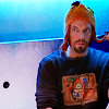
• Step Five: Like I mentioned earlier, I sort of like the nubbly texture on the door, so I want to bring that up into the blue area. This is where a texture comes in. I used one from yunhe:
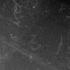
And I copied that as a new layer on top, and set it to Soft Light. That's really subtle - so you might want a more dramatic effect, but it works just to add a little detail. However, it does make Jayne a little too dark. For this, it doesn't matter if it's exact, so I just take a soft eraser brush and erased the part over Jayne. You get this:
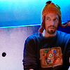
It's still a little dark, so I decided to add a few little light blobs. To do this, create new raster layer. Take a paintbrush, about 16px or so, at 50% opacity with the brush's blend mode set to screen (note: not the layer's blend mode, the brush's) and paint over the darker areas. I did on the right side, on the edge of his face, and then on his opposite shoulder. To illustrate this, I added a black fill layer behind it, just to show it - which would be this. (The black, again, was just added after to show the placement.) This is where they are on Jayne: here.
Okay! Now, if you leave it like that, it's a little too intense:
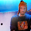
So to fix that, set the layer to Soft Light.
And as one final touch, I merged all the layers together, copied and pasted as a new layer. Then I just the sharpen brush on his face at a really, really low opacity to just sharpen up his features a little. And voila!
FINISHED:
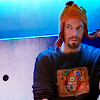
-gilove2dance, if you want the .psd or anything, let me know! :D I hope this was at least a little helpful!
Program Used: Paint Shop Pro XI
NOTE: I wrote this so it would be accessible to anybody who was beginning; so it's not dumbed down or anything, I just wanted to be really, really clear.
• Step One: Find a screencap and make a base. I used this cap from killcolor of Jayne from Firefly. Now it's time to resize, sharpen and all that to get a base. I knew immediately from looking at the cap that the focus was going to be on Jayne (obviously), and I wanted him in the right third of the icon. Center crops are cool sometimes, but I generally prefer off-center a little. Anyway! I resized, cropped, sharpened a little, and wound up with this base.
• Step Two: Now, I always try to look at the beginning base and try to figure out what's wrong, and then fix it from there. For this one, it's obviously too dark. Jayne's not the focus, the lighter left side is. We fix. This is really, really simple to do; just copy your base and paste it as a new layer, and set that to "Screen" as the blend mode. We wind up with this:
• Step Three: It's brighter, but now I want it to pop. I want contrast. So to get that, I decided to use a curves layer. Mine looks like:
With points 66»39 and 189»213. The reason for those points is to bring contrast in - the top sector, at the right, makes it brighter. So I dragged the line up until I got to a point I liked. And the bottom controls dark - so to offset the light, I dragged that down until I got to a point I liked. After the curves layer, you end up with:
I actually like that okay, and it could almost be an icon on its own. (Or I guess it could, actually, depending on your taste. But I'm not done!
• Step Four: First off, I bumped up the saturation just a bit by going to the menu Layers->New Adjustment Layer->Hue/Saturation/Lightness (that'll be a little different for Photoshop, but still really easy to find). I bumped up the master saturation to about 6, then upped the Cyan and Yellow. That doesn't add much change (except to the top right corner, which the cyan subtly but noticably affects), but it does deepen the colors. You end up with this.
I want to deepen the colors even more, though. I could add more saturation, or add a Brightness/Contrast layer, or maybe even a Soft Light layer. But I really like the little doorknob detail on the left, as well as the seeping darkness at the top of the cabinet door. So I want to enhance that. (It's a little nubbly because of the screencap, but you can soften that or leave it like I did. I add a texture later that adds grunge anyway, though.) So I copy a merged layer (which in PSP is Ctrl+Shift+C) and paste it on top. This just flattens all your layers into one so you can work on it as a whole without getting rid of all your previous layers. (I hope that makes sense.) Anyway, I did that and set that to the Burn blend mode. This makes the blue super bright, and the door look pretty cool, but it also leaves you with Orange!Monster!Jayne - like this.
Now, I took the smudge tool and push tool and just nudged down the blue above the cabinet down a little bit, too, just to bring a bit more color down.
Okay! So, to get rid of the icky orange over Jayne you can erase, but I find there's too much room for error there. I just used a layer mask. That's a really handy adjustment layer - you can choose which parts of a specific layer to show or hide. With the Burn layer selected, go up to Layers->New Mask Layer->Show All. That won't change anything, but it will bring up the mask - which looks like a white fill layer. Take black and paint over Jayne. I generally use a slightly bigger, softer brush for the middle, and then a smaller, harder brush for the edges. For this, I was at about 80% hardness or so, and then - because that was just a little too harsh, and it's difficult/tedious to get a really clean line unless you're patient or just really good at it - I blurred the mask layer slightly with Gaussian Blur with a radius of 1. When you get done with the layer mask, it look something like this:
• Step Five: Like I mentioned earlier, I sort of like the nubbly texture on the door, so I want to bring that up into the blue area. This is where a texture comes in. I used one from yunhe:
And I copied that as a new layer on top, and set it to Soft Light. That's really subtle - so you might want a more dramatic effect, but it works just to add a little detail. However, it does make Jayne a little too dark. For this, it doesn't matter if it's exact, so I just take a soft eraser brush and erased the part over Jayne. You get this:
It's still a little dark, so I decided to add a few little light blobs. To do this, create new raster layer. Take a paintbrush, about 16px or so, at 50% opacity with the brush's blend mode set to screen (note: not the layer's blend mode, the brush's) and paint over the darker areas. I did on the right side, on the edge of his face, and then on his opposite shoulder. To illustrate this, I added a black fill layer behind it, just to show it - which would be this. (The black, again, was just added after to show the placement.) This is where they are on Jayne: here.
Okay! Now, if you leave it like that, it's a little too intense:
So to fix that, set the layer to Soft Light.
And as one final touch, I merged all the layers together, copied and pasted as a new layer. Then I just the sharpen brush on his face at a really, really low opacity to just sharpen up his features a little. And voila!
FINISHED:
-gilove2dance, if you want the .psd or anything, let me know! :D I hope this was at least a little helpful!