Third Icon Tut, Thnks fr th COMMENTS
Here's another tutorial. It's a bit confusing so don't be afraid to ask questions! Shout out to all those awesome people who commented on my last tuts! THANK YOU!!!
Icon Tutorial #3
From this
to this
1. Open up your base image.
2. Create a new layer. Fill it with #000D4C (Exclusion, 100%)
3. Create another layer. Fill it with #EAFF00 (Color Burn, 12%)
4. Create yet another layer. Fill it with #FFD800 (Overlay, 17%)
5. Create a new Hue and Saturation layer. (Master: 0, +6, 0)
6. Create a new Brightness and Contrast layer (Brightness: +21, Contrast: +14)
7. Create a new Selective Color layer.
(Reds: -80, +14, 0, +21)
(Yellows: 0, 0, -43, +43)
8. Create another fill layer. Fill with #FF0000 (Soft Light, 16%)
9. Create another fill layer. Fill with #012A4D (Exclusion, 40%)
10. Duplicate your base image and drag it the top. (Normal, 24%)
11. Open a new Curves layer. (Input: 71, Output: 87)
12. Create another fill layer. Fill with #023165 (Difference, 14%)
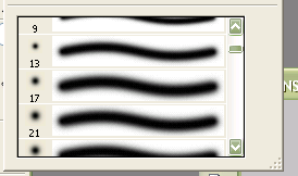
13. Make #650202 & #653F02 “color bubbles” by using a blurred brush like these:

Set to Color Dodge, 100%.
13. Create a layer. Fill it with #E10175 (Lighten, 18%)
14. Create a new Hue and Saturation layer. (Master: -5, +11, +7)
15. Add some dotted lines with a dotted brush! (To make one, just adjust a normal “dot” brush’s spacing)
16. DONEEE! I know this tutorial was particularly long. And it had some confusing points like the color bubbles and dotted lines. Sorry if the instructions were a bit vague. Feel free to ask questions!