Tutorial #1 - Juliet? from RomeoXJuliet
T U T O R I A L # 1

→
for PSP9; beginners-intermediate
Knowledge of blend modes, contrast/color
enhancements, where everything is
...probably image heavy...
tutorial
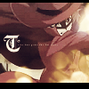
result
I started out by using this cap of (???).
Prep your base. Crop, resize, and sharpen - you know the drill. Because this image is very "gritty", I used Adjust > Add/Remove Noise > Edge Preserving Smooth on the base before resizing it. If you're having trouble sharpening without making it too sharp, duplicate your base, sharpen it, and change the opacity. Then merge the two layers.

Duplicate your base. Desaturate ONLY the duplicate by pressing Shift+H and adjusting saturation. Go to Adjust > Automatic Contrast Enhancement, have your settings set to Bias: Darker, Strength: Normal, and Appearance: Bold, and hit OK. Set the layer to Screen 60%.
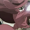
Duplicate the base again; drag to top. Use Automatic Contrast Enhancement again, same settings as before. Then go to Adjust > Automatic Color Balance - set Strength to 100, Temperature to 3500, and have the Remove Color Cast box checked off. Hit OK. Set to Soft Light 100%.
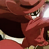
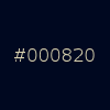
Pick a dark blue color, create a New Layer, fill it with your color, and set to Exclusion 100%. You can use #000820 like I did, but I highly encourage experimenting with different shades.
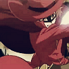

Take this light texture by colorfilter, and set to Screen 100%. If it looks too bright, try playing with the opacity a bit to see what looks best.


Take this gratient from colorfilter again, and set to Overlay 24%.

I decided it was a little too colorful, so I duplicated my desaturated layer from before, and dragged it to the top. Set to Color (L) 28%.
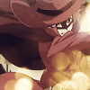

Adding black bars is optional here. i've been attracted to bars lately, neheheh. Because I want the icon to look more balanced, I made the black bar at the bottom bigger than the top one.
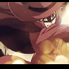
Now for the text... Type "T" in KingsCross (from daFont), size 20, Sharp anti-alias, in #FFFFFF. On the same layer, add tiny text (type it or use a brush). Drag the layer down so that it sits between your original base and the desaturated base, so its blinding whiteness can be dampened a bit. And you're done.

Comments/feedback/suggestions on how I can improve are highly appreciated. =) Feel free to watch us!