The barbarian's are in the citadel
OK, I admit I wasn't too shocked by what I saw on my Spicy Fruit Loaf the other day (although I now refuse to buy it until they fix the text), but I was shocked by what I saw in the Art Gallery of New South Wales today. I figure, generally, that people writing interpretive text for museums and art galleries are educated folks. Likely to be possessed of more comprehensive education in the arts than I, at the very least. But I present, for your viewing horror, the following.
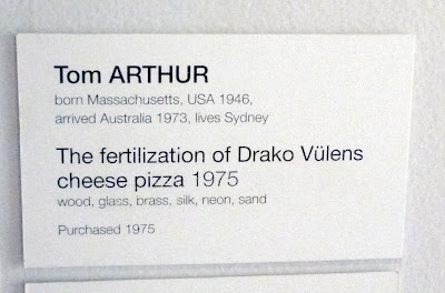
The title card...
From Blog photos
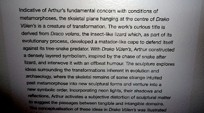
... and then, the interpretive text ...
From Blog photos
Not once, not twice, but ALL THREE TIMES the abbreviated title appears, it is graced with a greengrocer's apostrophe.
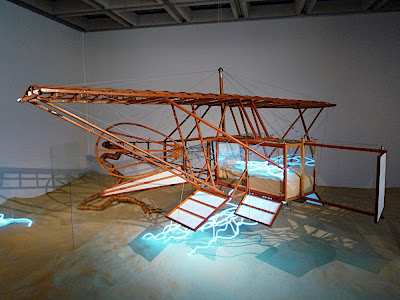
Incidentally, if you're wondering what a Drako Vülen[']s looks like, it looks like this...
From Blog photos
P.S. I know I'm not immune to typos or the occasional grammatical mishap - at my weakest, I've even been known to make an itso or use an incorrect "their" (OK - that was seriously embarrassing) - but I'm not writing or publishing for a living. To continue doing my job, I'm constantly checked and held to a higher standard than private pilots are... why should the same not be the case for professional writing?
The title card...
From Blog photos
... and then, the interpretive text ...
From Blog photos
Not once, not twice, but ALL THREE TIMES the abbreviated title appears, it is graced with a greengrocer's apostrophe.
Incidentally, if you're wondering what a Drako Vülen[']s looks like, it looks like this...
From Blog photos
P.S. I know I'm not immune to typos or the occasional grammatical mishap - at my weakest, I've even been known to make an itso or use an incorrect "their" (OK - that was seriously embarrassing) - but I'm not writing or publishing for a living. To continue doing my job, I'm constantly checked and held to a higher standard than private pilots are... why should the same not be the case for professional writing?