022 ♣ Photoshop Vector Tutorial
So! I promised aimaru I would get a sort of tutorial up for how I do vectoring. I'm super super new to it, and this tutorial is only my second one, haha, so it's very amateur and basic, but I thought it might be useful for anyone else who might be interested in getting started as well. It's essentially the basic uses of the pen tool, since I'm sure it's capable of loads more, but this is all I've managed thus far. Hopefully, it can be of at least a little help! Ah, and I'm not really too great at explaining things without visuals, so as a warning, this is IMAGE HEAVY!!
Ah, and I forgot to mention-- this is being done in Photoshop!! /doesn't know how to use anything else haha;;
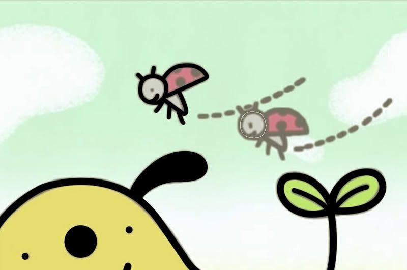
All right, here's the image I'm starting with!
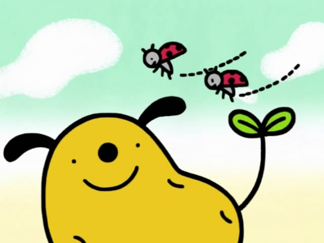
fujitsubo recommended Dogtato when I wondered what I should vector, and me being extremely lazy gay for Dogtato, thought it would be perfect, since it's really simple! And since this is a basic tutorial, a basic image is excellent to start with. I left it full-size so you can see exactly what is becoming what.
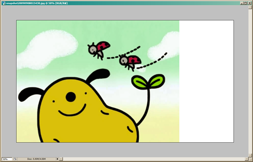
First off, expand the image to whatever size you want. I've been doing it 1920x1080. Extending the canvas to make it widescreen compatible is optional, but I recommend it!
All right! Next, create a new layer for the lines (circled on the right). Select the pen tool (circled on the left), and check that the settings are as circled at the top. APPARENTLY IT MAKES A DIFFERENCE, but as for the checked box and the last option there... I'm not really sure how haha.
I started my point at the bottom off the picture there; that's the first box. After that, you just point where you want the line to extend to and hold down until it fits the shape you want it to.
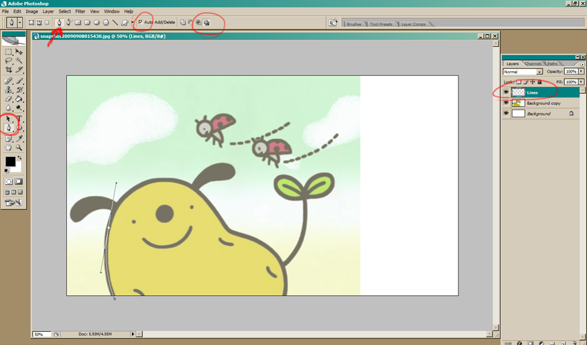
Now, you can see that it made that intersecting line based on the shape you gave it. If you click again where you want the line to continue extending to, it may not allow you to get the shape you want, like so:
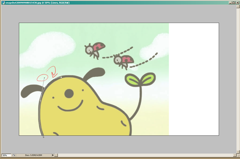
It's a little high, and if I try to lower it, it starts warping the whole line. So what you can do to make it behave is to hold down the ALT key and click and drag the little box that appeared from that line.
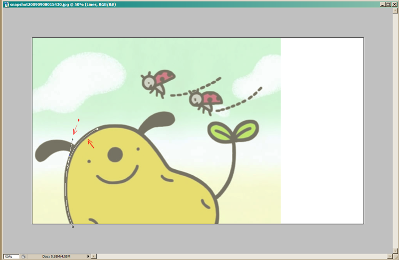
The left arrow shows where the box that was dragged and the right shows how my line looks how I want it to be now! This is kind of trial and error, and especially if you know the Photoshop shortcuts for undo/redo, you'll get faster at it.
So, just keep on going like that until your line is how you want it to be! I was a little lenient on the shape here because I'm lazy and... it's Dogtato.
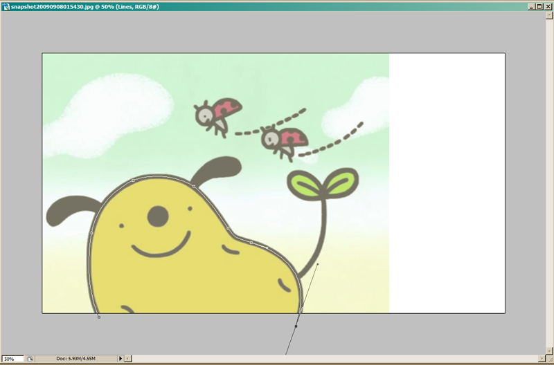
Okay, next! Make sure you've got the pen tool selected still, and right-click. You'll see this dialog box pop up.
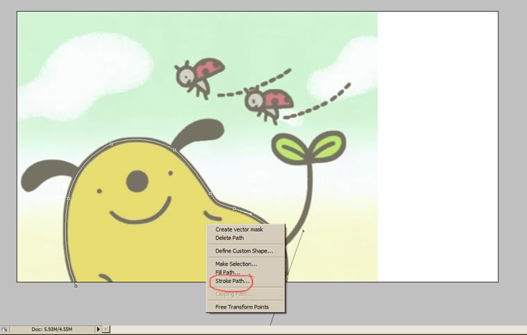
Select "Stroke Path" aaaand
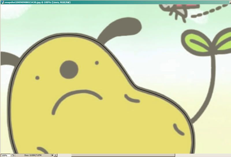
... Oh, that's nowhere near thick enough :( Dogtato is sad!! :(
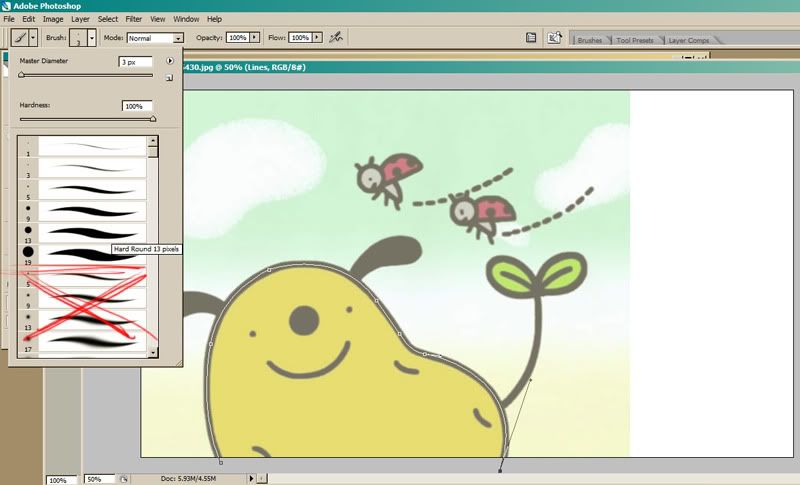
So undo!! The stroke size is determined by the brush size, so select the brush tool, and choose something thicker. 3px was pretty far off, so I tried 13px, but that was a little off still, so I ended up with 19px. You don't have to use the standard sizes, of course, but stay in the "solid" brushes rather than the soft ones-- unless you want soft lines!
And I forgot to screencap after I got the line looking how I wanted to, but you can see it in future pictures. |D;;
Now, there's other ways to make your lines, too, and Dogtato is again a perfect way to showcase that! You can also use the shapes/line tools and it'll work the same way! So I use the ellipse tool to make perfect circles for his nose, and this time, instead of using the "stroke path", I'm going to use the "fill path" since it's all solid black.
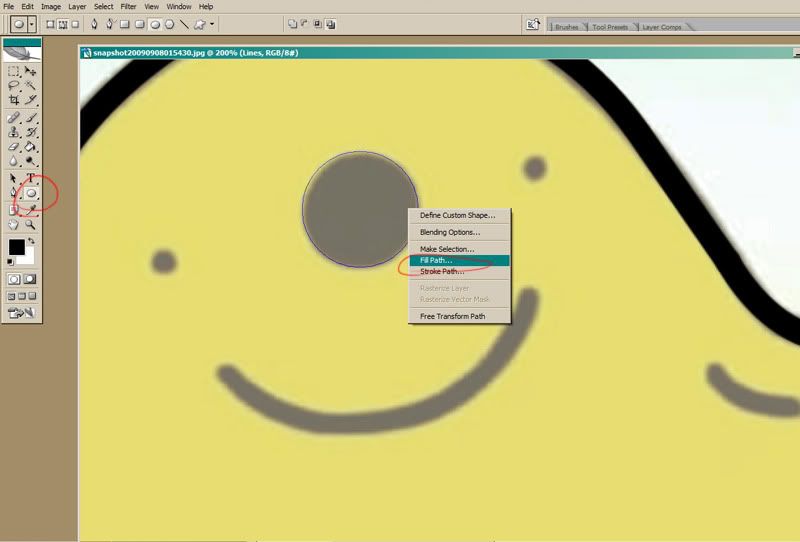
Man, that was easy! :D I did the same for Dogtato's eyes, and then went back to the normal pen tool to fill in his little spuddy lumps and his mouth.
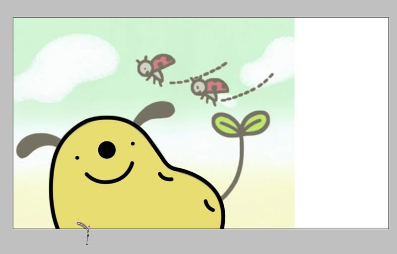
fskdlj I forgot to take a picture again, but I for the ears, I outlined them with the normal pen tool and used the "fill path" again, since they're solid black. I wish I had taken a picture since it's a little different from how you'd make the lines with the stroke path, but you can get the idea from the above fill part. But just know that the space will fill up to the lines you make, so you want to outline the very edge of what you're filling. are you sick of the word "fill" yet
Usually I do most of the cleanup at the very end, but sometimes I'll fix up little problems right away, like this little bump:
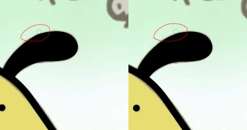
And for that, I just take the eraser tool and smooth it out.
Next we've got the little ladybugs here. Even though their heads are round, they weren't perfect circles like Dogtato's nose and eyes were, so I opted to use the regular tool and make imperfect circles. I also ended up going with a smaller brush size since... it just looked awkward to me haha.
And that's that! I checked pretty briefly and smoothed out a couple spots that were bugging me, but I did a pretty lazy job of that, once again, because lol Dogtato. I think it kind of lends to his cute if he's not quite perfect anyway. But I did end up making the ladybugs' mouths a little smaller, since I thought it looked better that way. Let's see how the linework is looking!
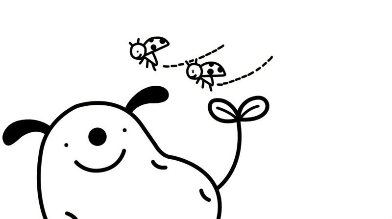
... GOOD ENOUGH. So, now we can move onto coloring! Make a new layer for the Colors and place it underneath the Linework layer.-- Which reminds me, you can totally use more than one layer for your linework and more for your colors as you please. Especially for more complicated pictures, it can be really useful, but again, I'm lazy and this is Dogtato.
I pull the colors using the Eyedropper tool. For coloring, I use the pen tool, also, since it keeps it crisp. It works just the same way as with making the lines, only you use the "fill path". And especially since Dogtato's linework is so thick, coloring is pretty quick and easy, like so:
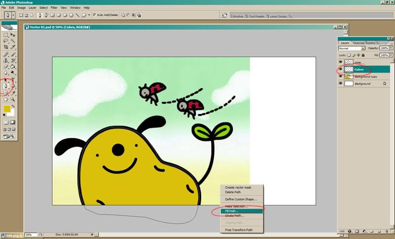
Repeat until it's all colored in! Dogtato was super simple, so this really took no time at all. Let's take a look at it!
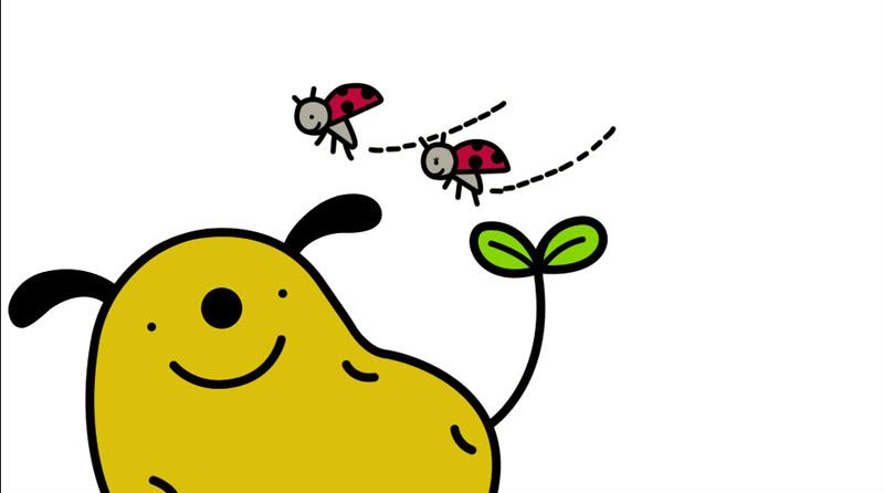
All right, time for the background! Again, it's a nice simple one, so I just eyedropped the colors and made a new layer and filled it with white since there's white in between the green and yellow. In order to see what I'm coloring, I set the opacity to 50% and used a big soft brush and just kind of filled it in.
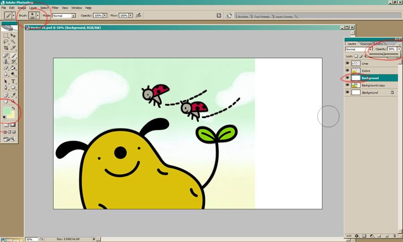
Like so! And the clouds were kinda fluffy so I picked out a similarish brush and-- yeah, doesn't have to be perfect. IT'S DOGTATO T^T//
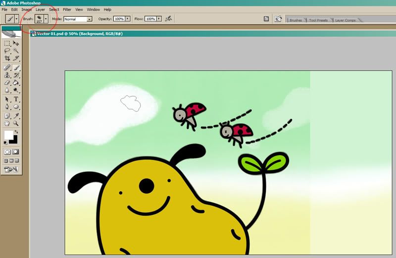
And just to have something on the right side, I added a tiny piece of cloud.
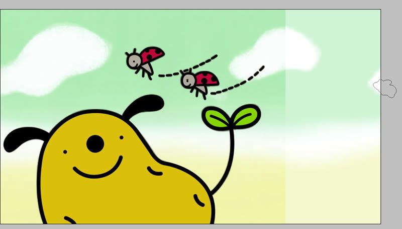
And that'a pretty much it! There's another thing the pen tool can do that I wasn't useful here, but I generally use it for folds in clothes and the like, and that's the "Simulate pressure" option. When you're going for the "stroke path", you'll see the option appear like so:
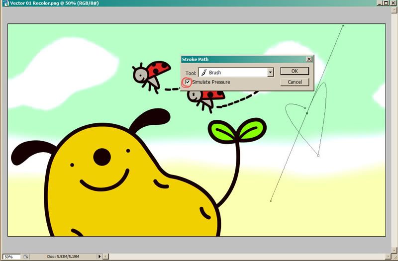
So if you check it, you'll get a line like this:
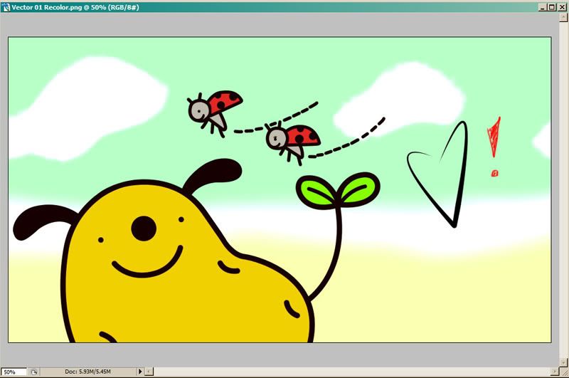
It's thinner at the ends and heavier in the middle, also depending on the brush size you select. I'm... really not good with simulated pressure lines haha |D; BUT THAT OPTION IS THERE, so play around with it if you want!
Anyway, that brings us to the finished product (sans the cheap heart there). I liked brighter colors, so I put the icon base on top of it, and got this in the end:
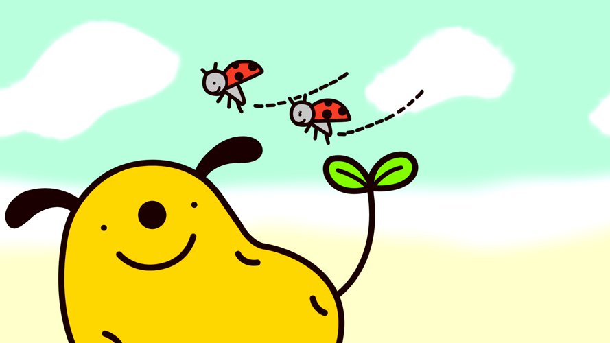
1920 x 1080 | 1440 x 900
So! That's pretty much the extent of my knowledge there, haha. I'm not the world's greatest teacher, but I hope I explained well enough. If not, do feel free to ask any questions and I'll do my best to clarify anything! ♥
Ah, and I forgot to mention-- this is being done in Photoshop!! /doesn't know how to use anything else haha;;
All right, here's the image I'm starting with!

fujitsubo recommended Dogtato when I wondered what I should vector, and me being extremely lazy gay for Dogtato, thought it would be perfect, since it's really simple! And since this is a basic tutorial, a basic image is excellent to start with. I left it full-size so you can see exactly what is becoming what.
First off, expand the image to whatever size you want. I've been doing it 1920x1080. Extending the canvas to make it widescreen compatible is optional, but I recommend it!

All right! Next, create a new layer for the lines (circled on the right). Select the pen tool (circled on the left), and check that the settings are as circled at the top. APPARENTLY IT MAKES A DIFFERENCE, but as for the checked box and the last option there... I'm not really sure how haha.
I started my point at the bottom off the picture there; that's the first box. After that, you just point where you want the line to extend to and hold down until it fits the shape you want it to.

Now, you can see that it made that intersecting line based on the shape you gave it. If you click again where you want the line to continue extending to, it may not allow you to get the shape you want, like so:

It's a little high, and if I try to lower it, it starts warping the whole line. So what you can do to make it behave is to hold down the ALT key and click and drag the little box that appeared from that line.

The left arrow shows where the box that was dragged and the right shows how my line looks how I want it to be now! This is kind of trial and error, and especially if you know the Photoshop shortcuts for undo/redo, you'll get faster at it.
So, just keep on going like that until your line is how you want it to be! I was a little lenient on the shape here because I'm lazy and... it's Dogtato.

Okay, next! Make sure you've got the pen tool selected still, and right-click. You'll see this dialog box pop up.

Select "Stroke Path" aaaand

... Oh, that's nowhere near thick enough :( Dogtato is sad!! :(
So undo!! The stroke size is determined by the brush size, so select the brush tool, and choose something thicker. 3px was pretty far off, so I tried 13px, but that was a little off still, so I ended up with 19px. You don't have to use the standard sizes, of course, but stay in the "solid" brushes rather than the soft ones-- unless you want soft lines!

And I forgot to screencap after I got the line looking how I wanted to, but you can see it in future pictures. |D;;
Now, there's other ways to make your lines, too, and Dogtato is again a perfect way to showcase that! You can also use the shapes/line tools and it'll work the same way! So I use the ellipse tool to make perfect circles for his nose, and this time, instead of using the "stroke path", I'm going to use the "fill path" since it's all solid black.

Man, that was easy! :D I did the same for Dogtato's eyes, and then went back to the normal pen tool to fill in his little spuddy lumps and his mouth.

fskdlj I forgot to take a picture again, but I for the ears, I outlined them with the normal pen tool and used the "fill path" again, since they're solid black. I wish I had taken a picture since it's a little different from how you'd make the lines with the stroke path, but you can get the idea from the above fill part. But just know that the space will fill up to the lines you make, so you want to outline the very edge of what you're filling. are you sick of the word "fill" yet
Usually I do most of the cleanup at the very end, but sometimes I'll fix up little problems right away, like this little bump:

And for that, I just take the eraser tool and smooth it out.
Next we've got the little ladybugs here. Even though their heads are round, they weren't perfect circles like Dogtato's nose and eyes were, so I opted to use the regular tool and make imperfect circles. I also ended up going with a smaller brush size since... it just looked awkward to me haha.

And that's that! I checked pretty briefly and smoothed out a couple spots that were bugging me, but I did a pretty lazy job of that, once again, because lol Dogtato. I think it kind of lends to his cute if he's not quite perfect anyway. But I did end up making the ladybugs' mouths a little smaller, since I thought it looked better that way. Let's see how the linework is looking!

... GOOD ENOUGH. So, now we can move onto coloring! Make a new layer for the Colors and place it underneath the Linework layer.-- Which reminds me, you can totally use more than one layer for your linework and more for your colors as you please. Especially for more complicated pictures, it can be really useful, but again, I'm lazy and this is Dogtato.
I pull the colors using the Eyedropper tool. For coloring, I use the pen tool, also, since it keeps it crisp. It works just the same way as with making the lines, only you use the "fill path". And especially since Dogtato's linework is so thick, coloring is pretty quick and easy, like so:

Repeat until it's all colored in! Dogtato was super simple, so this really took no time at all. Let's take a look at it!

All right, time for the background! Again, it's a nice simple one, so I just eyedropped the colors and made a new layer and filled it with white since there's white in between the green and yellow. In order to see what I'm coloring, I set the opacity to 50% and used a big soft brush and just kind of filled it in.

Like so! And the clouds were kinda fluffy so I picked out a similarish brush and-- yeah, doesn't have to be perfect. IT'S DOGTATO T^T//

And just to have something on the right side, I added a tiny piece of cloud.

And that'a pretty much it! There's another thing the pen tool can do that I wasn't useful here, but I generally use it for folds in clothes and the like, and that's the "Simulate pressure" option. When you're going for the "stroke path", you'll see the option appear like so:

So if you check it, you'll get a line like this:

It's thinner at the ends and heavier in the middle, also depending on the brush size you select. I'm... really not good with simulated pressure lines haha |D; BUT THAT OPTION IS THERE, so play around with it if you want!
Anyway, that brings us to the finished product (sans the cheap heart there). I liked brighter colors, so I put the icon base on top of it, and got this in the end:

1920 x 1080 | 1440 x 900
So! That's pretty much the extent of my knowledge there, haha. I'm not the world's greatest teacher, but I hope I explained well enough. If not, do feel free to ask any questions and I'll do my best to clarify anything! ♥