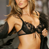
Tutorial #9 - Alessandra Ambrosio
We're going from

to
Uses Selective Color, Channel Mixer, and Color Balance so I don't think it's translatable. I used PhotoShop CS2.
This tutorial is requested by fashion_vogue from this post. I did this coloring way back and I have the PSD saved over, which I used to guide me in making this tutorial. It's not the exact coloring, but it's really similar. The images used are from vsafans. NOTE: Always remember that this whole tutorial can look amazing or catastrophic depending on your base, so adjusting is your best friend. Now, onto the tutorial.
1) The base is pretty dull right now. It doesn't have the colors we want to accomplish yet. But we'll get to that. For now, we duplicate the base twice and set the first to Screen at 50% Opacity and the second to Softlight at 50% Opacity. This depends on your base. Adjust the opacities according to your base. We don't want any drastic changes, just a little brightening and contrast.


2) Okay. Now it's time to add some colors. What I really want is to make the reds and the blues pop, so open up a Selective Color layer and play around with the reds and the neutrals. For mine, I decreased the cyan on the reds and upped everything else and for the neutrals I upped the cyan and decreased the magenta and yellow. Do not do anything drastic, though. Here are my inputs:
Reds: -30/+10/+10/+10
Neutrals: +20/-5/-5/0


3) After doing that, we can see that the base has a pretty low amount of cyan right now. If we want to achieve the color we want, we'll have to duplicate the Selective Color layer twice to add more reds and blues.


4) We're getting closer! Now, we want a little bit more color. Open up a Channel Mixer layer and play around with the reds and the blues. What we want now is the reds, yellows, and blues to pop. Here are my inputs:
Red: +140/-35/0/0
Blue: -25/+30/+100/0


5) Okay, now the colors are too overwhelming and not much contrast going on. Now, like all my other tutorials, we'll open up a Gradient Map layer (set the primary color to black and the secondary color to white) and set it to Softlight at 50% Opacity.


6) Now the base is really coming along. But it's a little too yellow for my taste. There's a simple way to remedy that, though. Open up a Color Balance layer and up the reds and the blues and lower the magentas in the midtones. Here are my inputs:
Midtones: +25/-10/+5


And there you have it! Please do not copy the inputs as they are. They are only there for reference if you do not know how much to increase or decrease something.
Other examples:


No PSD, please don't ask.

to

Uses Selective Color, Channel Mixer, and Color Balance so I don't think it's translatable. I used PhotoShop CS2.
This tutorial is requested by fashion_vogue from this post. I did this coloring way back and I have the PSD saved over, which I used to guide me in making this tutorial. It's not the exact coloring, but it's really similar. The images used are from vsafans. NOTE: Always remember that this whole tutorial can look amazing or catastrophic depending on your base, so adjusting is your best friend. Now, onto the tutorial.
1) The base is pretty dull right now. It doesn't have the colors we want to accomplish yet. But we'll get to that. For now, we duplicate the base twice and set the first to Screen at 50% Opacity and the second to Softlight at 50% Opacity. This depends on your base. Adjust the opacities according to your base. We don't want any drastic changes, just a little brightening and contrast.


2) Okay. Now it's time to add some colors. What I really want is to make the reds and the blues pop, so open up a Selective Color layer and play around with the reds and the neutrals. For mine, I decreased the cyan on the reds and upped everything else and for the neutrals I upped the cyan and decreased the magenta and yellow. Do not do anything drastic, though. Here are my inputs:
Reds: -30/+10/+10/+10
Neutrals: +20/-5/-5/0


3) After doing that, we can see that the base has a pretty low amount of cyan right now. If we want to achieve the color we want, we'll have to duplicate the Selective Color layer twice to add more reds and blues.


4) We're getting closer! Now, we want a little bit more color. Open up a Channel Mixer layer and play around with the reds and the blues. What we want now is the reds, yellows, and blues to pop. Here are my inputs:
Red: +140/-35/0/0
Blue: -25/+30/+100/0


5) Okay, now the colors are too overwhelming and not much contrast going on. Now, like all my other tutorials, we'll open up a Gradient Map layer (set the primary color to black and the secondary color to white) and set it to Softlight at 50% Opacity.


6) Now the base is really coming along. But it's a little too yellow for my taste. There's a simple way to remedy that, though. Open up a Color Balance layer and up the reds and the blues and lower the magentas in the midtones. Here are my inputs:
Midtones: +25/-10/+5


And there you have it! Please do not copy the inputs as they are. They are only there for reference if you do not know how much to increase or decrease something.
Other examples:


No PSD, please don't ask.