Tutorial #11
This is once again made for severalplums. (I got Second Place and Mod's Invitation. :D)
We're going from
to
As always, I started with cropping and choosing my base:

First I wanted to darken the base a little (instead of lightening it like I often do, since this base was alreayd light enough and more), so I turned to my trusted Curves layer. And as always, I played around with the channels until I got a nice result.
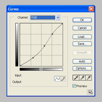
I usually use approximately three different input & output points. I start from the middle, then move upwards and finally downwards, stopping once I find the settings that make the picture look good.

Yeah, darker, and also looks better.
The next step was to give the icon a bit more colour, so Hue/Saturation layer it was then.
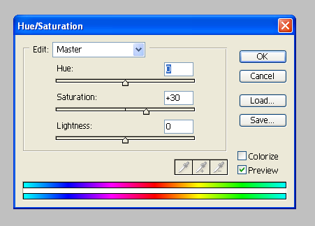
I put the Saturation to +30% and left the rest untouched.

After that, I wanted to give the icon a bit more contrast, so I duplicated the base, brought it on top of the other layers, blurred it using Gaussian Blur (radius 3,0) and changed it to Soft Light, opacity 50%.

It also got a bit darker in the process, but I liked it so it was good.
Then it was time to concentrate more on the empty side of the icon. I wanted to add some colour to it and also something that would make the icon more interesting to look at but that wouldn't take the focus off the subject (so I wanted the colour/pattern to blend in with the rest of the icon).
I wanted to use textures for that, so my first texture was a nice green/blueish one from yamarihime.
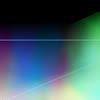
I put it on top of the earlier layers, flipped it vertically, changed it to Soft Light (leaving the opacity untouched) and, because it was a bit too much on the subject, I erased the texture from it and then used the Fade eraser tool to fade what I just erased (opacity 70%) to leave some of the texture's colour to the subject too.

Now it looks better and does not argue with the actual coloring too much but also helps the texture to blend in better. In my opinion, at least.
My next texture was a grunge one from alerieur.
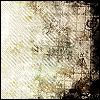
I put it on top of the other layers and and chaged it to Soft Light, leaving the opacity untouched. Then I again erased the texture from the subject because it was covering the subject a bit too much. But because the nice black border was lost on the subject's side of the icon, I selected the whole icon (Select - All) and used the Stroke tool (Edit - Stroke) with the black colour and the width of 2 px (if I remember correctly, it might have been 3 as well) to bring it back.

Lastly, I used the Brightness/Contrast layer with these settings:
Brightness: +5
Contrast: +8
to make the icon a little brighter.

Okay, we're done now. :D I did consider adding some text, but since I couldn't come up with anything nice to write and also finding a good font would have been too much of a hassle, I decided to stop here.
If something still remains unclear to you or you want to ask me something about the tutorial, feel free to do so and I'll answer the best I can. Also, if you decide to try it out I'd like to see your result.
We're going from

to

As always, I started with cropping and choosing my base:

First I wanted to darken the base a little (instead of lightening it like I often do, since this base was alreayd light enough and more), so I turned to my trusted Curves layer. And as always, I played around with the channels until I got a nice result.

I usually use approximately three different input & output points. I start from the middle, then move upwards and finally downwards, stopping once I find the settings that make the picture look good.

Yeah, darker, and also looks better.
The next step was to give the icon a bit more colour, so Hue/Saturation layer it was then.

I put the Saturation to +30% and left the rest untouched.

After that, I wanted to give the icon a bit more contrast, so I duplicated the base, brought it on top of the other layers, blurred it using Gaussian Blur (radius 3,0) and changed it to Soft Light, opacity 50%.

It also got a bit darker in the process, but I liked it so it was good.
Then it was time to concentrate more on the empty side of the icon. I wanted to add some colour to it and also something that would make the icon more interesting to look at but that wouldn't take the focus off the subject (so I wanted the colour/pattern to blend in with the rest of the icon).
I wanted to use textures for that, so my first texture was a nice green/blueish one from yamarihime.

I put it on top of the earlier layers, flipped it vertically, changed it to Soft Light (leaving the opacity untouched) and, because it was a bit too much on the subject, I erased the texture from it and then used the Fade eraser tool to fade what I just erased (opacity 70%) to leave some of the texture's colour to the subject too.

Now it looks better and does not argue with the actual coloring too much but also helps the texture to blend in better. In my opinion, at least.
My next texture was a grunge one from alerieur.

I put it on top of the other layers and and chaged it to Soft Light, leaving the opacity untouched. Then I again erased the texture from the subject because it was covering the subject a bit too much. But because the nice black border was lost on the subject's side of the icon, I selected the whole icon (Select - All) and used the Stroke tool (Edit - Stroke) with the black colour and the width of 2 px (if I remember correctly, it might have been 3 as well) to bring it back.

Lastly, I used the Brightness/Contrast layer with these settings:
Brightness: +5
Contrast: +8
to make the icon a little brighter.

Okay, we're done now. :D I did consider adding some text, but since I couldn't come up with anything nice to write and also finding a good font would have been too much of a hassle, I decided to stop here.
If something still remains unclear to you or you want to ask me something about the tutorial, feel free to do so and I'll answer the best I can. Also, if you decide to try it out I'd like to see your result.