Tutorial #9
Once again, I made this tutorial for severalplums because of winning the first place. :D
We're going from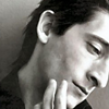
to
As I always do, I started with cropping and choosing my base, which was the following. (This time I purposedly didn't shrink it to 100x100 until in the end.)
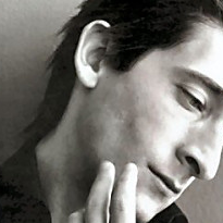
And like most of my icons, this is the result of playing around and trying out different things until I got something I liked.
First I wanted to brighten up the base some, so I turned to my trusted Curves layer. And as always, I played around with the channels until I got a nice result.
I usually use approximately three different input & output points. I start from the middle, then move upwards and finally downwards, stopping once I find the settings that make the picture look good.
This is how I did the first Curves layer:
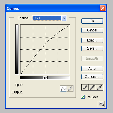
Better.
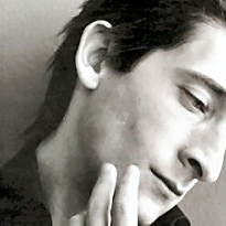
Then, I decided to give it some colour, so on with the Curves.
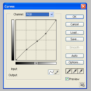
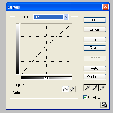

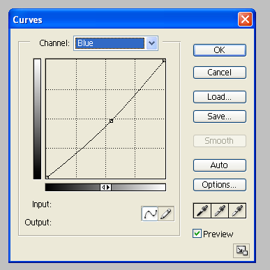
Definitely not so black and white anymore.
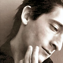
Next I wanted to darken the overall colour of the icon, so I duplicated the base, brought it on top of the other layers and changed it to Soft Light, leaving the opacity untouched.
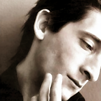
Time to get a bit more creative (or not) with the coloring! I often like to use the Exclusion layer at this point, so that was what I did now as well. I picked a dark blue colour (mine was #0A1D48), filled a new layer with said colour and set the layer to Exclusion, leaving he opacity again untouched.

To continue with the coloring, I picked a grey colour (mine was #EAE6E3) and filled a new layer with that. I set that layer to Multiply, once again not touching the opacity. It is a little darker and slightly less blue now.

After that, I continued with a Color Balance layer to give the coloring a new tone.
Here's what I did:
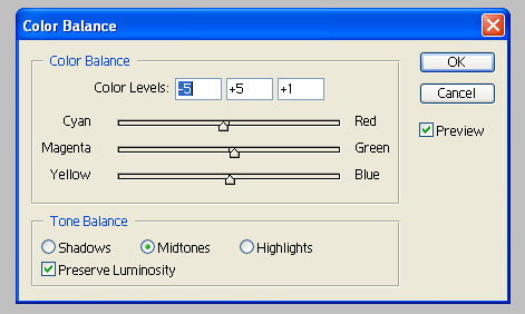
And it looks slightly more green-ish now.
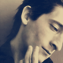
Then I wanted to brighten up the icon, so I used the Brightness/Contrast layer with these settings:
Brightness: +5
Contrast: +8

Then I wanted to deepen the colour a little, so I duplicated the base, brought it on top of the other layers and changed it to Soft Light, opacity 11%.
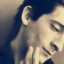
Next I wanted to once again brighten the icon, so another Curves layer was needed.
This is how I did it:
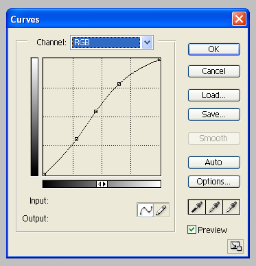
Yep, lighter it is.

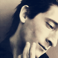
After that I selected the whole icon (Select - All & Edit - Copy Merged) and pasted this new layer on top of the other layers. Then, if I remember correctly, I used the Blur Tool to smooth the sharp lines around Adrian's lips and nose a little.
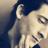
Then it was time for a black and white Gradient Map. I set the layer to Soft Light and brought the opacity down to 35% because I have learned that doing this makes the icon's colours brighter without losing the actual colour.
Then it was time to add some sort of texture to the icon. (Actually it is just a piece cut out of one of the other pictures, but it does the trick anyway.) So I cut out this,
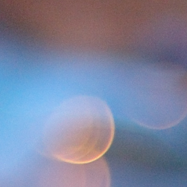
pasted it on top of the other layers, desaturated it and set it to Soft Light, not touching the opacity.
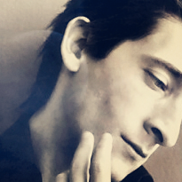
Looks nicer. :D
Then I wanted to give it a bit more contrast, so I duplicated the base, brought it on top of the other layers, blurred it using Gaussian Blur (radius 3,0) and changed it to Soft Light, opacity 33%.
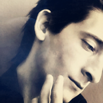
And all that was left anymore was to add some text to the icon. Now I resized it to the actual icon-size and then wrote 'follow your dreams' using the colour #D3C6AD that I had picked from the icon. The font I used for 'follow your' is called Porcelain, size 18 pt (I think that the size depends on your program, mine was acting a little funny that time), and for 'dreams' I used a font called BigNoodleTitling, size 14 pt.

Then I duplicated the 'follow your' layer and set it to Soft Light, and everything was as good as done :D
If something still remains unclear to you or you want to ask me something about the tutorial, feel free to do so and I'll answer the best I can. Also, if you decide to try it out I'd like to see your result.
We're going from

to

As I always do, I started with cropping and choosing my base, which was the following. (This time I purposedly didn't shrink it to 100x100 until in the end.)

And like most of my icons, this is the result of playing around and trying out different things until I got something I liked.
First I wanted to brighten up the base some, so I turned to my trusted Curves layer. And as always, I played around with the channels until I got a nice result.
I usually use approximately three different input & output points. I start from the middle, then move upwards and finally downwards, stopping once I find the settings that make the picture look good.
This is how I did the first Curves layer:

Better.

Then, I decided to give it some colour, so on with the Curves.


Definitely not so black and white anymore.

Next I wanted to darken the overall colour of the icon, so I duplicated the base, brought it on top of the other layers and changed it to Soft Light, leaving the opacity untouched.

Time to get a bit more creative (or not) with the coloring! I often like to use the Exclusion layer at this point, so that was what I did now as well. I picked a dark blue colour (mine was #0A1D48), filled a new layer with said colour and set the layer to Exclusion, leaving he opacity again untouched.

To continue with the coloring, I picked a grey colour (mine was #EAE6E3) and filled a new layer with that. I set that layer to Multiply, once again not touching the opacity. It is a little darker and slightly less blue now.

After that, I continued with a Color Balance layer to give the coloring a new tone.
Here's what I did:

And it looks slightly more green-ish now.

Then I wanted to brighten up the icon, so I used the Brightness/Contrast layer with these settings:
Brightness: +5
Contrast: +8

Then I wanted to deepen the colour a little, so I duplicated the base, brought it on top of the other layers and changed it to Soft Light, opacity 11%.

Next I wanted to once again brighten the icon, so another Curves layer was needed.
This is how I did it:

Yep, lighter it is.

After that I selected the whole icon (Select - All & Edit - Copy Merged) and pasted this new layer on top of the other layers. Then, if I remember correctly, I used the Blur Tool to smooth the sharp lines around Adrian's lips and nose a little.

Then it was time for a black and white Gradient Map. I set the layer to Soft Light and brought the opacity down to 35% because I have learned that doing this makes the icon's colours brighter without losing the actual colour.

Then it was time to add some sort of texture to the icon. (Actually it is just a piece cut out of one of the other pictures, but it does the trick anyway.) So I cut out this,

pasted it on top of the other layers, desaturated it and set it to Soft Light, not touching the opacity.

Looks nicer. :D
Then I wanted to give it a bit more contrast, so I duplicated the base, brought it on top of the other layers, blurred it using Gaussian Blur (radius 3,0) and changed it to Soft Light, opacity 33%.

And all that was left anymore was to add some text to the icon. Now I resized it to the actual icon-size and then wrote 'follow your dreams' using the colour #D3C6AD that I had picked from the icon. The font I used for 'follow your' is called Porcelain, size 18 pt (I think that the size depends on your program, mine was acting a little funny that time), and for 'dreams' I used a font called BigNoodleTitling, size 14 pt.

Then I duplicated the 'follow your' layer and set it to Soft Light, and everything was as good as done :D
If something still remains unclear to you or you want to ask me something about the tutorial, feel free to do so and I'll answer the best I can. Also, if you decide to try it out I'd like to see your result.