Tutorial #8
Again made for severalplums. Both second place and Mod's choice this time, which was a really nice surprise. :D And I even like this icon of mine this time. x)
We're going from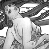
to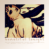
I started with cropping and choosing my base, which was the following.

First I wanted to brighten up the base, so I used the Curves layer. And as always, I played around with the channels until I got a nice result.
I usually use approximately three (or less, or more, depending on the image I'm working with) different input & output points. I start from the middle, then move upwards and finally downwards, stopping once I find the settings that make the picture look good.
This is how I did the first Curves layer:
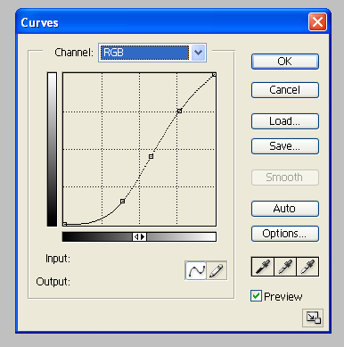
From top to bottom, the settings were as follows:
Input: 196
Output: 191
Input: 147
Output: 115
Input: 99
Output: 39
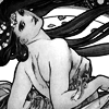
Brighter, and also darker.
Then I wanted to give the icon a bit of colour. And because the Curves layer is really handy for that purpose as well, that's what I used, again. This time I used the RGB channel, the Red channel and the Blue channel.
This is how I did it:
The RGB channel:
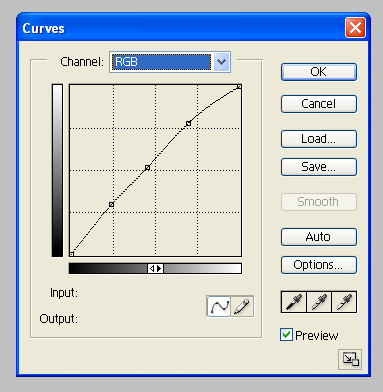
Input: 177
Output: 199
Input: 115
Output: 132
Input: 61
Output: 76
The Red channel:
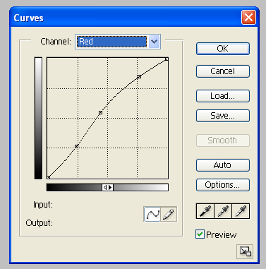
Input: 196
Output: 217
Input: 113
Output: 140
Input: 61
Output: 67
The Blue channel:
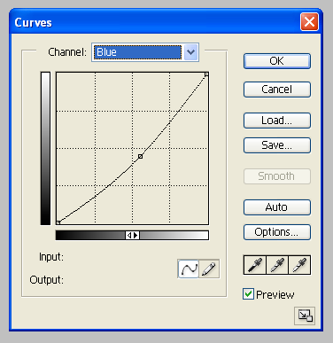
Input: 141
Output: 114
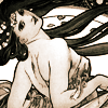
And it has a hint of colour now.
Next, I wanted to deepen the colour I had gotten. So I used Color Balance with these settings
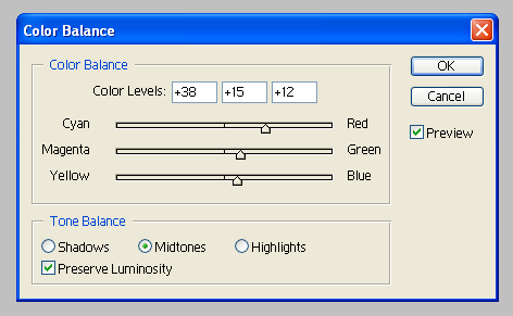
to make the colour a bit noticeable.
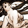
It's a bit redder now.
Then I wanted to change the colour scheme of the icon a bit. So, I picked a dark blue colour (mine was #1A1847) and set the layer to Exclusion with the opacity at 50%.
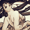
A nice colour, but I wanted it to be more blue. So I chose a light blue colour (mine was #94B8DD) and set that layer to Color Burn with the opacity at 80%.
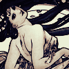
After that I decided to try what happens when I played with Hue/Saturation layer. I set Saturation to 50% and liked what I got, so I kept it.
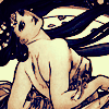
Then I wanted to add some contrast to the icon so I used the Brightness/Contrast layer with these settings:
Brightness: -10
Contrast: +10
and left the layer at Normal.

Then all that was left was to finish the coloring. I wanted to see what happened if I tried the Gradient Map so that's what I did. I picked this one
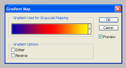
and set the layer to Lighten with the opacity at 16%.
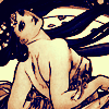
And the coloring is now done. :D
Then it was time to finish the icon. I started with cropping a part of my icon and pasting it to an empty layer.
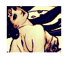
Next I chose a gradient from fraoch_icons

and pasted it on top of my previous layer, then set that layer to Multiply with the opacity at 44%.
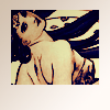
What remains to be done now are the finishing touches. I'm usually not very good with text (which is why a lot of my icons tend to be textless) but this one needed something so I thought of something simple and used that. I then wrote 'beautiful tonight' using the colour (#D5C4B3) that I had picked from the icon. The font I used is called Ben Brown, size 18 pt. I set the text layer to Multiply with the opacity left untouched, duplicated it and changed the opacity to 38% and duplicated it again, setting that layer to Soft Light and bringing the opacity back to 100%.

Then I put some tiny text underneath what I had written, using the same colour, and set the layer to Multiply with the opacity at 80%.
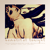
Lastly, I selected the whole icon (Select - All, Edit - Copy Merged - Paste) and pasted that layer on top of my other layers. I set it to Soft Light with the opacity at 33% to make the colour just a bit darker.

And so the icon is finished. :D
If something still remains unclear to you or you want to ask me something about the tutorial, feel free to do so and I'll answer the best I can. Also, if you decide to try it out I'd like to see your result.
We're going from

to

I started with cropping and choosing my base, which was the following.

First I wanted to brighten up the base, so I used the Curves layer. And as always, I played around with the channels until I got a nice result.
I usually use approximately three (or less, or more, depending on the image I'm working with) different input & output points. I start from the middle, then move upwards and finally downwards, stopping once I find the settings that make the picture look good.
This is how I did the first Curves layer:

From top to bottom, the settings were as follows:
Input: 196
Output: 191
Input: 147
Output: 115
Input: 99
Output: 39

Brighter, and also darker.
Then I wanted to give the icon a bit of colour. And because the Curves layer is really handy for that purpose as well, that's what I used, again. This time I used the RGB channel, the Red channel and the Blue channel.
This is how I did it:
The RGB channel:

Input: 177
Output: 199
Input: 115
Output: 132
Input: 61
Output: 76
The Red channel:

Input: 196
Output: 217
Input: 113
Output: 140
Input: 61
Output: 67
The Blue channel:

Input: 141
Output: 114

And it has a hint of colour now.
Next, I wanted to deepen the colour I had gotten. So I used Color Balance with these settings

to make the colour a bit noticeable.

It's a bit redder now.
Then I wanted to change the colour scheme of the icon a bit. So, I picked a dark blue colour (mine was #1A1847) and set the layer to Exclusion with the opacity at 50%.

A nice colour, but I wanted it to be more blue. So I chose a light blue colour (mine was #94B8DD) and set that layer to Color Burn with the opacity at 80%.

After that I decided to try what happens when I played with Hue/Saturation layer. I set Saturation to 50% and liked what I got, so I kept it.

Then I wanted to add some contrast to the icon so I used the Brightness/Contrast layer with these settings:
Brightness: -10
Contrast: +10
and left the layer at Normal.

Then all that was left was to finish the coloring. I wanted to see what happened if I tried the Gradient Map so that's what I did. I picked this one

and set the layer to Lighten with the opacity at 16%.

And the coloring is now done. :D
Then it was time to finish the icon. I started with cropping a part of my icon and pasting it to an empty layer.

Next I chose a gradient from fraoch_icons
and pasted it on top of my previous layer, then set that layer to Multiply with the opacity at 44%.

What remains to be done now are the finishing touches. I'm usually not very good with text (which is why a lot of my icons tend to be textless) but this one needed something so I thought of something simple and used that. I then wrote 'beautiful tonight' using the colour (#D5C4B3) that I had picked from the icon. The font I used is called Ben Brown, size 18 pt. I set the text layer to Multiply with the opacity left untouched, duplicated it and changed the opacity to 38% and duplicated it again, setting that layer to Soft Light and bringing the opacity back to 100%.

Then I put some tiny text underneath what I had written, using the same colour, and set the layer to Multiply with the opacity at 80%.

Lastly, I selected the whole icon (Select - All, Edit - Copy Merged - Paste) and pasted that layer on top of my other layers. I set it to Soft Light with the opacity at 33% to make the colour just a bit darker.

And so the icon is finished. :D
If something still remains unclear to you or you want to ask me something about the tutorial, feel free to do so and I'll answer the best I can. Also, if you decide to try it out I'd like to see your result.