Tutorial #5
My fifth tutorial. Made for severalplums, an icon challenge community where the winner of each challenge is required to post a tutorial of her winning icon. I won last week so here's mine. :D
We're going from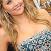
to
Start with cropping your base. I myself rotated the original image a little and then cropped it to get this.

After getting the base I wanted, it was time to get to the real business. First, I dublicated the base twice. The first one I sharpened (Filter - Sharpen - Sharpen) and the second one I set to Soft light to get a bit more colour to the base.
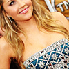
Then it was time for the actual coloring. I started with a dark blue exclusion layer (using #0C1735) in 100% to add a hint of blue to the icon.
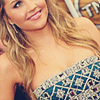
I realized that one layer wasn't enough so I duplicated it. However, I decided to lower the opacity to 50% because 100% would have been a bit too dark for my tastes, so I got this:

I still wanted the icon to have more blue, so I continued with a light blue soft light layer (using #9EA5EE) without touching the opacity.

I decided that I would like it to have even more blue, so I duplicated the previous layer. But because I didn't want it to have too much blue, I lowered the opacity to 50%. And thus I was satisfied. xD
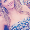
The overall colour of the icon was a bit too darkish, though, so the next step is used to brighten it (and especially the skin) a little. I duplicated the base, brought it to the top, desaturated it (Image - Adjustments - Desaturate) and blurred it using Gaussian blur (Filter - Blur - Gaussian blur, radius 4,0 - Edit - Fade Gaussian blur, opacity 100%). Then I set the layer to Soft light.
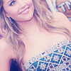
Note! The Gaussian blur trick was something I learned from a friend ages ago. And in order for it to fully work, you need to do to the Fade bit right after setting the Gaussian blur. Otherwise it refuses to let you use it.
Next, I returned to the coloring again. After I had gotten the blue that I wanted, I decided to want the icon to have some more yellow. So, I added a yellow-ish Multiply layer (using #E6DC89) and lowered the opacity to 50%.
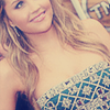
Even though I liked the yellow, I wanted a hint of red to the icon. So it was time for a light red Soft light layer (using #F1AEAE) with the opacity lowered to 26%.
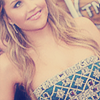
Time to brighten the colour again! I added a Brightness and contrast layer
brightness -10
contrast -10 and set it to Soft light. I lowered the opacity to 50% because it looked better like that.
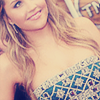
To brighten the colour even more, I added a Curves layer with these settings
RGB
Input - 80 / Output - 67
Input - 123 / Output - 120
Input - 135 / Output - 145
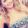
I liked the colour I had gotten so far, but it had gotten a bit too light. So, I went to play with Selective coloring. These were my settings:
Neutrals
Cyan - +50
Magenta - +30
Yellow - +20
Black - +10
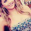
Looks better, yes? At least it has a bit more contrast and colour to it now.
Now the basic coloring is all done and it's time to concentrate on the extras, so to say. I started with copying all I had gotten done so far (Select - All - Edit - Copy Merged) and pasting it to the top (Edit - Paste). Then I sharpened the layer (Filter - Sharpen - Sharpen - Edit - Fade Sharpen, opacity 50%) and zoomed in, then used the Smudge tool to go over the skin to make it look better.

Note! When using the Smudge tool, don't go over the lips, the eyes or the edges. If you do, it won't look that good. A little sharpness in the eyes and lips, for example, looks quite good (at least in my opinion). Also, you should use a small sized brush, such as 3. It gives a better result like that. Or well, I guess that depends on personal tastes. I like to use the smaller brushes, anyway.
Time for textures now. I have always liked using light textures, so that was what I did this time as well. I added a light texture by haudvafra
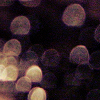
and set it to Screen, thus getting this:
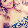
I like the effect the lights have on the icon.
What I also liked was the colour of Amanda's dress, so I wanted to increase it a bit. So, I choose another light texture, this time from crazykira,
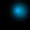
and moved it so that the blue light part was covering most of her dress. I set the layer to Screen and lowered the opacity to 80% to make it a bit less bright.
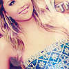
Much better.
The coloring was still missing something, though. I usually like it bright and shiny and all but this time I wanted something different, so I chose another texture by fraoch_icons
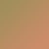
and set it to Multiply with the opacity lowered to 30%.
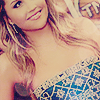
Well, of course I ended up wanting to brighten the colour again. (This is something I always do: I want something and when I have gotten it I decide that I want something else instead - like with my playing with the colours in the beginning (from blue to yellow and so on). Though all of those colour layers are necessary to the end colour; I have tested it with many colorings before and deleting a colour layer, no matter if its opacity is only 20%, does affect the colour and not always in a positive way. That, naturally, depends on personal tastes.)
I once again duplicated the base, brought it to top, desaturated it and blurred it using Gaussian blur. Then I set the layer to Soft light.
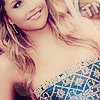
Nice, but it could be a bit brighter.
The next thing I did was that I copied all I had gotten done so far and pasted it to the top. Then I desaturated it, set the layer to Soft light and lowered the opacity to 50%.
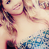
Almost done, finally. The coloring is ready and all there is left to do is to find a something nice to decorate the icon with. I settled with yet another light texture (did I already mention how much I love light textures? XD) [I can't remember who made this, though - if you do, please let me know]
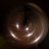
and set it to Screen. Then I moved it a bit, and finished the icon with that.
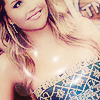
[This must be my longest tutorial. Oh well. xD]
We're going from

to

Start with cropping your base. I myself rotated the original image a little and then cropped it to get this.

After getting the base I wanted, it was time to get to the real business. First, I dublicated the base twice. The first one I sharpened (Filter - Sharpen - Sharpen) and the second one I set to Soft light to get a bit more colour to the base.

Then it was time for the actual coloring. I started with a dark blue exclusion layer (using #0C1735) in 100% to add a hint of blue to the icon.

I realized that one layer wasn't enough so I duplicated it. However, I decided to lower the opacity to 50% because 100% would have been a bit too dark for my tastes, so I got this:

I still wanted the icon to have more blue, so I continued with a light blue soft light layer (using #9EA5EE) without touching the opacity.

I decided that I would like it to have even more blue, so I duplicated the previous layer. But because I didn't want it to have too much blue, I lowered the opacity to 50%. And thus I was satisfied. xD

The overall colour of the icon was a bit too darkish, though, so the next step is used to brighten it (and especially the skin) a little. I duplicated the base, brought it to the top, desaturated it (Image - Adjustments - Desaturate) and blurred it using Gaussian blur (Filter - Blur - Gaussian blur, radius 4,0 - Edit - Fade Gaussian blur, opacity 100%). Then I set the layer to Soft light.

Note! The Gaussian blur trick was something I learned from a friend ages ago. And in order for it to fully work, you need to do to the Fade bit right after setting the Gaussian blur. Otherwise it refuses to let you use it.
Next, I returned to the coloring again. After I had gotten the blue that I wanted, I decided to want the icon to have some more yellow. So, I added a yellow-ish Multiply layer (using #E6DC89) and lowered the opacity to 50%.

Even though I liked the yellow, I wanted a hint of red to the icon. So it was time for a light red Soft light layer (using #F1AEAE) with the opacity lowered to 26%.

Time to brighten the colour again! I added a Brightness and contrast layer
brightness -10
contrast -10 and set it to Soft light. I lowered the opacity to 50% because it looked better like that.

To brighten the colour even more, I added a Curves layer with these settings
RGB
Input - 80 / Output - 67
Input - 123 / Output - 120
Input - 135 / Output - 145

I liked the colour I had gotten so far, but it had gotten a bit too light. So, I went to play with Selective coloring. These were my settings:
Neutrals
Cyan - +50
Magenta - +30
Yellow - +20
Black - +10

Looks better, yes? At least it has a bit more contrast and colour to it now.
Now the basic coloring is all done and it's time to concentrate on the extras, so to say. I started with copying all I had gotten done so far (Select - All - Edit - Copy Merged) and pasting it to the top (Edit - Paste). Then I sharpened the layer (Filter - Sharpen - Sharpen - Edit - Fade Sharpen, opacity 50%) and zoomed in, then used the Smudge tool to go over the skin to make it look better.

Note! When using the Smudge tool, don't go over the lips, the eyes or the edges. If you do, it won't look that good. A little sharpness in the eyes and lips, for example, looks quite good (at least in my opinion). Also, you should use a small sized brush, such as 3. It gives a better result like that. Or well, I guess that depends on personal tastes. I like to use the smaller brushes, anyway.
Time for textures now. I have always liked using light textures, so that was what I did this time as well. I added a light texture by haudvafra

and set it to Screen, thus getting this:

I like the effect the lights have on the icon.
What I also liked was the colour of Amanda's dress, so I wanted to increase it a bit. So, I choose another light texture, this time from crazykira,

and moved it so that the blue light part was covering most of her dress. I set the layer to Screen and lowered the opacity to 80% to make it a bit less bright.

Much better.
The coloring was still missing something, though. I usually like it bright and shiny and all but this time I wanted something different, so I chose another texture by fraoch_icons

and set it to Multiply with the opacity lowered to 30%.

Well, of course I ended up wanting to brighten the colour again. (This is something I always do: I want something and when I have gotten it I decide that I want something else instead - like with my playing with the colours in the beginning (from blue to yellow and so on). Though all of those colour layers are necessary to the end colour; I have tested it with many colorings before and deleting a colour layer, no matter if its opacity is only 20%, does affect the colour and not always in a positive way. That, naturally, depends on personal tastes.)
I once again duplicated the base, brought it to top, desaturated it and blurred it using Gaussian blur. Then I set the layer to Soft light.

Nice, but it could be a bit brighter.
The next thing I did was that I copied all I had gotten done so far and pasted it to the top. Then I desaturated it, set the layer to Soft light and lowered the opacity to 50%.

Almost done, finally. The coloring is ready and all there is left to do is to find a something nice to decorate the icon with. I settled with yet another light texture (did I already mention how much I love light textures? XD) [I can't remember who made this, though - if you do, please let me know]

and set it to Screen. Then I moved it a bit, and finished the icon with that.

[This must be my longest tutorial. Oh well. xD]