13 [full icon tutorial]
A note: the final result might be slightly different, since my iBook renders text slightly different than my PC. I'm not sure if this will translate to PSP, I'm sorry. I'm not even sure how much help I'd be with PSP, since I haven't used it for years.
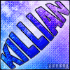
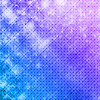
We'll be making this icon here, since tons of people asked for it. Written for Photoshop & Image Ready CS.
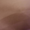
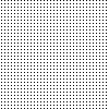
[1] We begin with this brown texture, which came from a much bigger on at Hybrid Genesis.
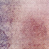
[2] Second, I take this texture, paste as a new layer, and set that layer to overlay. Once again, it's cropped from a bigger texture, also found at Hybrid Genesis.
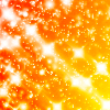
[3] Now, I'm going to paste this sparkley texture by i_consent at LJ as a new layer. This layer is set at overlay and 72% opacity.
[4] Create a new layer. I filled it with this pattern and set it at overlay, 69% opacity.

[5] Next, I created another new layer and used this gradient, with the layer set to color.

[6] Then I created another new layer and used this brush (created by me). The layer's set to overlay, with 51% opacity.
[7] The base now looks like this:
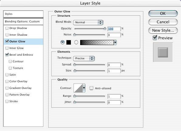
[8] Text time! I'll start with the username, since that's way easier. The font is 04b24 in white, set to 8pt with no anti-aliasing, with the layer opacity at 40%. Now for the effects. The stroke is done by going to Layer > Layer Style > Outer Glow, and filling it in exactly like I have done.
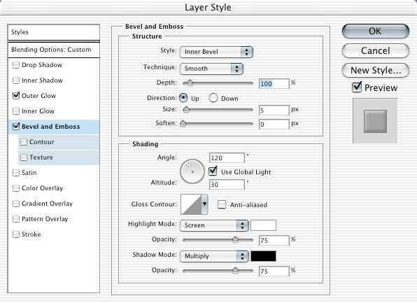
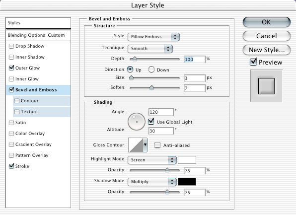
[9] Now, there's also the bevel. Go once again to Layer > Layer Style and now go to Bevel and Emboss. Fill it out like mine.
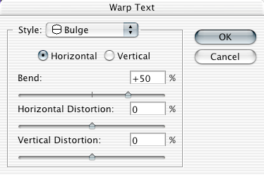
[10] The large text is much more complicated. Fun fun. It's Arial Black in black, 26pt, anti-aliasing set to crisp. To rotate text, you hold down Ctrl key for Windows or the Apple key for Macs, and use the mouse to turn it. Set the layer to Vivid Light with the fill set to 49%. For the bulge, click the warped text button (it looks like this:
) and fill it out like mine.
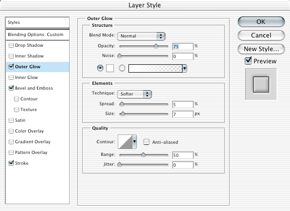
[11] Effects! Time to get complicated. Go to Layer > Layer Style > Outer Glow. Fill it out like mine.

[12] Layer > Layer Style > Bevel and Emboss. Fill out like mine.
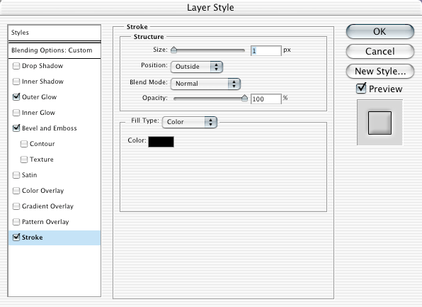
[13] Layer > Layer Style > Stroke. Once again, fill out like mine.
[14] Duplicate the text layer. We're only changing one thing: the outer glow. So, go to Layer > Layer Style > Outer Glow and fill out like mine.
[15] Finally, create a new layer and add a 1px black border. Now it's Image Ready time! Yay! Click the edit in Image Ready button (it looks like so:
). It's gonna get kinda confusing now. The first frame should have everything visible except the duplicated text layer, and the time should be 0.1 seconds. This is how my layer window looks:
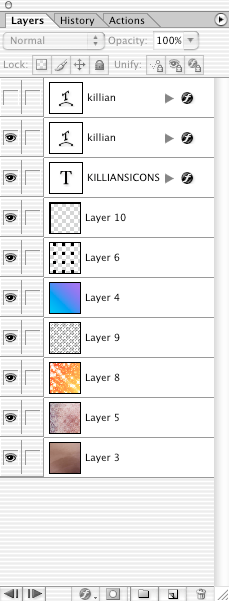
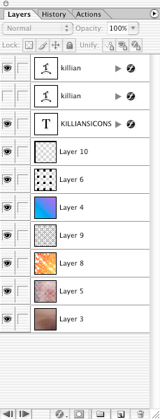
[16] Make a new animation frame. This time, make the duplicated text layer visible and the original invisible. This is how my layer window looks now:
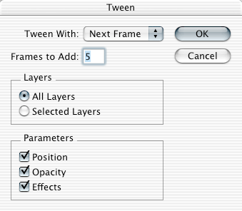
[17] Now for tweening. Make sure the first frame in the animation window is highlighted. Click the tween button, which looks like this:
. Fill out everything so it looks like mine.
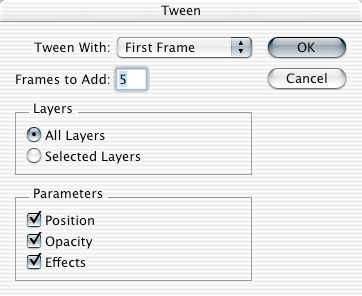
[18] Now, make the last frame (frame 7) highlighted. Click on the tween button again, and make it look like mine.
[20] Go to File > Save Optimized As... and save it! You might want to check to make sure the file size isn't too large for GJ, but other than that...you're done! Yay!
If you have any questions not related to doing it in PSP, feel free to ask! And I may do another tutorial soon, not sure though. This one took over an hour.
DO NOT MAKE THIS EXACT ICON AND TAKE REQUESTS ON IT, OR TAKE FULL CREDIT FOR IT. I SPENT HOURS ON IT AND THIS TUTORIAL. THANK YOU.
We'll be making this icon here, since tons of people asked for it. Written for Photoshop & Image Ready CS.
[1] We begin with this brown texture, which came from a much bigger on at Hybrid Genesis.
[2] Second, I take this texture, paste as a new layer, and set that layer to overlay. Once again, it's cropped from a bigger texture, also found at Hybrid Genesis.
[3] Now, I'm going to paste this sparkley texture by i_consent at LJ as a new layer. This layer is set at overlay and 72% opacity.
[4] Create a new layer. I filled it with this pattern and set it at overlay, 69% opacity.
[5] Next, I created another new layer and used this gradient, with the layer set to color.
[6] Then I created another new layer and used this brush (created by me). The layer's set to overlay, with 51% opacity.
[7] The base now looks like this:
[8] Text time! I'll start with the username, since that's way easier. The font is 04b24 in white, set to 8pt with no anti-aliasing, with the layer opacity at 40%. Now for the effects. The stroke is done by going to Layer > Layer Style > Outer Glow, and filling it in exactly like I have done.
[9] Now, there's also the bevel. Go once again to Layer > Layer Style and now go to Bevel and Emboss. Fill it out like mine.
[10] The large text is much more complicated. Fun fun. It's Arial Black in black, 26pt, anti-aliasing set to crisp. To rotate text, you hold down Ctrl key for Windows or the Apple key for Macs, and use the mouse to turn it. Set the layer to Vivid Light with the fill set to 49%. For the bulge, click the warped text button (it looks like this:
) and fill it out like mine.
[11] Effects! Time to get complicated. Go to Layer > Layer Style > Outer Glow. Fill it out like mine.
[12] Layer > Layer Style > Bevel and Emboss. Fill out like mine.
[13] Layer > Layer Style > Stroke. Once again, fill out like mine.
[14] Duplicate the text layer. We're only changing one thing: the outer glow. So, go to Layer > Layer Style > Outer Glow and fill out like mine.
[15] Finally, create a new layer and add a 1px black border. Now it's Image Ready time! Yay! Click the edit in Image Ready button (it looks like so:
). It's gonna get kinda confusing now. The first frame should have everything visible except the duplicated text layer, and the time should be 0.1 seconds. This is how my layer window looks:
[16] Make a new animation frame. This time, make the duplicated text layer visible and the original invisible. This is how my layer window looks now:
[17] Now for tweening. Make sure the first frame in the animation window is highlighted. Click the tween button, which looks like this:
. Fill out everything so it looks like mine.
[18] Now, make the last frame (frame 7) highlighted. Click on the tween button again, and make it look like mine.
[20] Go to File > Save Optimized As... and save it! You might want to check to make sure the file size isn't too large for GJ, but other than that...you're done! Yay!
If you have any questions not related to doing it in PSP, feel free to ask! And I may do another tutorial soon, not sure though. This one took over an hour.
DO NOT MAKE THIS EXACT ICON AND TAKE REQUESTS ON IT, OR TAKE FULL CREDIT FOR IT. I SPENT HOURS ON IT AND THIS TUTORIAL. THANK YOU.