TUTORIAL
I've had a few people ask for tutorials. So here they are! :)
A step-by-step guide on how to create your own simple but very effective light effects.
(Or how to use gradients)
Made for Photoshop, but should be translatable.


Icons are from this batch.
Okay, so you've made your icon, but it looks a bit bland, so what you need is a light effect! There are no textures involved to achieve this effect, you will be making it all by yourself. It's dead simple to do and you can move the position of the light around until it "fits" your icon, which is sometimes hard to do with light textures. Lets get started, shall we!
Step 1. Create your icon. I find it best to work on a larger scale to 100x100, but that's up to you.

I'll be using this icon as an example. It looks a bit dark and boring right? We will sort that out now.
Step 2. Create a new GRADIENT layer. Do not confuse this with Gradient map.
Layer > New Fill Layer > Gradient. The GRADIENT FILL should now be opened.
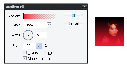
Yours will probably look differently to mine now, depending on what colour you had previously selected and what gradient.
Step 3. Click on the little down arrow where it says GRADIENT.
Choose the gradient which goes from foreground to transparent.
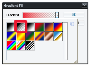
Step 4. Double click on this gradient to be taken to the gradient editor where you can change the colours of the gradient.
First we will be altering the colour on the bottom left. There is no need to touch the colours on the top.
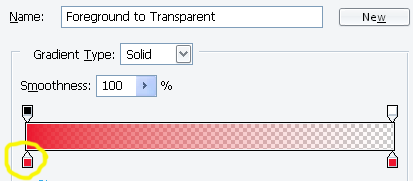
I chose a pale yellow (#F1F0C2) for mine.
Now do the same for the colour on the bottom right. You can choose the same colour or different for this. I chose a pale pink (#DBC6C6) for mine.
It now looks like this:

Step 5. Now we need to change the position of the gradient.
Go back to the gradient fill and change the Angle of the gradient. I chose 137.4° You can fiddle around with this until you are happy with it.
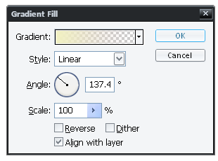
The icon should look something similar to this, which looks awful right?

Step 6. Lower the opacity until the light gradient blends in well with the icon.

And that's it!
Go from this:
to this:
There are too many steps to write up a tutorial for this icon. Here's the .PSD file.

Or download as .psp
I'd really love to know if these tutorials were helpful to anyone, and I'd really like to see your results. Have fun! :D
Friend
matchbox_icons for updates!
A step-by-step guide on how to create your own simple but very effective light effects.
(Or how to use gradients)
Made for Photoshop, but should be translatable.


Icons are from this batch.
Okay, so you've made your icon, but it looks a bit bland, so what you need is a light effect! There are no textures involved to achieve this effect, you will be making it all by yourself. It's dead simple to do and you can move the position of the light around until it "fits" your icon, which is sometimes hard to do with light textures. Lets get started, shall we!
Step 1. Create your icon. I find it best to work on a larger scale to 100x100, but that's up to you.

I'll be using this icon as an example. It looks a bit dark and boring right? We will sort that out now.
Step 2. Create a new GRADIENT layer. Do not confuse this with Gradient map.
Layer > New Fill Layer > Gradient. The GRADIENT FILL should now be opened.

Yours will probably look differently to mine now, depending on what colour you had previously selected and what gradient.
Step 3. Click on the little down arrow where it says GRADIENT.
Choose the gradient which goes from foreground to transparent.

Step 4. Double click on this gradient to be taken to the gradient editor where you can change the colours of the gradient.
First we will be altering the colour on the bottom left. There is no need to touch the colours on the top.

I chose a pale yellow (#F1F0C2) for mine.
Now do the same for the colour on the bottom right. You can choose the same colour or different for this. I chose a pale pink (#DBC6C6) for mine.
It now looks like this:

Step 5. Now we need to change the position of the gradient.
Go back to the gradient fill and change the Angle of the gradient. I chose 137.4° You can fiddle around with this until you are happy with it.

The icon should look something similar to this, which looks awful right?

Step 6. Lower the opacity until the light gradient blends in well with the icon.

And that's it!
Go from this:

to this:

There are too many steps to write up a tutorial for this icon. Here's the .PSD file.

Or download as .psp
I'd really love to know if these tutorials were helpful to anyone, and I'd really like to see your results. Have fun! :D
Friend
matchbox_icons for updates!