Picspam: Michael/Mahone Wall!Porn
I posted this photoset/picspam to tumblr last week but wanted to repost it here because I felt like rambling a bit about it and my editing/colouring process.
Despite the use of porn in the subject line, this is completely SFW btw.
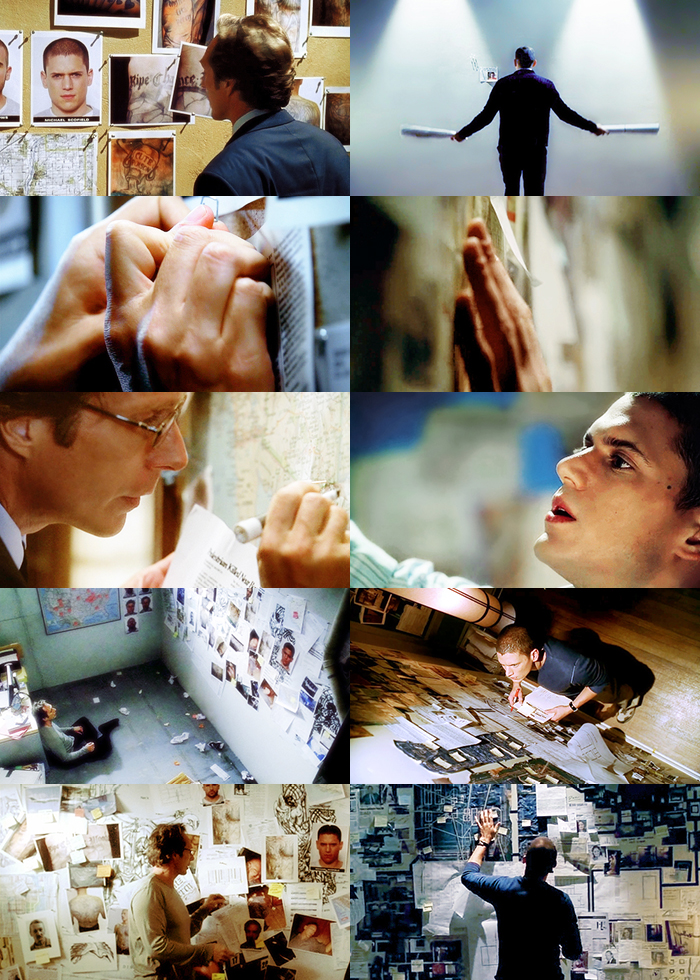
About the picspam itself: I know, there are a lot more obvious moments I could've chosen for a Michael/Mahone wall!porn picspam, like the montage with overlapping footage of Michael and Mahone as they lovingly caress The Wall, or just about every other scene with them in Sona. But I figure I'll need to keep some things for part 2! ;)
Also, I felt that I wanted this one to be more of a showcase of how similar they are, in terms of mindset, working habits, obsessiveness, etc., instead of something outright slashy.
I didn't originally intend to do the alternating yellow/blue colour scheme, but after I picked out the caps (which took a lot longer than I would've liked. Damn the lack of quality screencaps! I do appreciate Prison Break Caps, but I would LOVE this level of quality of screencaps for the whole series. Or at least S1-3, I don't really need 4 LBH), but yes, after I picked out the caps and laid them out, it was obvious that I would need to do some drastic colour editing because the colours and shades were really unbalanced.
I like how it turned out now though, because with the alternating, you get this sense that Michael and Alex are interchangeable, two sides of the same coin. I'm surprised that I was able to get as many matching screencaps for the two of them as I did, although the first one isn't quite mirroring, but it's where everything started: just a picture on a wall led them to such obsessive depths.
About the colours and editing: When I started this picspam I thought: picspams, simple, right? Not so much. At least not when you have screencaps that look like this:
I didn't realize how dark the show interior scenes were until I started making icons with them, and then working with Michael's flashback scenes from 1x16 was just the worst. All of Michael's caps were from 1x16, and you can see in the original version that his side was just way too dark and heavy. I also didn't realize how warm Michael's apartment looked. I know it was in flashback, and flashbacks are usually kind of sepia-toned, but the lighting in those caps are really freaking warm. Considering how... cold Michael pre-S1 was supposed to have been, I was quite surprised.
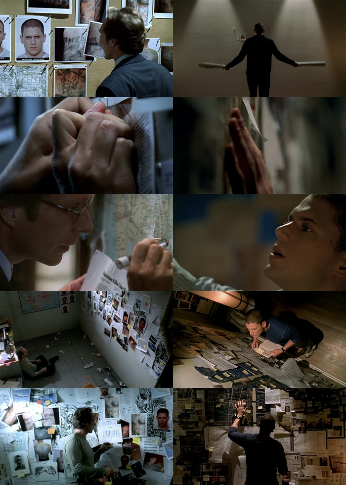
I was sad when I had to change the blues in Mahone's last picture to yellow, because the blue version was really gorgeous and my inspiration for all the other blues in the picspam. Although I don't actually hate the yellow version, I still think a (slightly edited/lightened/cleaned up) version of the original blue version is better. The lighting, framing, everything in that shot was just gorgeous <333
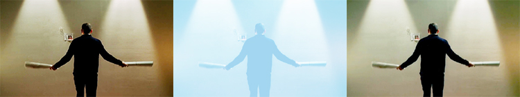
Now for the technical bits. Back when I first started making icons, I used either PaintShopPro or some trial/light version of Photoshop, and it didn't have anything like selective colouring. So I got used to editing/colouring using colour fill layers set to soft light. Even now, with a version of Photoshop that has selective colour, I've never gotten around to really trying it out. The only problem with that, is that it tends to bring out the shadows and increase contrast, even if you use white/a light colour. And of course, lightening an image by duplicating the base and setting it to screen won't have any effect on already-black areas, and will end up washing out white areas. You can kind of see it in the below picture, which shows 1. the original, 2. with 2 duplicated layers set to screen, and 3. 2 duplicated screen layers and a medium blue colour fill set to soft light. For the blue, I chose one that was similar in tone to the blues in the final version of this picture. A lighter blue wouldn't have changed the colours much, and a darker blue would've made it even darker.

So, what to do? One thing that I find myself doing is to set a gradient map with the colour(s) I want (for dark images, I usually use white as the highlight), set it to screen on top of the base, then copy merged, paste the result as a new layer set to soft light or screen, and then delete the gradient map. Sounds complicated, but hopefully the image below will help. You can see the results in the following image: 1. screencap with minor edits (screen layers, sharpen, curves), 2. the gradient map layer set to screen over the base, 3. the gradient map and base merged, then the whole thing copied and pasted over the base, and set to soft light, and the gradient map layer deleted. You can see that the colour has changed, and it's noticeably lighter in even the dark parts (see: highlight on Michael's right shoulder in the third that wasn't there in the first). So a layer like this can help to bring brightness back to the image that was lost when using just colour fill set to soft light.
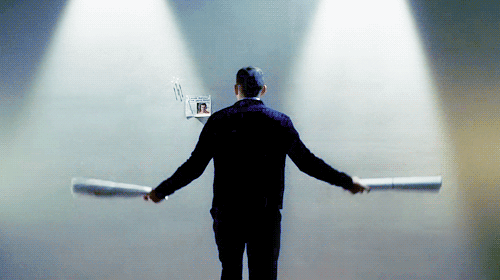
With my more complex edits, at the very end, I also like to take the slightly edited base image (screen layer(s), sharpen, curves), paste it as a new layer, and set it to a low opacity on maybe colour/screen/normal. It might seem like a waste to do all that colour editing, then paste the original back over top, but if I play around with an image too much, I feel that things get kind of... muddy. I can always delete/mask areas that change the colour back to the original too much. With low-quality screencaps and lots of empty space, I also like to copy the final image and do a gaussian blur to get rid of the pixellated bits, then delete/mask the areas I want to stay sharp. You can kind of see this in the gif below, but saving as a gif made everything a little pixellated anyways. For this cap, I kept the wall blurred, and deleted/masked Michael, the papers, and the lines where the lights were shining. You can see that gaussian blur sometimes has a nice effect on the colours too!
And that's another thing that I see get missed a lot in editing tutorials. I don't treat editing screencaps for icons/graphics/picspams any differently than I treat editing my computer-drawn art after colouring (line art on the other hand,would be treated differently). So I don't hesitate to get in there, erasing/masking bits of fill layers or gradient layers if they make parts of an image too dark/too saturated/too whatever because I can delete those parts. I also don't hesitate to draw things when doing edits, like extend some hair that was cut out of frame, or cover up a logo.
Soooo.... that ended up being less of a fun behind-the-picspam thing and more of a tutorial-type thing. Oh well, I hope it can be useful to somebody even though nobody asked for it.
Despite the use of porn in the subject line, this is completely SFW btw.
About the picspam itself: I know, there are a lot more obvious moments I could've chosen for a Michael/Mahone wall!porn picspam, like the montage with overlapping footage of Michael and Mahone as they lovingly caress The Wall, or just about every other scene with them in Sona. But I figure I'll need to keep some things for part 2! ;)
Also, I felt that I wanted this one to be more of a showcase of how similar they are, in terms of mindset, working habits, obsessiveness, etc., instead of something outright slashy.
I didn't originally intend to do the alternating yellow/blue colour scheme, but after I picked out the caps (which took a lot longer than I would've liked. Damn the lack of quality screencaps! I do appreciate Prison Break Caps, but I would LOVE this level of quality of screencaps for the whole series. Or at least S1-3, I don't really need 4 LBH), but yes, after I picked out the caps and laid them out, it was obvious that I would need to do some drastic colour editing because the colours and shades were really unbalanced.
I like how it turned out now though, because with the alternating, you get this sense that Michael and Alex are interchangeable, two sides of the same coin. I'm surprised that I was able to get as many matching screencaps for the two of them as I did, although the first one isn't quite mirroring, but it's where everything started: just a picture on a wall led them to such obsessive depths.
About the colours and editing: When I started this picspam I thought: picspams, simple, right? Not so much. At least not when you have screencaps that look like this:
I didn't realize how dark the show interior scenes were until I started making icons with them, and then working with Michael's flashback scenes from 1x16 was just the worst. All of Michael's caps were from 1x16, and you can see in the original version that his side was just way too dark and heavy. I also didn't realize how warm Michael's apartment looked. I know it was in flashback, and flashbacks are usually kind of sepia-toned, but the lighting in those caps are really freaking warm. Considering how... cold Michael pre-S1 was supposed to have been, I was quite surprised.
I was sad when I had to change the blues in Mahone's last picture to yellow, because the blue version was really gorgeous and my inspiration for all the other blues in the picspam. Although I don't actually hate the yellow version, I still think a (slightly edited/lightened/cleaned up) version of the original blue version is better. The lighting, framing, everything in that shot was just gorgeous <333
Now for the technical bits. Back when I first started making icons, I used either PaintShopPro or some trial/light version of Photoshop, and it didn't have anything like selective colouring. So I got used to editing/colouring using colour fill layers set to soft light. Even now, with a version of Photoshop that has selective colour, I've never gotten around to really trying it out. The only problem with that, is that it tends to bring out the shadows and increase contrast, even if you use white/a light colour. And of course, lightening an image by duplicating the base and setting it to screen won't have any effect on already-black areas, and will end up washing out white areas. You can kind of see it in the below picture, which shows 1. the original, 2. with 2 duplicated layers set to screen, and 3. 2 duplicated screen layers and a medium blue colour fill set to soft light. For the blue, I chose one that was similar in tone to the blues in the final version of this picture. A lighter blue wouldn't have changed the colours much, and a darker blue would've made it even darker.
So, what to do? One thing that I find myself doing is to set a gradient map with the colour(s) I want (for dark images, I usually use white as the highlight), set it to screen on top of the base, then copy merged, paste the result as a new layer set to soft light or screen, and then delete the gradient map. Sounds complicated, but hopefully the image below will help. You can see the results in the following image: 1. screencap with minor edits (screen layers, sharpen, curves), 2. the gradient map layer set to screen over the base, 3. the gradient map and base merged, then the whole thing copied and pasted over the base, and set to soft light, and the gradient map layer deleted. You can see that the colour has changed, and it's noticeably lighter in even the dark parts (see: highlight on Michael's right shoulder in the third that wasn't there in the first). So a layer like this can help to bring brightness back to the image that was lost when using just colour fill set to soft light.
With my more complex edits, at the very end, I also like to take the slightly edited base image (screen layer(s), sharpen, curves), paste it as a new layer, and set it to a low opacity on maybe colour/screen/normal. It might seem like a waste to do all that colour editing, then paste the original back over top, but if I play around with an image too much, I feel that things get kind of... muddy. I can always delete/mask areas that change the colour back to the original too much. With low-quality screencaps and lots of empty space, I also like to copy the final image and do a gaussian blur to get rid of the pixellated bits, then delete/mask the areas I want to stay sharp. You can kind of see this in the gif below, but saving as a gif made everything a little pixellated anyways. For this cap, I kept the wall blurred, and deleted/masked Michael, the papers, and the lines where the lights were shining. You can see that gaussian blur sometimes has a nice effect on the colours too!
And that's another thing that I see get missed a lot in editing tutorials. I don't treat editing screencaps for icons/graphics/picspams any differently than I treat editing my computer-drawn art after colouring (line art on the other hand,would be treated differently). So I don't hesitate to get in there, erasing/masking bits of fill layers or gradient layers if they make parts of an image too dark/too saturated/too whatever because I can delete those parts. I also don't hesitate to draw things when doing edits, like extend some hair that was cut out of frame, or cover up a logo.
Soooo.... that ended up being less of a fun behind-the-picspam thing and more of a tutorial-type thing. Oh well, I hope it can be useful to somebody even though nobody asked for it.