Paine Tutorial
Tutorial Time!
Program used: Corel Paint Shop Pro Photo XI
Happy Halloween!
From ordinary to extraordinary!


First, we start with a simple base. The original image I used to create this tutorial was this one from SHATTERHEART. I resized and cropped it to get
. Now, this is a base with a touch of sharpening and softening of the pixely areas, especially the face.
I went ahead and created several other bases for you to use, they are located up top. These bases were also resized and cropped from their original images. I chose these bases because they were compatible with this tutorial and worked with the coloring. Plus, these required no extra steps(besides relocating some scratch marks from a certain texture). I could have cropped them differently, but that would require me and you to make a few changes in the tutorial, which you may freely do, but I didn't want to make a separate tutorial for each of these bases...
This tutorial rides greatly on a high saturation level! Will vary with images used.
Let's begin, shall we?
Picked a base? Okay! Let's get started. First thing we need to is create a new adjustment layer. So go to Layers --> New Adjustment Layer --> Hue/Saturation/Lightness and set the (master) Saturation option to...yes, 60 and click OK. You will get this:

She was a paled out beast, no? LOL. Moving on, time to create a Color Balance layer. Go to Layer --> New Adjustment Layer --> Color Balance. Here are the numbers you need:
Midtones Color Levels: 32, 17, 18
Shadows Color Levels: 0, 8, 5
Highlights Color Levels: 21, 14, -11
Leave the Preserve Luminance option checked and click OK. You will get this:

Now you are going to duplicate the Color Balance layer and set it to Screen at 50 percent opacity. You will get this:

Time to create a Channel Mixer layer. Go to Layer --> New Adjustment Layer --> Channel Mixer. Make sure the Monochrome box is unchecked. Enter in these sets of numbers:
Output channel: Red
Red (%) = 114
Green (%) = -1
Blue (%) = -35
Output channel: Green
Red (%) = 6
Green (%) = 103
Blue (%) = 0
Output channel: Blue
Red (%) = 8
Green (%) = -3
Blue (%) = 107
After you entered in those numbers, click the tab labeled General and switch the blend mode from Normal to Lighten and click OK. You will get this:

Almost done... sort of! Just a couple more steps. We will now be creating a Levels layer...ooh! Levels layer, sounds nice. LOL. Anyway, go to Layer --> New Adjustment Layer --> Levels. Enter in these sets of numbers:
- Channel: RGB AND Red = Do not change any of the numbers. They both should already read: 0, 128, 255
- Channel: Green = 0, 125, 255
- Channel: Blue = 0, 124, 255
After you entered those numbers in, click the tab labeled General and switch the blend mode from Normal to Soft Light and click OK. You will get this:

Now it's time to use a texture. I decided to go with
by innocent_lexys. Find the entire set here. I located it slightly to the bottom-right so that the texture wouldn't take over Paine's face. I also blurred the texture after relocating it. Go to Adjust --> Blur --> Blur More(twice). I then set the texture to Lighten with 83 opacity. You can use a different texture from that set or not blur the one I used or even relocated it on the icon, be creative! Anyway, once you are done messing around with that texture, if you followed my guideline, you will get something like this:

Time to add another texture. I went with a scratchy-type. I used
by piemin.Find the entire set here. Just slap that baby on and set it to Lighten and you're done with that texture. The texture should appear like so:

Moving on to the FINAL step! (OMG) ...Ahem, time for another texture. I used
which is from the same set as the previous texture by piemin. I rotated this texture to the right two times. I set this texture to Screen. Hm, all looks good, but I don't particularly like the lines going through her face, so I erased a bit of the texture all up in her face space (Haha, I rhymed...) ((If you used a different base, this might require you to erase in several different areas)). I've said this before, you could've used another texture from the set or just used more of them, it's all up to you!
Merge everything together. Go to Layer --> Merge --> Merge All (Flatten). Any little pixely places, soften them, other than that... Save the fabulous icon and you are done my friend! This is what you get:

I created this tutorial for kotono for this icon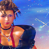
from a previous icon post of mine. Unfortunately, I made the original icon (there was a version before the final product) a long time ago and I was clueless to how I put it together! So, I tried to come up with something similar. I know this tutorial icon is slightly brighter than the icon wanting a tutorial of, so what you can do, is take out the Channel Mixer layer. You get a slightly darker icon:

Take out, put in, mix and match layers, use different textures! Make the icon your own from my tutorial. Not all images will work with this tutorial, but many will. Also, the heavy Saturation I use in my tutorial can make the difference when using for other icons. So if the image is causing your eyes to bleed, lower the saturation level some.
Well, I hope you enjoyed my first ever tutorial! Any questions, problems, comments can be made here! I hope I explained everything correctly...


Program used: Corel Paint Shop Pro Photo XI
Happy Halloween!
From ordinary to extraordinary!
First, we start with a simple base. The original image I used to create this tutorial was this one from SHATTERHEART. I resized and cropped it to get
. Now, this is a base with a touch of sharpening and softening of the pixely areas, especially the face.
I went ahead and created several other bases for you to use, they are located up top. These bases were also resized and cropped from their original images. I chose these bases because they were compatible with this tutorial and worked with the coloring. Plus, these required no extra steps(besides relocating some scratch marks from a certain texture). I could have cropped them differently, but that would require me and you to make a few changes in the tutorial, which you may freely do, but I didn't want to make a separate tutorial for each of these bases...
This tutorial rides greatly on a high saturation level! Will vary with images used.
Let's begin, shall we?
Picked a base? Okay! Let's get started. First thing we need to is create a new adjustment layer. So go to Layers --> New Adjustment Layer --> Hue/Saturation/Lightness and set the (master) Saturation option to...yes, 60 and click OK. You will get this:
She was a paled out beast, no? LOL. Moving on, time to create a Color Balance layer. Go to Layer --> New Adjustment Layer --> Color Balance. Here are the numbers you need:
Midtones Color Levels: 32, 17, 18
Shadows Color Levels: 0, 8, 5
Highlights Color Levels: 21, 14, -11
Leave the Preserve Luminance option checked and click OK. You will get this:
Now you are going to duplicate the Color Balance layer and set it to Screen at 50 percent opacity. You will get this:
Time to create a Channel Mixer layer. Go to Layer --> New Adjustment Layer --> Channel Mixer. Make sure the Monochrome box is unchecked. Enter in these sets of numbers:
Output channel: Red
Red (%) = 114
Green (%) = -1
Blue (%) = -35
Output channel: Green
Red (%) = 6
Green (%) = 103
Blue (%) = 0
Output channel: Blue
Red (%) = 8
Green (%) = -3
Blue (%) = 107
After you entered in those numbers, click the tab labeled General and switch the blend mode from Normal to Lighten and click OK. You will get this:
Almost done... sort of! Just a couple more steps. We will now be creating a Levels layer...ooh! Levels layer, sounds nice. LOL. Anyway, go to Layer --> New Adjustment Layer --> Levels. Enter in these sets of numbers:
- Channel: RGB AND Red = Do not change any of the numbers. They both should already read: 0, 128, 255
- Channel: Green = 0, 125, 255
- Channel: Blue = 0, 124, 255
After you entered those numbers in, click the tab labeled General and switch the blend mode from Normal to Soft Light and click OK. You will get this:
Now it's time to use a texture. I decided to go with
by innocent_lexys. Find the entire set here. I located it slightly to the bottom-right so that the texture wouldn't take over Paine's face. I also blurred the texture after relocating it. Go to Adjust --> Blur --> Blur More(twice). I then set the texture to Lighten with 83 opacity. You can use a different texture from that set or not blur the one I used or even relocated it on the icon, be creative! Anyway, once you are done messing around with that texture, if you followed my guideline, you will get something like this:
Time to add another texture. I went with a scratchy-type. I used
by piemin.Find the entire set here. Just slap that baby on and set it to Lighten and you're done with that texture. The texture should appear like so:
Moving on to the FINAL step! (OMG) ...Ahem, time for another texture. I used
which is from the same set as the previous texture by piemin. I rotated this texture to the right two times. I set this texture to Screen. Hm, all looks good, but I don't particularly like the lines going through her face, so I erased a bit of the texture all up in her face space (Haha, I rhymed...) ((If you used a different base, this might require you to erase in several different areas)). I've said this before, you could've used another texture from the set or just used more of them, it's all up to you!
Merge everything together. Go to Layer --> Merge --> Merge All (Flatten). Any little pixely places, soften them, other than that... Save the fabulous icon and you are done my friend! This is what you get:
I created this tutorial for kotono for this icon
from a previous icon post of mine. Unfortunately, I made the original icon (there was a version before the final product) a long time ago and I was clueless to how I put it together! So, I tried to come up with something similar. I know this tutorial icon is slightly brighter than the icon wanting a tutorial of, so what you can do, is take out the Channel Mixer layer. You get a slightly darker icon:
Take out, put in, mix and match layers, use different textures! Make the icon your own from my tutorial. Not all images will work with this tutorial, but many will. Also, the heavy Saturation I use in my tutorial can make the difference when using for other icons. So if the image is causing your eyes to bleed, lower the saturation level some.
Well, I hope you enjoyed my first ever tutorial! Any questions, problems, comments can be made here! I hope I explained everything correctly...