Round Four - Challenge Seven - Results
Wonderful voting turnout you guys, thank you!
I'm sorry we have to say goodbye to another wonderful participant. Hope to see you back in the next round :D
Eliminated:
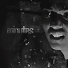
by rebecca_bougan with -7
People's Choice:
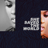
by catharsis_o_s with +4
Mod's Choice:
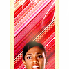
by aberrantcliche
I love the bright color texture background used with this cap choice. I don't know, it's quite unique and works so well for my taste. Lovely.
Voting Breakdown
1
- The text placement seems out of place.
2
+ (no comment)
+ I like the crop and the colouring.
3
- The colouring seems a little too orange/oversaturated and also slightly flat (perhaps some added contrast would have made them 'pop' more?)
- The icon looks a bit blurry and the colouring is too orange.
- icon looks bit blurry and the blacks seem bit faded, it could use more contrast
- the colouring is too blue
- The icon is oversaturated.
4
+ Great use of double image.
+ As most of the people in this round used the same screencap it was nice to see this very unique crop of it!
+ I like the text style and placement, it's a different style.
+ Fantastic fresh colouring and great composition.
5
- Image does not go well with texture.
- Nice colouring on Martha but the crop is awkward.
- The crop on her face is awkward, as it cuts through her mouth.
+ Wonderful composition. The texture use is great and the image is very well blended.
+ very colourful and creative
7
- Too dark, not enough contrast, text is hard to read.
- The icon is too dark/overcontrasted
- A nice crop but the black and white makes it difficult to see Martha and the fun(font?) isn't easily readable.
- A difficult picture to make a good quality icon out of, which I think has tripped this icon up as it makes the image difficult to see and the text isn't clear.
- The icon could use a bit more contrast.
- icon looks too dark
- very grainy and hard to see
(If your number is not listed, then you didn't receive any comments.)
Next challenge should be up...soon, I think.
I'm sorry we have to say goodbye to another wonderful participant. Hope to see you back in the next round :D
Eliminated:

by rebecca_bougan with -7
People's Choice:

by catharsis_o_s with +4
Mod's Choice:

by aberrantcliche
I love the bright color texture background used with this cap choice. I don't know, it's quite unique and works so well for my taste. Lovely.
Voting Breakdown
1
- The text placement seems out of place.
2
+ (no comment)
+ I like the crop and the colouring.
3
- The colouring seems a little too orange/oversaturated and also slightly flat (perhaps some added contrast would have made them 'pop' more?)
- The icon looks a bit blurry and the colouring is too orange.
- icon looks bit blurry and the blacks seem bit faded, it could use more contrast
- the colouring is too blue
- The icon is oversaturated.
4
+ Great use of double image.
+ As most of the people in this round used the same screencap it was nice to see this very unique crop of it!
+ I like the text style and placement, it's a different style.
+ Fantastic fresh colouring and great composition.
5
- Image does not go well with texture.
- Nice colouring on Martha but the crop is awkward.
- The crop on her face is awkward, as it cuts through her mouth.
+ Wonderful composition. The texture use is great and the image is very well blended.
+ very colourful and creative
7
- Too dark, not enough contrast, text is hard to read.
- The icon is too dark/overcontrasted
- A nice crop but the black and white makes it difficult to see Martha and the fun(font?) isn't easily readable.
- A difficult picture to make a good quality icon out of, which I think has tripped this icon up as it makes the image difficult to see and the text isn't clear.
- The icon could use a bit more contrast.
- icon looks too dark
- very grainy and hard to see
(If your number is not listed, then you didn't receive any comments.)
Next challenge should be up...soon, I think.