challenge 1; round 5: results
Unfortunately we must say by to the following this week:
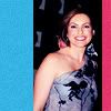
by ex0h with -2 votes
VOTER'S CHOICE:
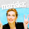
by heyjersey with +1 votes
MOD'S CHOICE:
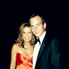
by i-gota-rock
The simplicity of it was nice, good coloring and crop.
VOTING TALLY
02; + - - = -1
03; + - - = -1
04; - - = -2 >> ELIMINATED
05; + = +1 >> VOTER'S CHOICE
COMMENTS
2:
- A little too sharpened, the dot brush doesn't really work.
- The "orb" textures plus the text, coupled with the close-up style of cropping of Mariska overcrowd the icon
+ the colouring is simple and elegant
3:
- it's too sharp, it's hard to see the facial features unlike the other icons
- The man in the icon takes up more room than Mariska. Also, Mariska seems over-sharpened.
+ Simple, elegant and nice use of cropping. Your eye is really drawn to Mariska
4:
- the brightness of the colours on each side of mariska are too distracting, the eye is drawn away from mariska when it should be the other way around.
- The colors don't really match with her dress and are distracting from the picture of Mariska
5:
+ Good cropping, the font works well with the picture, and I love that the font is on an angle
If you have any questions, feel free to ask.

by ex0h with -2 votes
VOTER'S CHOICE:

by heyjersey with +1 votes
MOD'S CHOICE:
by i-gota-rock
The simplicity of it was nice, good coloring and crop.
VOTING TALLY
02; + - - = -1
03; + - - = -1
04; - - = -2 >> ELIMINATED
05; + = +1 >> VOTER'S CHOICE
COMMENTS
2:
- A little too sharpened, the dot brush doesn't really work.
- The "orb" textures plus the text, coupled with the close-up style of cropping of Mariska overcrowd the icon
+ the colouring is simple and elegant
3:
- it's too sharp, it's hard to see the facial features unlike the other icons
- The man in the icon takes up more room than Mariska. Also, Mariska seems over-sharpened.
+ Simple, elegant and nice use of cropping. Your eye is really drawn to Mariska
4:
- the brightness of the colours on each side of mariska are too distracting, the eye is drawn away from mariska when it should be the other way around.
- The colors don't really match with her dress and are distracting from the picture of Mariska
5:
+ Good cropping, the font works well with the picture, and I love that the font is on an angle
If you have any questions, feel free to ask.