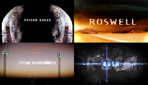
pretty credits picspam
'Pretty Opening Credits' Picspam
The wonderful opening credits of four television shows.
Prison Break | FOX | 2005-2009
credits shown are the season one credits | watch online at dailymotion here
credits designed by Picture Mill
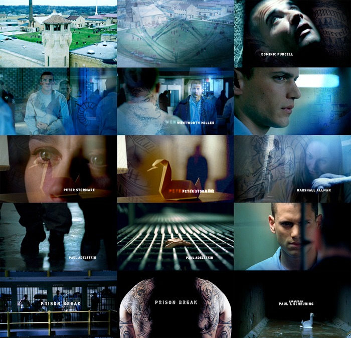
+ The layering of the blueprints and tattoo images over the shots is really pretty. Adds a really nice touch and i don't think the credits
would be as effective without it.
+ Love how the music is fast, but a lot of the shots of the credits are in slow motion. It creates a nice juxtaposition which actually works
really well. You get a sense of building up speed, despite the slow shots. It's interesting. The shots become quicker and not
in slow motion as the credits continue and they build to the end shots which are much faster.
+ I like how the title 'Prison Break' appears over two shots. So that it can appear for a reasonable time, I am guessing, but not be boring
by remaining on one shot for too long, as well as keep with the fast speed of the shots which has been built up to by the end.
+ Love the ending shot with the little paper crane floating down the drain. It's so cute and so appropriate and a lovely way to finish the credits
with the little appearance by the crane floating by.
Roswell | The WB and UPN | 1999-2002
credits shown are the season two credits | watch online at youtube here
credits designed by yU+Co.
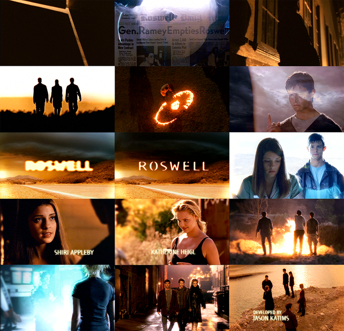
+ The beginning of the credits is so eerie yet beautiful, with the pods, newspaper clippings and silhouettes, accompanied
by the lovely - yet almost foreboding - piano notes of 'Here With Me'.
+ Beautiful use of colour, with the strong blue and yellow.
+ Uses matching character shots to go with each actor's name. However, there are random other shots in between each few names,
which allows for a a nice mix and breaks up the individual character shots.
+ Timed beautifully, such as with the 'but I...' lyric soaring as the text of the title glows and comes into focus.
Friday Night Lights | NBC and DirecTV | 2006-
credits shown are the season one credits | watch online at vbox7 here
designer of credits unknown
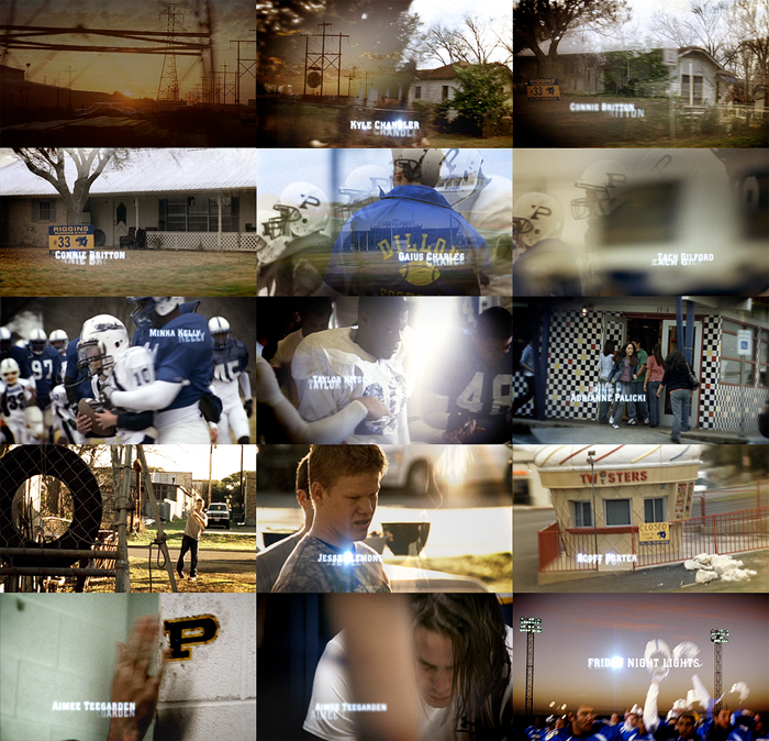
+ The focus on the places and landscapes is wonderful. Really helps to paint a picture of Dillon and give insight into life there.
+ The somewhat limited use of character shots is interesting. There are some, definitely, but it's not totally made up of them. There are lots
shots of the places and landscape as I said, and some of football where you can't really see faces. Also, a lot of the shots of the characters
are subtle, eg. backs and faces looking down. It's nice and makes for less obvious credits, plus I give them points for managing to resist the
urge to fill the credits with pretty shots of Riggins.
+ The layering of the images as they slowly dissolve into each other is just stunning, such as shown in the second and third images.
+ How can you not love credits that feature a giant ice-cream cone?
Rush | Network Ten Australia | 2008-
credits shown are the season one credits | watch online at youtube here
credits designed by Complete Post
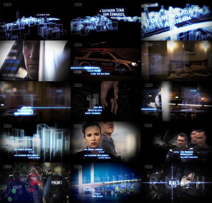
+ Fresh and modern without trying too hard to be that way.
+ The 3D line rendering of the buildings is really effective. Especially cool is how, in parts, the buildings rise up and the camera
angle shifts, rising up and tilting down.
+The transitions from one image to another are really cool, with backgrounds disappearing but the foreground/subject carrying on,
remaining over the next image.
+ The blue line is nice, giving a sense of speed and direction as it rapidly reveals the names.
x Deliberately not coloured in Photoshop. All that was done was a slight increase of the brightness/contrast. The pretty colours are exactly what you see when watching!
x Comments appreciated!