Ask the maker filled request 5 of ?
This is a general post on my favorite textures, requested by novindalf.
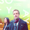
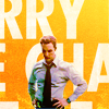
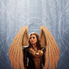
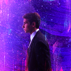
First though, is the textures I used on this icon also requested by novindalf.
[here]
It's been forever since I made this icon so I can't find where I got these textures from, I think I've deleted them. So if anyone knows, leave a comment and I'll update the post!
This first one is just an ocean texture, so I went looking for a similar one and found this (through google images),

I had the original set to multiply on 67%, this should work the same/similar especially if you put a blue exclusion layer over top of the texture on a lower opacity for the 'vintage-y' effect.
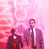
The next one is a ornate frame. I don't have the specific one but I did find one pretty similar,

I had it set to Screen with it cut out from around Cora.
The rest of the psd was color and adjustment layers!
**I don't have all the names to these so if you see yours or know who made one, please let me know and I'll credit!
I have a stupid amount of textures. I hoard them and fonts. I have hundreds that I have not used once...yet. I have been trying lately to actually use what I have already without searching for more and clean out the ones I hate/look boring. It seems to be working! :P I'm going to share my favorites and for some of them, I'll give a general description and examples on how/where I use them. These aren't all my favorites, there's just too many so I went with the ones I remember using more than once.
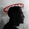
Textures like these are great for adding an extra 'something' that I feel is missing in the background, I guess you'd call them 'technical'? idk :P


lookslikerain 1-4. 5-7 by fauxism
examples (which are..all...green??);


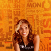
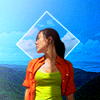
I love typography and so while I do try to make my own text it usually just doesn't work, so I go to some trusty font textures when I need something type related. 99% of icons of mine with text are typically using a text texture. These are some of my favorites to use,


juanxyo x2 - adriftingsea - dontayyy (deviantart or tumblr)


1-4 planets-bend-between-us (tumblr or deviantart)


brutal - accio-glow @ deviantart
examples;


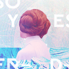

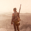
Stock textures are my liiife I think I used at least 1 in almost every single negative space/far crop icon in the past year. I like to use landscape pictures the most to either keep as the main background focus or as a building point. I have a lot of these so I'll just post the ones I use the most.


arctic_stock x2 - cemacstock - lucieg_stock (all deviantart)
I don't have any set layer setting for stock textures I use practically all of them. So play around and see what happens!
Other stock textures I use often,


sweettasteofbitter ? - unknown maker - amka stock (deviantart) - jantiff stocks (deviantart
examples;


Paint and grunge textures are great for adding in a little 'something' when you can't figure out what else to use without overwhelming an icon. I use these on many different layer settings and most frequently used are, Screen, Overlay, Subtract, Vivid Light and Divide. The color ones I'll change to black and white sometimes too if I don't need that color and/or just want the texture it has.


midnight_road - lookslikerain x3


tinebrella - lookslikerain x3


lookslikerain x2 - rebel x2
examples;


I think that's it...let me know if you have any questions!
First though, is the textures I used on this icon also requested by novindalf.
[here]
It's been forever since I made this icon so I can't find where I got these textures from, I think I've deleted them. So if anyone knows, leave a comment and I'll update the post!
This first one is just an ocean texture, so I went looking for a similar one and found this (through google images),

I had the original set to multiply on 67%, this should work the same/similar especially if you put a blue exclusion layer over top of the texture on a lower opacity for the 'vintage-y' effect.
The next one is a ornate frame. I don't have the specific one but I did find one pretty similar,

I had it set to Screen with it cut out from around Cora.
The rest of the psd was color and adjustment layers!
**I don't have all the names to these so if you see yours or know who made one, please let me know and I'll credit!
I have a stupid amount of textures. I hoard them and fonts. I have hundreds that I have not used once...yet. I have been trying lately to actually use what I have already without searching for more and clean out the ones I hate/look boring. It seems to be working! :P I'm going to share my favorites and for some of them, I'll give a general description and examples on how/where I use them. These aren't all my favorites, there's just too many so I went with the ones I remember using more than once.
Textures like these are great for adding an extra 'something' that I feel is missing in the background, I guess you'd call them 'technical'? idk :P
lookslikerain 1-4. 5-7 by fauxism
examples (which are..all...green??);
I love typography and so while I do try to make my own text it usually just doesn't work, so I go to some trusty font textures when I need something type related. 99% of icons of mine with text are typically using a text texture. These are some of my favorites to use,

juanxyo x2 - adriftingsea - dontayyy (deviantart or tumblr)


1-4 planets-bend-between-us (tumblr or deviantart)

brutal - accio-glow @ deviantart
examples;
Stock textures are my liiife I think I used at least 1 in almost every single negative space/far crop icon in the past year. I like to use landscape pictures the most to either keep as the main background focus or as a building point. I have a lot of these so I'll just post the ones I use the most.


arctic_stock x2 - cemacstock - lucieg_stock (all deviantart)
I don't have any set layer setting for stock textures I use practically all of them. So play around and see what happens!
Other stock textures I use often,


sweettasteofbitter ? - unknown maker - amka stock (deviantart) - jantiff stocks (deviantart
examples;
Paint and grunge textures are great for adding in a little 'something' when you can't figure out what else to use without overwhelming an icon. I use these on many different layer settings and most frequently used are, Screen, Overlay, Subtract, Vivid Light and Divide. The color ones I'll change to black and white sometimes too if I don't need that color and/or just want the texture it has.
midnight_road - lookslikerain x3
tinebrella - lookslikerain x3
lookslikerain x2 - rebel x2
examples;
I think that's it...let me know if you have any questions!