15
guys, you guys! I finished my 20inspirations claim and god was it a struggle near the end! I don't know what it was, whether my muse just decided to walk away or whether it were the many indoor scenes I had to work with or the same face over and over, IDK, but I am done. PHEW. the theme was down the rabbit hole, we were supposed to do something crazy, out of the box like. now, some of these don't feel out of the box at all, others are way over the top. idk, I feel a bit weird about these, but I'm glad I worked on them until the very last minute :3 my claim was sherlock holmes from the bbc series.
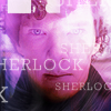
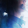
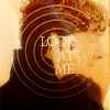
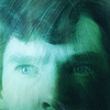

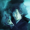

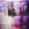
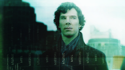
1 | photo | first of all, I tried to go for dark icons a lot in this batch (didn't always work out, as you can see) as it's not something I usually do. I always wanna go bright and colourful. idk whether you can see where my inspiration came from, if you look at the photo,
but it's the ~hair and especially the waves in the last one, which is why I implemented this wavy texture on top of it (I fell in love with that one. srsly.)
2 | photo & word: duplicate | not much to say about this one. it's sort of the little brother to my default movie!sherlock :3
3 | photo | again, a dark icon. I also tried to do some proper blending. I usually go for blocking because I'm lazy, because blending is a much bigger struggle for me. finding the right caps and a colouring that fits them both etc etc IT'S DIFFICULT OK?!
so, I took the plunge this time. I still feel like there's something missing though.
4 | graphic | sooo~ proud about this one! I just dig monochrome colouring lately and I upped the orange a lot more than I'd usually dare + I actually picked a texture that is not supposed to change the light or depth of the icon, but just adds some symbolism to it.
5 | word: duplicate | boring icon is boring.
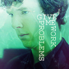
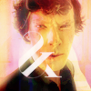
6 | graphic | another somewhat darker icon. I tried not to go for my usual shade of green and tried to copy the one in the LOST graphic posted in the inspiration post + I added some weird looking text.
7 | word: experimental | AHAHA. I made this after I read kawaii_chicken's paint tutorial. the result is undoubtedly strange, but it fits the theme, I suppose. sherlock looks like the joker here.
8 | texture | and again, another unusually dark icon from me. I really like how this turned out, though!
9 | word: multicolored | another outdoor scene made dark. not my style at all! and I went a little vibrance-happy. I remember I liked the hint of purple on his skin there, while the rest of the icon is mainly blue.
10 | word: bizzare | I avoid night scenes like the plague and when I picked the cap I thought I was doomed, but hey! I think this is actually one of my top 5 of the batch. I like the grungy feel to it.
11 | word: fade | just another dark icon, I don't have anything else to say here :c
12 | word: multicolored | ugh, this icon could have been so much more. I love the sharpness of it, but the yellow spots on each side of the icon don't wanna harmonize. IDK WHY, I tried to fix it for a long time, but ngh it just got worse, so I left it at that.
13 | icon | shamelessly inspired by one of the icons provided.
14 | word: conflicting | I CHEATED OK?! there was just so much sherlocksherlocksherlock, I had to icon a different face just for once, and I mean, sherlock is still in there, so it counts y/y? again, weird blending stuff and text I normally wouldn't do.
15 | word: crazy | what is this? I must have been on a LSD trip I have no recollection of.

16 | word: intense | that scene. let me get this straight, I still find benedict's face absolutely weird and a little off-putting, but that scene was the hottest thing I've seen on tv in a long time, ngl. I went for some pale lighting and obscurring crop to distract from the fact that I used a centre crop AGAIN.
17 | texture pack | another attempt using kawaii_chicken's tutorial without creating the joker all over again + I liked that painty look of the textures. also one of my top 5!
18 | word: duplicate | some good old blocking with a brownish colouring I'm usually rarely going for.
19 | word: experimental | I think this is my #1. I'm not sure people will see what I was trying to do, so I'll just write it down here: the texture over sherlock's head is the skull of a lioness (or something); it's supposed to create a connection to the episode the cap is from (the hounds of baskerville).
I didn't have a dog texture at hand, so I used this one (as it's more frightening / beast-like anyway), and idk I just dig the idea.
20 | word: off-colour | I'm ending the batch on another dark icon to make you think I actually had a plan, lol. IT'S A TRAP.
alts
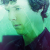

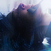
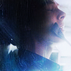
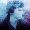
comments: ♥, credit: fouroux @ maisonjaune
my icons/graphics are no bases, please do not alter them.
no stealing, no reposting at fanpop.


1 | photo | first of all, I tried to go for dark icons a lot in this batch (didn't always work out, as you can see) as it's not something I usually do. I always wanna go bright and colourful. idk whether you can see where my inspiration came from, if you look at the photo,
but it's the ~hair and especially the waves in the last one, which is why I implemented this wavy texture on top of it (I fell in love with that one. srsly.)
2 | photo & word: duplicate | not much to say about this one. it's sort of the little brother to my default movie!sherlock :3
3 | photo | again, a dark icon. I also tried to do some proper blending. I usually go for blocking because I'm lazy, because blending is a much bigger struggle for me. finding the right caps and a colouring that fits them both etc etc IT'S DIFFICULT OK?!
so, I took the plunge this time. I still feel like there's something missing though.
4 | graphic | sooo~ proud about this one! I just dig monochrome colouring lately and I upped the orange a lot more than I'd usually dare + I actually picked a texture that is not supposed to change the light or depth of the icon, but just adds some symbolism to it.
5 | word: duplicate | boring icon is boring.


6 | graphic | another somewhat darker icon. I tried not to go for my usual shade of green and tried to copy the one in the LOST graphic posted in the inspiration post + I added some weird looking text.
7 | word: experimental | AHAHA. I made this after I read kawaii_chicken's paint tutorial. the result is undoubtedly strange, but it fits the theme, I suppose. sherlock looks like the joker here.
8 | texture | and again, another unusually dark icon from me. I really like how this turned out, though!
9 | word: multicolored | another outdoor scene made dark. not my style at all! and I went a little vibrance-happy. I remember I liked the hint of purple on his skin there, while the rest of the icon is mainly blue.
10 | word: bizzare | I avoid night scenes like the plague and when I picked the cap I thought I was doomed, but hey! I think this is actually one of my top 5 of the batch. I like the grungy feel to it.


11 | word: fade | just another dark icon, I don't have anything else to say here :c
12 | word: multicolored | ugh, this icon could have been so much more. I love the sharpness of it, but the yellow spots on each side of the icon don't wanna harmonize. IDK WHY, I tried to fix it for a long time, but ngh it just got worse, so I left it at that.
13 | icon | shamelessly inspired by one of the icons provided.
14 | word: conflicting | I CHEATED OK?! there was just so much sherlocksherlocksherlock, I had to icon a different face just for once, and I mean, sherlock is still in there, so it counts y/y? again, weird blending stuff and text I normally wouldn't do.
15 | word: crazy | what is this? I must have been on a LSD trip I have no recollection of.


16 | word: intense | that scene. let me get this straight, I still find benedict's face absolutely weird and a little off-putting, but that scene was the hottest thing I've seen on tv in a long time, ngl. I went for some pale lighting and obscurring crop to distract from the fact that I used a centre crop AGAIN.
17 | texture pack | another attempt using kawaii_chicken's tutorial without creating the joker all over again + I liked that painty look of the textures. also one of my top 5!
18 | word: duplicate | some good old blocking with a brownish colouring I'm usually rarely going for.
19 | word: experimental | I think this is my #1. I'm not sure people will see what I was trying to do, so I'll just write it down here: the texture over sherlock's head is the skull of a lioness (or something); it's supposed to create a connection to the episode the cap is from (the hounds of baskerville).
I didn't have a dog texture at hand, so I used this one (as it's more frightening / beast-like anyway), and idk I just dig the idea.
20 | word: off-colour | I'm ending the batch on another dark icon to make you think I actually had a plan, lol. IT'S A TRAP.
alts


comments: ♥, credit: fouroux @ maisonjaune
my icons/graphics are no bases, please do not alter them.
no stealing, no reposting at fanpop.