tutorial time
Tutorial requested by gwendalavir
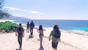
How to go from this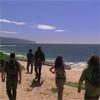
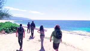
to this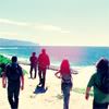
01. Take your base. Don´t crop it yet.
02. Duplicate your base twice and set both to Screen.
03. Select the top layer and go to Image>Adjust>Color Balance. Adjust the following settings:
-Midtones; Cyan-Red -44 / Magenta-Green 0 / Yellow-Blue +100
04. With that same layer selected, go to Image>Adjust>Hue/Saturation and set the saturation to +50

05. Now select the bottom layer, just at the top of your base. Go to Image>Adjust> Brightness/Contrast. Set the Brightness to +30 and set the Contrast to +40
06. New layer. Fill it with #000425 and set it to Exclusion (100%)

07. One more layer. Fill it with #C0E9EB and set it to Color Burn (90-100%)

08. Merge all the layers, duplicate that new base and set it to Soft Light (100%)

09. With your top layer selected, go to Image>Adjust>Hue/Saturation and set the saturation to +60.
10. Now you can see our base is too blue. We can fix that with a new Color Balance Layer, and adjusting the following settings:
-Midtones; Cyan/Red +19 / Magenta-Green +15 / Yellow-Blue -20
11. Merge all the layers.
12. Now it´s time to cropping!
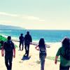
13. I added a brush made by myself and set it to Lighten
>>
And you´re done!
This is a very useful technique but sometimes you will need that last Color Balance Layer in order to add some red/yellow to the icon.
Others icons using the same technique:


I'd love to see what you come up with!
You can find my other tutorial here
---------
-Feel free to friend this community to keep up with the updates
-Do you want to be an affiliate? Click here
How to go from this
to this
01. Take your base. Don´t crop it yet.
02. Duplicate your base twice and set both to Screen.
03. Select the top layer and go to Image>Adjust>Color Balance. Adjust the following settings:
-Midtones; Cyan-Red -44 / Magenta-Green 0 / Yellow-Blue +100
04. With that same layer selected, go to Image>Adjust>Hue/Saturation and set the saturation to +50
05. Now select the bottom layer, just at the top of your base. Go to Image>Adjust> Brightness/Contrast. Set the Brightness to +30 and set the Contrast to +40
06. New layer. Fill it with #000425 and set it to Exclusion (100%)
07. One more layer. Fill it with #C0E9EB and set it to Color Burn (90-100%)
08. Merge all the layers, duplicate that new base and set it to Soft Light (100%)
09. With your top layer selected, go to Image>Adjust>Hue/Saturation and set the saturation to +60.
10. Now you can see our base is too blue. We can fix that with a new Color Balance Layer, and adjusting the following settings:
-Midtones; Cyan/Red +19 / Magenta-Green +15 / Yellow-Blue -20
11. Merge all the layers.
12. Now it´s time to cropping!
13. I added a brush made by myself and set it to Lighten
>>
And you´re done!
This is a very useful technique but sometimes you will need that last Color Balance Layer in order to add some red/yellow to the icon.
Others icons using the same technique:
I'd love to see what you come up with!
You can find my other tutorial here
---------
-Feel free to friend this community to keep up with the updates
-Do you want to be an affiliate? Click here