my second tutorial ever
No one asked for this one, but I though it was pretty.
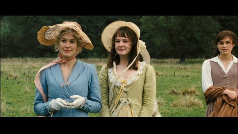
From this to
01. Take your cap (I used this one of Rosamund Pike from Pride & Prejudice from
dragonlady981), crop it and sharpen it. Layer > New Adjustment Layer > Brightness/Contrast - you want each at roughly +25, it really depends on the cap.

02. Here's where it starts to get fun. Layer > New Adjustment Layer > Selective Coloring with these levels:
Reds: -100, 3, 13, 0
Greens: 100, -100, 100, 5
Cyans: 100, 9, 2, 52
Neutrals: 33, -3, 2, -30
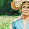
03. That looks a little better, but I wanted a bit more red in her face and I'd like for her scarf to stand out. I also want that pretty dress to pop. Make a new selective color layer with these levels:
Reds: -100, 9, -14, 56
Greens: 100, -45, 100, 0
Cyans: 100, 0, 0, 0
Blues: 100, 0, 0, 0
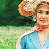
04. We want a little more punch out of that so go to Layers > New Adjustment Layer > Hue/Saturation. Kick up your saturation to 10.

05. Now to soften it up a bit make a new layer, duplicate your base and drag it to the top (you can just as easily merge everything up, but I didn't want my icon to be quite so neon). Filter > Blur > Gaussian Blur with a radius of about 7 px. Set that layer to soft light.
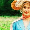
06. It could be done, but I wanted a little more stuff going on. Create a new layer and merge everything up (Alt+Ctrl+Shift+E). I moved it over a little to the left as that's where my subject is, I then took a slice out of this texture from
peoplemachinesand slapped it on the side.
From this to
01. Take your cap (I used this one of Rosamund Pike from Pride & Prejudice from
dragonlady981), crop it and sharpen it. Layer > New Adjustment Layer > Brightness/Contrast - you want each at roughly +25, it really depends on the cap.
02. Here's where it starts to get fun. Layer > New Adjustment Layer > Selective Coloring with these levels:
Reds: -100, 3, 13, 0
Greens: 100, -100, 100, 5
Cyans: 100, 9, 2, 52
Neutrals: 33, -3, 2, -30
03. That looks a little better, but I wanted a bit more red in her face and I'd like for her scarf to stand out. I also want that pretty dress to pop. Make a new selective color layer with these levels:
Reds: -100, 9, -14, 56
Greens: 100, -45, 100, 0
Cyans: 100, 0, 0, 0
Blues: 100, 0, 0, 0
04. We want a little more punch out of that so go to Layers > New Adjustment Layer > Hue/Saturation. Kick up your saturation to 10.
05. Now to soften it up a bit make a new layer, duplicate your base and drag it to the top (you can just as easily merge everything up, but I didn't want my icon to be quite so neon). Filter > Blur > Gaussian Blur with a radius of about 7 px. Set that layer to soft light.
06. It could be done, but I wanted a little more stuff going on. Create a new layer and merge everything up (Alt+Ctrl+Shift+E). I moved it over a little to the left as that's where my subject is, I then took a slice out of this texture from
peoplemachinesand slapped it on the side.