icon tutorial
to
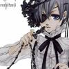
Have an image. You want to make sure main focus of the image is small, since the masks I will be using have a small visible area. You'll see this in a minute. I used this image that I resized. Image is from Minitokyo.

He's cute, right? Now, open a mask. It'd be best if you use the one I am using, at least for this tutorial. I found this mask here.
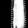
Okay, make a new layer and paste the mask into that layer, making sure it's on top of the base image.
Set the blend mode of the mask to Multiply. Your icon should look like this-
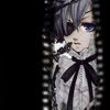
To spice things up, let's use a nice gradient . You can make your own gradient or you can use someone made by someone else. I made my own.
Create a new layer above the mask and put your gradient or color in it. Then set the blending mode of that layer to Overlay. (( Soft Light also works but Overlay has a stronger effect.))
Your icon should now look like this-
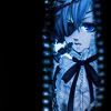
Now it's time to spruce things up with a text brush. I used a brush from here, but you could use anything. Just make sure to put the text brush under the gradient but above the mask. (( I suggest using a brush that takes up a lot of space.))
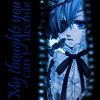
And the final product is--!

It's very simple, and simple looking, but simplicity is elegance. I hope this taught you some good techniques~