huh...
It's irritating, to be involved in icon contest comms. I always feel guilty if I don't vote--even if the icons on offer are some of the shittiest icons ever made. Seriously. If I can't tell what's on your icon? It's not good. It's not pretty. It's just ugly as shit. The addition of tiny tiny text? Not a good fad. Probably one of the most pretentious and obviously stupid fads ever to hit iconing.
But you've all heard me mock it before, I'm sure.
I'm a simple gal, generally. I'd rather go for an icon like this:

Than an icon like this:
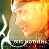
Guess which won a place in a contest?
It's not the clear, easy to see icon. It's the deliberately shitty-looking one with extraneous signage and pointless little graphicy thing in one corner.
That's right, the one that was intentionally awful won an award while the one that actually took longer in artistic time 5 minutes to design, crop, sharpen, etc. didn't. Makes you wonder if people deliberately vote for the awful ones.
eta: The sad thing is, I don't have a .psd for the Stark icon. I think the text is prose from Sam/Kara fic, though.
But you've all heard me mock it before, I'm sure.
I'm a simple gal, generally. I'd rather go for an icon like this:
Than an icon like this:
Guess which won a place in a contest?
It's not the clear, easy to see icon. It's the deliberately shitty-looking one with extraneous signage and pointless little graphicy thing in one corner.
That's right, the one that was intentionally awful won an award while the one that actually took longer in artistic time 5 minutes to design, crop, sharpen, etc. didn't. Makes you wonder if people deliberately vote for the awful ones.
eta: The sad thing is, I don't have a .psd for the Stark icon. I think the text is prose from Sam/Kara fic, though.