tutorial: watchmen
Then I crop the cap to 100px by 100 px.
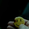
Watchmen caps tend to be dark and this one is very, very dark. You brighten this by duplicating the background layer and setting it to screen, but I found you end up with a ton of these layers. So instead, go to layer > new adjustment layer > levels.
Under RGB, only move the middle and far right triangles toward your left. Moving these arrows to the left will lighten the image. Move them to the right, and you darken it. Here’s my numbers:
Input levels: 0, 1.68, 227
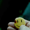
Now our icon is much lighter and we can start colouring.
Go to layer > new adjustment layer > hue/saturation.
Under master, change saturation to 32.
Upping the saturation brings out some of our vivid colours, in this case the yellow of the button.
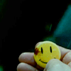
Now it’s time to change our colouring some more. Layer > new adjustment layer > levels. Change the arrows on the red, green, and blue until you get something you like.
Just some background: moving the far left arrow to the right gives more of that particular colour (for ex. red under the red drop down). Moving the other two arrows to the left takes away that colour. I usually move the left arrow to the right a bit, and move the other two arrows to the left until I’m happy with the product. Here’s my numbers:
Red: 18, 1.04, 249
Green: 34, 1.05, 250
Blue: 56, 1.05, 249
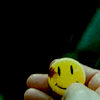
Now layer > new adjustment layer > brightness/contrast. Brightness = -3, contrast = 3. This gives a bit more depth to our icon.

Layer > new fill layer > solid colour. Fill with f89117. Change to Soft Light, opacity 16%. I do these colour layers on all my icons. This adds a bit of yellow/orange.

Layer > new fill layer > solid colour. Fill with 03061e. Change to Exclusion, opacity 100%. I love this layer to death. It can add a bit of grunge to an icon depending on the opacity. The lower the opacity, the less of the grunge you see.

Now go back to your background layer. Right click, Duplicate and drag this layer to the top of your layer list. Set this to Soft Light, opacity 25%. This is another way to get more depth.

Hit Ctrl+Alt+Shift+E. This copies all of the past layers and makes a new one. Set this new layer to Soft Light, 44% opacity. Again, more depth.

Hit Ctrl+Alt+Shift+E again. Now go to filter > sharpen > Unsharp mask. Set the amount to 25% and radius to 2.5 pixels.
I Unsharp mask all my icons. It does wonders, if you set the amounts right. If you up the amount to a ridiculous number, your icon will look ridiculous. I keep the amount between 20% and 30%. I never go beyond 30% just because any more than that doesn’t look natural. If you change the amount to 30%, then change the radius to 3.0 pixels.
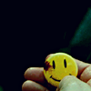
Our icon is still a bit too dark for my liking. Go to layer > new adjustment layer > levels. Under RGB, set the input levels to 0, 1.14, 242. Again, this is just an easier way of lighting up the icon instead of duplicating a ton of layers.

Last step, go to layer > new fill layer > solid colour. Fill with f89117. Set to Exclusion, 15% opacity. I just recently started using this step and I don’t use it all the time. It depends on what look you want to go for. This step gives the icon a grungier look, very fitting for Watchmen icons. You can lower the opacity if it seems like too much. Just play around with it.
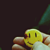
And now you’re done! You’ve got a new Watchmen icon. Yay you!
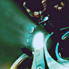
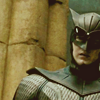
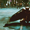
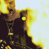
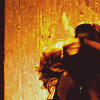
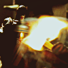
Other examples of icons I've used this technique on:


Watchmen caps tend to be dark and this one is very, very dark. You brighten this by duplicating the background layer and setting it to screen, but I found you end up with a ton of these layers. So instead, go to layer > new adjustment layer > levels.
Under RGB, only move the middle and far right triangles toward your left. Moving these arrows to the left will lighten the image. Move them to the right, and you darken it. Here’s my numbers:
Input levels: 0, 1.68, 227
Now our icon is much lighter and we can start colouring.
Go to layer > new adjustment layer > hue/saturation.
Under master, change saturation to 32.
Upping the saturation brings out some of our vivid colours, in this case the yellow of the button.
Now it’s time to change our colouring some more. Layer > new adjustment layer > levels. Change the arrows on the red, green, and blue until you get something you like.
Just some background: moving the far left arrow to the right gives more of that particular colour (for ex. red under the red drop down). Moving the other two arrows to the left takes away that colour. I usually move the left arrow to the right a bit, and move the other two arrows to the left until I’m happy with the product. Here’s my numbers:
Red: 18, 1.04, 249
Green: 34, 1.05, 250
Blue: 56, 1.05, 249
Now layer > new adjustment layer > brightness/contrast. Brightness = -3, contrast = 3. This gives a bit more depth to our icon.
Layer > new fill layer > solid colour. Fill with f89117. Change to Soft Light, opacity 16%. I do these colour layers on all my icons. This adds a bit of yellow/orange.
Layer > new fill layer > solid colour. Fill with 03061e. Change to Exclusion, opacity 100%. I love this layer to death. It can add a bit of grunge to an icon depending on the opacity. The lower the opacity, the less of the grunge you see.
Now go back to your background layer. Right click, Duplicate and drag this layer to the top of your layer list. Set this to Soft Light, opacity 25%. This is another way to get more depth.
Hit Ctrl+Alt+Shift+E. This copies all of the past layers and makes a new one. Set this new layer to Soft Light, 44% opacity. Again, more depth.
Hit Ctrl+Alt+Shift+E again. Now go to filter > sharpen > Unsharp mask. Set the amount to 25% and radius to 2.5 pixels.
I Unsharp mask all my icons. It does wonders, if you set the amounts right. If you up the amount to a ridiculous number, your icon will look ridiculous. I keep the amount between 20% and 30%. I never go beyond 30% just because any more than that doesn’t look natural. If you change the amount to 30%, then change the radius to 3.0 pixels.
Our icon is still a bit too dark for my liking. Go to layer > new adjustment layer > levels. Under RGB, set the input levels to 0, 1.14, 242. Again, this is just an easier way of lighting up the icon instead of duplicating a ton of layers.
Last step, go to layer > new fill layer > solid colour. Fill with f89117. Set to Exclusion, 15% opacity. I just recently started using this step and I don’t use it all the time. It depends on what look you want to go for. This step gives the icon a grungier look, very fitting for Watchmen icons. You can lower the opacity if it seems like too much. Just play around with it.
And now you’re done! You’ve got a new Watchmen icon. Yay you!
Other examples of icons I've used this technique on: