tutorial!
I made an icon I kinda liked just now, and unlike every other icon I make I actually have the PSD file saved so I thought I'd do a full icon tutorial!
How to make this -->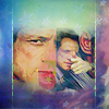
Using Photoshop CS
Lost screencaps from lost-media.
:: COLORING ::
Whenever I do coloring I always use the regular size image and crop after..but whatever is up to you.
Start out with your image. I'm using these screencaps of the Marshal from Lost - 01 and 02.
Working with the first picture, duplicate the picture & set to screen 100%.
New Hue/Saturation layer: Normal, 100%
Master: Saturation (+17)
Reds: Saturation (+23)
Curves layer: Normal 76% opacity
RGB: add a new point (235, 240)
Red: change the bottom left point to (9, 0); change the top right point to (255, 234); add a new point (170, 156)
Green: add two new points (79, 82) and (184, 179)
Blue:
Hue/Saturation layer: Normal, 100%
Master: Saturation (+17)
Reds: (+1)
Selective Color layer: Normal, 100%
Reds: (+65, -5, -41, 0)
Yellows: (+30, 0, +40, +10)
Neutrals: (-8, -6, +1, 0)
Selective Color layer: Normal, 69%
Reds: (+100, +14, -20, 0)
Yellows: (+87, +21, -24, +31)
Neutrals: (+14, +6, +4, 0)
Brightness/Contrast layer: Normal, 100%
Brightness: (-5); Contrast: (+9)
Curves layer: Pin Light, 100%
RGB: change the bottom left point to (20, 0); add 3 new points at (71, 101), (117, 186) and (211, 224).
That is the coloring.. Then to soften up the caps a bit I did:
Smart Blur (filter>>blur>>smart blur): Radius (3.0); Threshold (7.5); Quality (Low); Mode (Normal)
and Diffuse (filter>>stylize>>diffuse): set to Anisotropic
One of the reasons I work with the full sized image is that these last two effects will be too overwhelming if done on an icon sized image. If you do it on the full size image it looks better once you resize it after doing the effects, if that makes sense.
End result (resized a little):
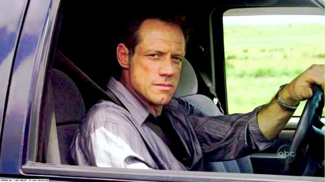
Same coloring/effects used for the second image:
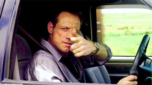
and now for the icon...
:: ICON ::
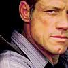
Take the first image, resize it/crop it to 100x100 and sharpen it to your liking:
Take the second image and place it on a new layer. Resize it so it is about 86 pixels in height, or whatever works for you. Place it in the top left corner where there is the black.
Set it to Lighten 100% and sharpen to your liking.
There will be a bunch of green covering the big/first picture so you'll have to erase that part (I usually create masks that way you can undo it if need be later on):
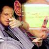
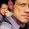
>>>
These textures:
by kiho_chan set to Darken 100%.
by kiho_chan set to Lighten 100%.
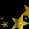
by cdg set to Lighten 100%.
After that you should have something like this: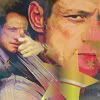
Now here comes the tricky/confusing part. Create a new layer and you're going to make a pattern out of what you've done so far. So while on the new, blank layer go to (Edit>>Define Pattern>>OK). We'll use this later on.
Now were going to start a new icon, but feel free to keep the other one opened, or you can just work on top of what you've done already..but that could get confusing.
Starting with this texture as your base, again by kiho_chan
, duplicate it and set it to Multiply 100% and add this texture
set to Lighten 100%
Add these textures:
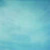
by _iconographer set toOverlay 100%
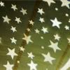
by cielo_icons sharpened once and set to Lighten 51%
by _iconographer set to Multiply 100% and duplicated set to Soft Light 100%
You should now have something like this: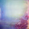
Now, we are going to go back and utilize the pattern you made with the screen caps.
Create a new layer.
Select the Pattern Stamp Tool (S). In the settings toolbar for the Pattern Stamp Tool, select the pattern you made in the drop down box (it should be there) and make sure that BOTH "aligned" and "impressionist" are UNCHECKED. You can select any type of brush you want, it doesn't really matter.
Now, on your new blank layer you're just going to start running your brush across the canvas. Having "aligned" unchecked will give you all sorts of cool misplaced/misaligned structures. You can do this until you've got a composition you like. I usually end up deleting and redoing it many times..but whatever you like. This part was greatly inspired by part of this tutorial.
I don't have the exact one I came up with, because I later resized it..but I got something similar to this: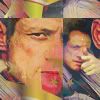
Don't worry about that ugly bar thing at the top because we'll get rid of it.
Once you've found something you like resize it to about 75x75 pixels and center it:
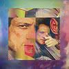
Now to get rid of the ugly part on the top of the resized picture simply create a layer mask and erase with whatever brush you'd like the top part of it (I did some on the bottom so it'd match):

Then I created a Brightness/Contrast layer on ONLY the Marshal's picture (you can do this by holding the CTRL button and clicking on the layer mask you just created, then deleting the selection that exceeds the actual picture):
Brightness: (-17); Contrast: (+5)
Then I used the pencil tool to create the dashed lines on each side. One layer had the dashed lines in #DEB77B set to Overlay 100% and I motion blurred it about 38 pixels at an angle of -90.
The second dashed layer was in #82FF82 set to Lighten 77%, motion blur it again but fade it right after (CTRL+SHIFT+F) to an opacity of about 25:
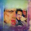
Then finally add this texture
by _iconographer set to Soft Light 100%
And tada, you end up with something like this -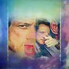
I hope this was helpful/interesting to some of you. If you've got any questions feel free to ask, I probably make most things more complicated than they are. And I'd love to see what you come up with :)
And as always...
-Full list of resources can be found here
*feel free to friend me for updates! :)
How to make this -->
Using Photoshop CS
Lost screencaps from lost-media.
:: COLORING ::
Whenever I do coloring I always use the regular size image and crop after..but whatever is up to you.
Start out with your image. I'm using these screencaps of the Marshal from Lost - 01 and 02.
Working with the first picture, duplicate the picture & set to screen 100%.
New Hue/Saturation layer: Normal, 100%
Master: Saturation (+17)
Reds: Saturation (+23)
Curves layer: Normal 76% opacity
RGB: add a new point (235, 240)
Red: change the bottom left point to (9, 0); change the top right point to (255, 234); add a new point (170, 156)
Green: add two new points (79, 82) and (184, 179)
Blue:
Hue/Saturation layer: Normal, 100%
Master: Saturation (+17)
Reds: (+1)
Selective Color layer: Normal, 100%
Reds: (+65, -5, -41, 0)
Yellows: (+30, 0, +40, +10)
Neutrals: (-8, -6, +1, 0)
Selective Color layer: Normal, 69%
Reds: (+100, +14, -20, 0)
Yellows: (+87, +21, -24, +31)
Neutrals: (+14, +6, +4, 0)
Brightness/Contrast layer: Normal, 100%
Brightness: (-5); Contrast: (+9)
Curves layer: Pin Light, 100%
RGB: change the bottom left point to (20, 0); add 3 new points at (71, 101), (117, 186) and (211, 224).
That is the coloring.. Then to soften up the caps a bit I did:
Smart Blur (filter>>blur>>smart blur): Radius (3.0); Threshold (7.5); Quality (Low); Mode (Normal)
and Diffuse (filter>>stylize>>diffuse): set to Anisotropic
One of the reasons I work with the full sized image is that these last two effects will be too overwhelming if done on an icon sized image. If you do it on the full size image it looks better once you resize it after doing the effects, if that makes sense.
End result (resized a little):

Same coloring/effects used for the second image:

and now for the icon...
:: ICON ::
Take the first image, resize it/crop it to 100x100 and sharpen it to your liking:

Take the second image and place it on a new layer. Resize it so it is about 86 pixels in height, or whatever works for you. Place it in the top left corner where there is the black.
Set it to Lighten 100% and sharpen to your liking.
There will be a bunch of green covering the big/first picture so you'll have to erase that part (I usually create masks that way you can undo it if need be later on):

>>>

These textures:

by kiho_chan set to Darken 100%.

by kiho_chan set to Lighten 100%.

by cdg set to Lighten 100%.
After that you should have something like this:

Now here comes the tricky/confusing part. Create a new layer and you're going to make a pattern out of what you've done so far. So while on the new, blank layer go to (Edit>>Define Pattern>>OK). We'll use this later on.
Now were going to start a new icon, but feel free to keep the other one opened, or you can just work on top of what you've done already..but that could get confusing.
Starting with this texture as your base, again by kiho_chan

, duplicate it and set it to Multiply 100% and add this texture

set to Lighten 100%
Add these textures:
by _iconographer set toOverlay 100%
by cielo_icons sharpened once and set to Lighten 51%
by _iconographer set to Multiply 100% and duplicated set to Soft Light 100%
You should now have something like this:

Now, we are going to go back and utilize the pattern you made with the screen caps.
Create a new layer.
Select the Pattern Stamp Tool (S). In the settings toolbar for the Pattern Stamp Tool, select the pattern you made in the drop down box (it should be there) and make sure that BOTH "aligned" and "impressionist" are UNCHECKED. You can select any type of brush you want, it doesn't really matter.
Now, on your new blank layer you're just going to start running your brush across the canvas. Having "aligned" unchecked will give you all sorts of cool misplaced/misaligned structures. You can do this until you've got a composition you like. I usually end up deleting and redoing it many times..but whatever you like. This part was greatly inspired by part of this tutorial.
I don't have the exact one I came up with, because I later resized it..but I got something similar to this:

Don't worry about that ugly bar thing at the top because we'll get rid of it.
Once you've found something you like resize it to about 75x75 pixels and center it:

Now to get rid of the ugly part on the top of the resized picture simply create a layer mask and erase with whatever brush you'd like the top part of it (I did some on the bottom so it'd match):

Then I created a Brightness/Contrast layer on ONLY the Marshal's picture (you can do this by holding the CTRL button and clicking on the layer mask you just created, then deleting the selection that exceeds the actual picture):
Brightness: (-17); Contrast: (+5)
Then I used the pencil tool to create the dashed lines on each side. One layer had the dashed lines in #DEB77B set to Overlay 100% and I motion blurred it about 38 pixels at an angle of -90.
The second dashed layer was in #82FF82 set to Lighten 77%, motion blur it again but fade it right after (CTRL+SHIFT+F) to an opacity of about 25:

Then finally add this texture
by _iconographer set to Soft Light 100%
And tada, you end up with something like this -

I hope this was helpful/interesting to some of you. If you've got any questions feel free to ask, I probably make most things more complicated than they are. And I'd love to see what you come up with :)
And as always...
-Full list of resources can be found here
*feel free to friend me for updates! :)