Two Guides - How to Use the Levels Layer (Bright/Contrast & Color)
requested by tasha73. Hope this helps a bit, Tasha! =]
Program: PSP X, but it can be used in other programs
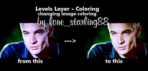
Involves: Brighten/Contrast an image & color normalization, very brief guide in how to use the Levels layer to complete these two objectives.
Translatable: Yes
Steps: Not many, but I'm a babbler, so please feel free to ask questions if you don't understand something.

This guide, lwena11 wrote in good_tutorial, A Guide to Colour Normalization, is amazing. She goes much more in-depth than I do, which I find very helpful.
This guide is very image heavy.
I actually learned how to use the Levels layer by trying out different coloring tutorials. It became my favorite adjustment layer because it's so versatile. I like to use it to lighten/darken images or to colorize them. Below are examples on how it works. Hope this helps!!
Spike cap from Screencap Paradise - resized
Brighten/Contrast an Image
1. Get your base, I'm using a Spike screencap from Screencap Paradise, and duplicate it once. Set the duplicate to Screen, 100%. I find that making at least one screen layer will help you judge just how bright you want your image. For this image, I duplicated it 3 more times (a total of 4 screen layers) to bring out his eyes a bit more. This is what it should look like: base & screen layers
2. Next we are going to use the Levels layer. Go to Layers -> Adjustment -> Levels. This is what your Levels layer should look like and what each dot does to an image: Levels Layer
Make sure that the channel is set to RGB (changes the light/darkness) before you make any adjustments.
3. To add the contrast, make sure you're working on the Input setting located at the top. To darken, move the dot on the left side to the right, like this: Contrast Movement. This adds more shadow to cap that was taken away while lightening the image.
4. If you want to brighten the image more, move the other two dots in the Input layer. To brighten the midtones, push the grey slider (middle dot) to the left. To brighten the entire image, move the right dot to the left: Brighten Movement I don't like this cap to be too bright, so I left this step out of my final image.
Your final pieces should look like either of these:
Darker/Contrast Only or Brighter Image
5. Now you are done. =] If you have any questions, just ask me. I'll be happy to help.
*****

1. I'm going to use the Spike cap, with only the contrast change, that I already made with the Levels layer: Darker/Contrast Only
2. Create a Levels layer: Go to Layers -> Adjustment -> Levels. Now we are going to use the Red, Green, & Blue channels in the Levels layer. They look like this:
Red channel
Green channel
Blue channel
To change the colors of the image, we move the Midtones dot (middle one) to either the left or the right side. I'll show you which below. I don't like to touch the other two Input settings because it makes things more difficult and changes the outcome too much. It's just a preference.
3. First, we are going to adjust the Red channel in the Levels layer.
-To give the image a reddish tint, move the midtones dot (middle) to the left, like this: reddish tint
-To give it a more cyan/blueish tint, move the midtones dot to the right, like this: blueish tint
I prefer the reddish tint, so we're going to use these settings:
RED: 0, 1.17, 255
Your image should look like this: red tint final
4. Next we are going to adjust the Green channel:
-To give it a more cyan/greenish tint, move the midtones dot to the right, like this: cyan/green tint
-To give it a reddish tint, move the midtones dot (middle) to the left, like this: red/purple tint
I prefer the cyan/greenish tint, so we're going to use these settings:
GREEN: 0, 1.18, 255
Your image should look like this: green tint final
5. Finally, we are going to adjust the Blue channel:
-To give it a more blueish tint, move the midtones dot to the right, like this: Blue tint
-To give it a yellowish tint, move the midtones dot (middle) to the left, like this: yellow tint
I prefer the yellowish tint, so we're going to use these settings:
BLUE: 0, 0.70, 255
Your image should look like this: Blue tint final
6. You can stop here, but I want to add a bit more color to the image, so I'm going to use another Levels layer with these settings:
RED: 0, 1.17, 255
GREEN: 0, 1.12, 255
BLUE: 0, 0.83, 255
You can also adjust the Brightness/Contrast levels by changing the RGB settings, but I left mine alone.
7. You're done! Your final image should look like this: SpikeColorFinal
Hope this helps!! If you have any questions, don't hesitate to ask me.
Program: PSP X, but it can be used in other programs
Involves: Brighten/Contrast an image & color normalization, very brief guide in how to use the Levels layer to complete these two objectives.
Translatable: Yes
Steps: Not many, but I'm a babbler, so please feel free to ask questions if you don't understand something.

This guide, lwena11 wrote in good_tutorial, A Guide to Colour Normalization, is amazing. She goes much more in-depth than I do, which I find very helpful.
This guide is very image heavy.
I actually learned how to use the Levels layer by trying out different coloring tutorials. It became my favorite adjustment layer because it's so versatile. I like to use it to lighten/darken images or to colorize them. Below are examples on how it works. Hope this helps!!
Spike cap from Screencap Paradise - resized
Brighten/Contrast an Image
1. Get your base, I'm using a Spike screencap from Screencap Paradise, and duplicate it once. Set the duplicate to Screen, 100%. I find that making at least one screen layer will help you judge just how bright you want your image. For this image, I duplicated it 3 more times (a total of 4 screen layers) to bring out his eyes a bit more. This is what it should look like: base & screen layers
2. Next we are going to use the Levels layer. Go to Layers -> Adjustment -> Levels. This is what your Levels layer should look like and what each dot does to an image: Levels Layer
Make sure that the channel is set to RGB (changes the light/darkness) before you make any adjustments.
3. To add the contrast, make sure you're working on the Input setting located at the top. To darken, move the dot on the left side to the right, like this: Contrast Movement. This adds more shadow to cap that was taken away while lightening the image.
4. If you want to brighten the image more, move the other two dots in the Input layer. To brighten the midtones, push the grey slider (middle dot) to the left. To brighten the entire image, move the right dot to the left: Brighten Movement I don't like this cap to be too bright, so I left this step out of my final image.
Your final pieces should look like either of these:
Darker/Contrast Only or Brighter Image
5. Now you are done. =] If you have any questions, just ask me. I'll be happy to help.
*****

1. I'm going to use the Spike cap, with only the contrast change, that I already made with the Levels layer: Darker/Contrast Only
2. Create a Levels layer: Go to Layers -> Adjustment -> Levels. Now we are going to use the Red, Green, & Blue channels in the Levels layer. They look like this:
Red channel
Green channel
Blue channel
To change the colors of the image, we move the Midtones dot (middle one) to either the left or the right side. I'll show you which below. I don't like to touch the other two Input settings because it makes things more difficult and changes the outcome too much. It's just a preference.
3. First, we are going to adjust the Red channel in the Levels layer.
-To give the image a reddish tint, move the midtones dot (middle) to the left, like this: reddish tint
-To give it a more cyan/blueish tint, move the midtones dot to the right, like this: blueish tint
I prefer the reddish tint, so we're going to use these settings:
RED: 0, 1.17, 255
Your image should look like this: red tint final
4. Next we are going to adjust the Green channel:
-To give it a more cyan/greenish tint, move the midtones dot to the right, like this: cyan/green tint
-To give it a reddish tint, move the midtones dot (middle) to the left, like this: red/purple tint
I prefer the cyan/greenish tint, so we're going to use these settings:
GREEN: 0, 1.18, 255
Your image should look like this: green tint final
5. Finally, we are going to adjust the Blue channel:
-To give it a more blueish tint, move the midtones dot to the right, like this: Blue tint
-To give it a yellowish tint, move the midtones dot (middle) to the left, like this: yellow tint
I prefer the yellowish tint, so we're going to use these settings:
BLUE: 0, 0.70, 255
Your image should look like this: Blue tint final
6. You can stop here, but I want to add a bit more color to the image, so I'm going to use another Levels layer with these settings:
RED: 0, 1.17, 255
GREEN: 0, 1.12, 255
BLUE: 0, 0.83, 255
You can also adjust the Brightness/Contrast levels by changing the RGB settings, but I left mine alone.
7. You're done! Your final image should look like this: SpikeColorFinal
Hope this helps!! If you have any questions, don't hesitate to ask me.