Icon Tutorial #01
Some people have told me that they would like to read a tutorial on one of my icons; I don't usually save the .psd files of the icons I make so it's pretty much impossible for me to replicate one. What I will do is make the tutorial as I make the icon.
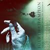
This is what we will be doing:
>
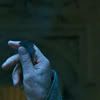
1. The first thing I do is sharpen it. Filter > Sharpen > Sharpen. Just once.

>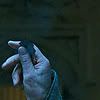
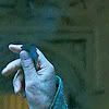
2. I duplicate the picture layer, and set the second one to Screen. I also desaturate a little: Image >Adjustements > Hue/Saturation (Ctrl + U). I set the saturation "meter" to -60.
>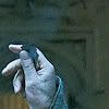
3. I duplicate the second layer, and this time I set it to Soft Light. I desaturate this one completely Image >Adjustements > Desaturate (Sft + Ctrl + U)
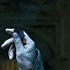
4. Now to choose a texture. For this icon I have chosen this one, from the talented TRE. The little square in the bottom doesn't fit what I have in mind for the icon, so I just edit it out.
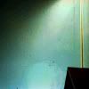
>
5. I put the texture layer on top of the others, and set it to Screen.
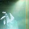
6. The line on the right still looks weird there, so I'm just going to blur it until it disappears. These edits are pretty rough, because they won't be noticeable once the icon is finished.
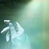
7. Next thing I do is pick the Burn Tool (with a diffuse brush, 80px) and use it very softly on the texture to darken the hand area a little bit.
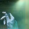
8. I create a new layer on top of all the others, and hit Ctrl + Alt + E. This is the equivalent of merging all layers, copying the resulting layer, undo the merging and paste the merged layer on top of all the others. I'm not sure I'm making sense, this is what your layer palette should look like:
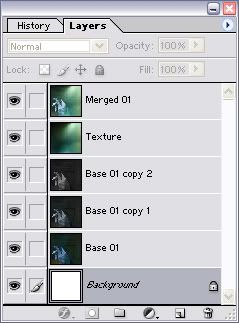
9. I now set my "merged" layer to Soft Light. It has way too much color for my taste, so I desaturate again. (Shft + Ctrl + U)

10. I duplicate the merged layer, and leave it on Soft Light

11. I create a new layer, and set it to Lighten. I change the foreground color in my layer palette to #3F0000, and with the Gradient Tool set to Foreground to Transparent I create a gradient on the new layer.

>
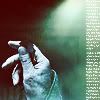
12. Again, I create a new layer. This time I'm going to use a brushes on it. I'm using a brush of mine that simulates text. I use it on the right corner, in white. It's too bright, so I lower the layer's opacity to %50.
>
>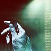
13. With the Eyedropper Tool I select one of the darkest colors on my icon, in this case it's this one: #38312A. It's time to add some text. I choose the font I want to use: ASI_Mono, 4. I write a line (it can be either meaningless stuff or something that means something; no one will be able to read it, but I always write stuff that makes sense). I write "Only one will go down in history".
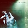
14. Now I want to rotate it so that it's vertical. So I go to Edit > Transform > Rotate 90 CCW. When it's vertical, I move it so that it's aligned with the fake test column.

15. I pick the Text Tool again, only this time I change the font to Palatino Linotype size 6. I write "Fourth Champion" in the same color as the other text. Again, I rotate it 90 CCW and place it right next to the previous text.
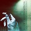
16. Finally, I add the finishing touch, a splatter brush of mine.
(you can download the brush set here)
>
And voilà! A very simple icon that can be done in less than 10 minutes :) Usually it takes me longer because I try a lot of gradients and textures and colors before I keep one, but it's a very easy icon to make nevertheless. I hope you enjoyed it and learnt something :)
Oh and if you have any questions, feel free to ask!
This is what we will be doing:
>
1. The first thing I do is sharpen it. Filter > Sharpen > Sharpen. Just once.
>
2. I duplicate the picture layer, and set the second one to Screen. I also desaturate a little: Image >Adjustements > Hue/Saturation (Ctrl + U). I set the saturation "meter" to -60.
>
3. I duplicate the second layer, and this time I set it to Soft Light. I desaturate this one completely Image >Adjustements > Desaturate (Sft + Ctrl + U)
4. Now to choose a texture. For this icon I have chosen this one, from the talented TRE. The little square in the bottom doesn't fit what I have in mind for the icon, so I just edit it out.
>
5. I put the texture layer on top of the others, and set it to Screen.
6. The line on the right still looks weird there, so I'm just going to blur it until it disappears. These edits are pretty rough, because they won't be noticeable once the icon is finished.
7. Next thing I do is pick the Burn Tool (with a diffuse brush, 80px) and use it very softly on the texture to darken the hand area a little bit.
8. I create a new layer on top of all the others, and hit Ctrl + Alt + E. This is the equivalent of merging all layers, copying the resulting layer, undo the merging and paste the merged layer on top of all the others. I'm not sure I'm making sense, this is what your layer palette should look like:
9. I now set my "merged" layer to Soft Light. It has way too much color for my taste, so I desaturate again. (Shft + Ctrl + U)
10. I duplicate the merged layer, and leave it on Soft Light
11. I create a new layer, and set it to Lighten. I change the foreground color in my layer palette to #3F0000, and with the Gradient Tool set to Foreground to Transparent I create a gradient on the new layer.
>
12. Again, I create a new layer. This time I'm going to use a brushes on it. I'm using a brush of mine that simulates text. I use it on the right corner, in white. It's too bright, so I lower the layer's opacity to %50.
>
>
13. With the Eyedropper Tool I select one of the darkest colors on my icon, in this case it's this one: #38312A. It's time to add some text. I choose the font I want to use: ASI_Mono, 4. I write a line (it can be either meaningless stuff or something that means something; no one will be able to read it, but I always write stuff that makes sense). I write "Only one will go down in history".
14. Now I want to rotate it so that it's vertical. So I go to Edit > Transform > Rotate 90 CCW. When it's vertical, I move it so that it's aligned with the fake test column.
15. I pick the Text Tool again, only this time I change the font to Palatino Linotype size 6. I write "Fourth Champion" in the same color as the other text. Again, I rotate it 90 CCW and place it right next to the previous text.
16. Finally, I add the finishing touch, a splatter brush of mine.
(you can download the brush set here)
>
And voilà! A very simple icon that can be done in less than 10 minutes :) Usually it takes me longer because I try a lot of gradients and textures and colors before I keep one, but it's a very easy icon to make nevertheless. I hope you enjoyed it and learnt something :)
Oh and if you have any questions, feel free to ask!