Tutorial/Essay: Selective Coloring and Cropping
First of all I'd like to say that this isn't so much a tutorial as it is... an "essay" on the way I make icons.
Many people these days ask for tutorials on a particular coloring (for example), maybe not realizing that what they are asking for is basically a set of numbers that will only work on icons with the same basic coloring as the original. Many people also, after seeing a thousand over-saturated icons, tend to blame the Selective Coloring tool.
In this "tutorial" (for lack of a better word) I will try to show you the way I use Selective Coloring and other tools in order to make icons like the ones in this batch.
I will be using not one but at least four or five icons to illustrate my point, so if you were expecting a step by step tutorial, I'm afraid you're going to be disappointed.
Also, bear in mind that English is not my first language so I apologize in advance for any mistakes: I know I've written tutorials before but never this lengthy.
Oh and the necessary info:
Tutorial for: Photoshop
Made in: Photoshop CS2
Level: Intermediate
Ok, let's start, shall we?
The first thing I do when I start working on an icon is to prepare the base. I like my icons to be clear, bright and sharp enough. If I can't manage to make them clear enough after preparing them, then I just get rid of the icon. That's important: unless the base is very rare (for example, the Half-Blood Prince sneek peak with Harry and Ginny; the caps from that were awful but the fangirl in me just couldn't pass such an oportunity to have a real Harry/Ginny icon and so I made pretty crappy icons out of very crappy screencaps) I will not use it.
Prepare the Base
So what to do in order to prepare the base? I usually do three things: Sharpen, Screen and Levels.
Sharpen
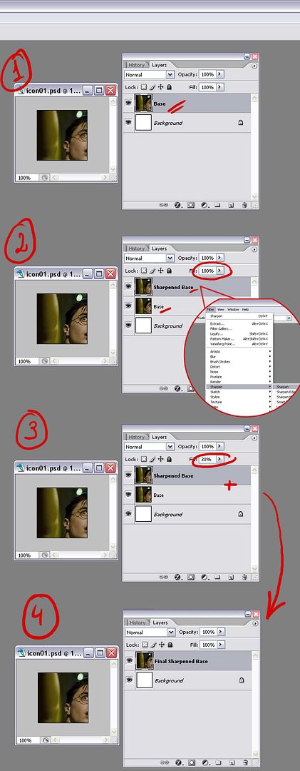
First I sharpen. I don't do it often because I hate over-sharpened icons. What I do, when I do it, is duplicate the base, sharpen the duplicate and then lower the opacity until I'm happy with the level of sharpness. Then I just merge the two and I'm left with a reasonably well sharpened base. Bear in mind that I don't do this often because most images don't need it (the one in the example doesn't really need it, but I figured it wouldn't look too bad).
>>> You can see the visual example of what I just explained here
Screen
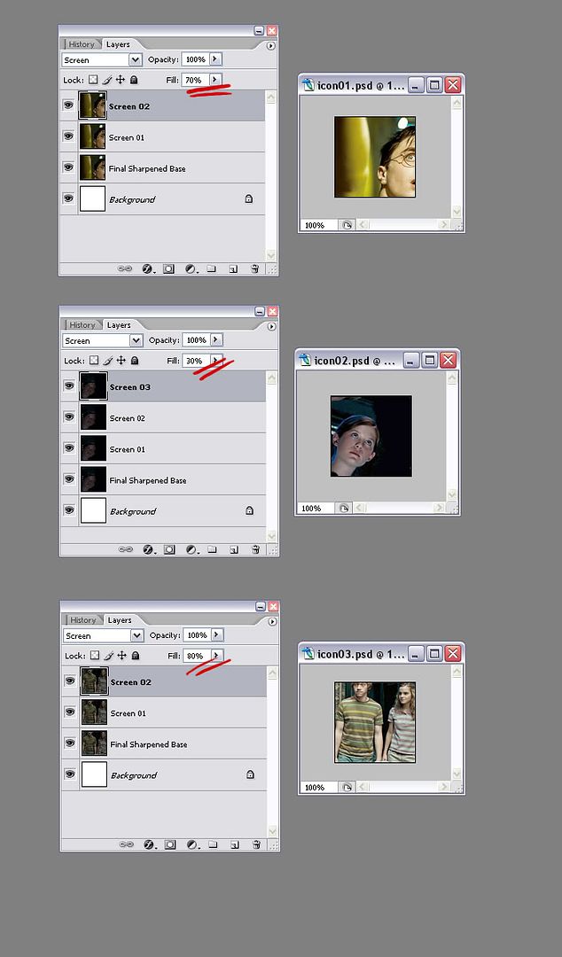
The second thing I do (and this I do quite often) is duplicate the base layer over and over, and set the duplicates to Screen until I'm happy with the brightness. This of course depends greatly on the darkness and contrast of the base. If the base has a lot of contrast (shadow and light are very pronounced) then the Screen mode isn't likely to work as well. If the base doesn't have much contrast, then the next two steps will be very useful. Don't forget to play with the Opacity and the Fill on your Screen layers! If you feel the last Screen layer makes the icon too bright, then try lowering the Opacity or the Fill (I always lower the Fill) until you're happy with the level of brightness.
>>> See a visual example of this using two different icons with two different results
In the example you can see that different icons require different numbers of Screen layers and opacities.
The first and third icons as you can see have a very nice contrast after the Screen layers. The lighter parts are lighter and the darker ones are darker. In the case of the second one I feel some of the darker places have been a bit "unnaturally" brightened so I will need to compensate with the Levels, which leads us to the third step.
Levels
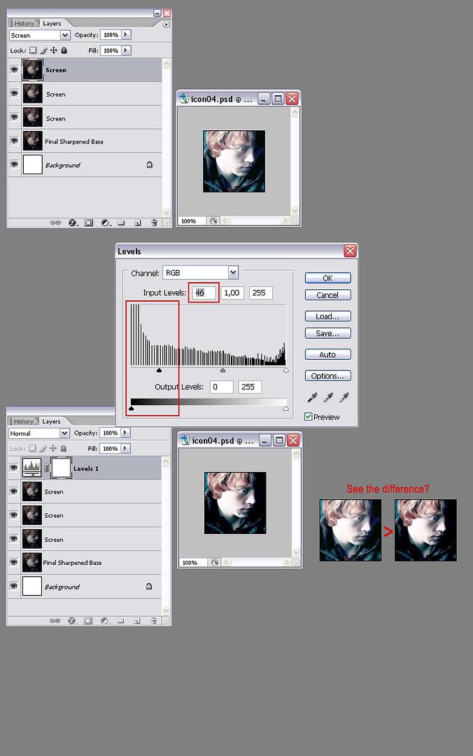
The last thing I do is create a new Levels layer in order to increase the contast, which tends to lower when you use the Screen mode (the images get a little "washed up"). Again, I don't do this as a rule, just when I feel I need a bit more contast, which isn't always.
In the following example, you can see the difference between the two icons. Yes, you can see much detail in the one without Levels, but the result is such a washed up tone! I know it might not be obvious at first but I do believe the key to making nice colored icons lies in subtlety. And I know it's pretty hard to be subtle sometimes because when you work on an icon, after a while you tend to loose your objectiveness (you wonder "Is it too bright?" "Did I go overboard with the blue?" and you can't really tell after a while) and it's very hard to be subtle.
A little tip: always keep the original base open next to your icon so that you can keep comparing.
>>> See a visual example of the Levels layer
The Color
This part is much easier than it looks.
Now the way I see it, the key to create a good, nicely-colored icon is to first observe carefully the colors of the base after it has been prepared. What I do with most of my icons is just enhance the already existing colors. As simple as that. In order to achieve this, I use two kinds of Adjustement Layers: Selective Color and Color Balance.
I'm not gonna go into technicalities because it's boring, confusing and I'm not even good at it so let's keep it simple: With the Selective Color layer you can manipulate all the individual colors in your icon. As simple as that. The Color Balance however will not affect individual colors, it will add or substract a color to the whole icon. Let's start with the Selective Color.
Selective Color
Now as I said, the Selective Color changes each individual color in your icon. Let's look at the example below:
>>> Selective Color: Yellow
As you can see the most prominent colors of the base are yellow and beige (or in other words, red mixed with yellow).
A Little tip: the Eyedropper Tool can help you a lot if you want to identify colors, don't be afraid to use it!
In the example I wanted to see whether the icon would benefit from less Yellow, so I chose the color Yellow in the drop down menu ("Yellows") of the Selective Color panel and I slid the arrow on the Yellow to the left so as to lower the amount of Yellow in my icon (did I say we're talking about Yellow? Lol!). When it's down to -100% the Yellow has been completely removed. The result as you can see isn't bad but it's a little boring. If you want to change the color of the icon completely, you could build up from this and the result would be quite different. However, I usually like as many colors in my icons as possible so I'm going to keep the Yellow.
Now, changing color isn't just copying a bunch of numbers, you have to experiment with it and slide the arrows up and down until you get the color you want. Of course, it helps if you know what you're doing when you move the arrows: the names of the colors aren't there for nothing, just identify the colors you see, think of the colors you WANT and then start tweaking.
It is also a good thing to keep in mind the subject of your icon. If it's a human being, you want to keep his or her skin as human-looking as possible. Of course, lots of times the light on the base will decide the color of the skin: In this icon the original light is very yellow so the fact that your subject's face is yellow isn't really an issue. In this icon however the light is much more subtle so if your subject's face was this color, it wouldn't really work that well (that doesn't mean it doesn't work at all, it just means that the color isn't as natural as I would like it to be).
In the following example, I wanted Ginny's face to look a bit more "healthy"; that means adding a bit more red and a bit more yellow. I also noticed that there was some blue and some cyan in the background and in the light falling over Ginny's head. I love blue light so I tried to make it clearer, more pronounced.
>>> See the process in this example with Ginny
A lot of times, after you use the Screen Layers, your icon's colors tend to wash down a lot. So the Selective Color layer is very useful to bring them out again. In the next example, you can see that the icon is bright enough but the colors, I feel, are not good enough. The shirts that Ron and Hermione are wearing for example should have green and magenta stripes, but you can barely see them. So my solution is to raise the level of greens and magentas a lot, and then erase the parts I don't want.
>>> You can see how I do it with this example with Ron and Hermione
I want the colors to be much, much more pronouced so instead of just going to the Magentas and sliding the arrow to 100%, I will go to the Neutrals and do it there (the Neutrals work a little bit like the Color Balance, they will raise the amount of one color on the whole icon, regardless of whether that color already exists in the icon).
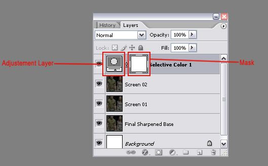
Now with mask layers, instead of using the Eraser tool, you have to use the Brush tool. As you can see, next to the Selective Color square is another white one. If you pick a brush, set the foreground color to black and paint over it, it will work as an eraser. If you erase too much, just change the foreground to white and paint over it (that's the beauty of Masks!).
In the example, I have already added some coloring (mostly Yellow and Red for the skin, Ron's shirt and their hair and Cyan and Blue for the background, pants and light) but now I really want the magenta stripes to stand out so that's what I do.
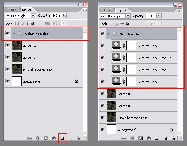
A Little Tip: In order to keep my layers organized, I like to Group them. That way I can keep track of them more easily and move them around all at once.
Color Balance
The great thing about the Color Balance layer is that you can choose where you want to change the color: the Highlights, the Midtones or the Shadows. Personally, I use it to compensate for another color, or add some light. Take the next example; I wanted to add a bit of brightness to the icon, so I created a new Color Balance layer and increased the amount of yellow in the Highlights. The result is not dramatic by any means, but it does help illuminate the icon a bit.
>>> You can see an example of this here
I also use it to compensate: in an icon which has too much yellow, like the one in the example below, adding a good amount of blue in the midtones will compensate for the yellow and give the icon a much more natural color. The thing with that is that in this particular case, I like both versions: one has the original color highlighted and looks good because the yellow color is clearly the result of the film's own photography, and the other is a nice take on the original and with the colors changed it looks very different but still good.
>>> You can see an example of this here
And that's pretty much all I do color-wise! Granted, I still have a card or two up my sleeve but it's nothing fancy, I assure you ;)
The Cropping
For a lot of people, myself included, cropping is as important as color in an icon. Look at the Harry Potter fandom: millions of icons, all made using the same pictures, and the same screencaps; what sets most of them apart is the cropping (not ONLY the cropping, but mainly I'd say).
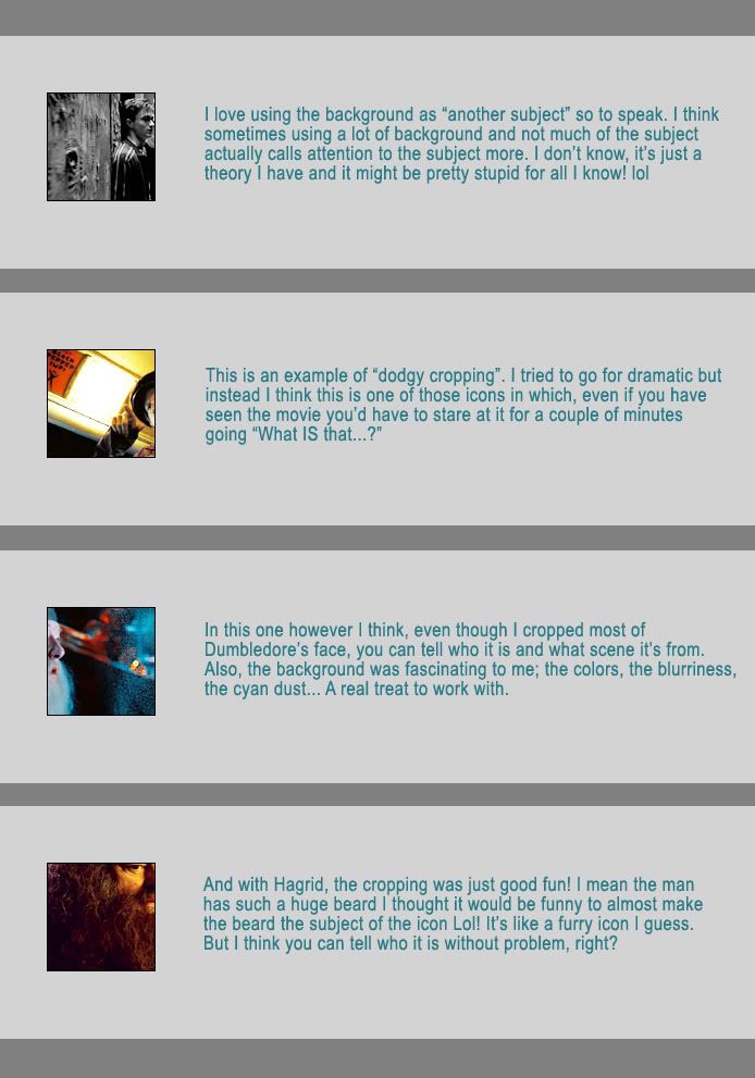
Personally I'm a big fan of the "dramatic crop". I love an icon that has been dramatically cropped so that you can see enough of the subject to know what it is, but it leaves enough out so that you can imagine the rest. There are very few iconists who can actually get away with this kind of cropping; I'm not bold enough to be one of them but I will try to give you examples of what this kind of cropping looks like to me.
The Dramatic Crop
First of all, I use the Crop Tool
to crop my icons. It sounds obvious but when I started making icons I used the Rectangular Marquee tool because it felt more familiar for some reason. Also, I didn't learn what the Crop Tool was for until embarassingly late. The good thing about the Crop Tool, if you haven't used it yet, is that it allows you to actually see what the crop looks like before you do it. So I create a square in the screencap/photo and basically just move it around to see how it looks like everywhere. But beware, a square of 500 x 500 px is not necessarily the same as a 100 x 100 px one! What is clear as the sun in the big one might not be seen at all in the small one.
Let's take this Order of the Phoenix screencap (courtesy of Fez at HarryandGinny.org) for example. The first thing I ask myself before I crop my picture is "What do I want the subject of my icon to be?". Once I have picked a clear subject, in this case, Luna (and not Harry) then I try the more obvious crops, which would be the following (in my opinion):
>>> Obvious crops with Miss Lovegood
So then I go for the more dramatic ones. As I said, I'm not brave enough to be a good dramatic cropper; so these are the crops I've tried next:
>>> Dramatic crops with Luna Lovegood.
They are not too much over-the-top, except maybe the first one in which you can't really see anything but hair. The important thing with these crops is that while being original, they must be clear on the subject: you have to be able to know what the subject is (and preferably who, although if you're not a Harry Potter fan and have not seen the movies, then it doesn't matter what the crop is like, you won't recognize the character either way).
It has happened to me more than once that I have had to sit and stare at an icon for 10 minutes because I couldn't for the life of me make out what the icon was picturing (is it a hand? A foot? A bald guy?)! In this case I have chosen the last crop, although I like the others as well. I think the last one will work better for me and will look better as a 100 x 100 square. But as I said before, there's no accounting for taste and most of you would have probably chosen a different crop ;)
Here is how the last crop looks as an icon after I'm done with it: Finished Icon
>>> And here are a few more examples of my (attempted) dramatic crops.
The Center Crop
As much as I love my dramatic crops, I am also very fond of a good old center crop. I know it's not original and it's not "fresh" but I do think that it can be very beautiful when it's done right. My personal rules for using this crop are these: it must feature the profile or the front of the subject's head preferably and the background must be very appealing: it can be lots of things, from a neutral grey backrgound in a promo (which can be tweaked later and made to look pink or something), to a beautiful landscape with clouds and grass. Here are a few examples in which I think the center crop works:
>>> See here some examples of the center crop.
The Cheated Crop
Wow, I am really great an naming things aren't I? Lol!
Well the cheated crop is what I call an icon in which I have to manipulate the image in order to make the crop that I want. It usually implies putting characters together (because in the original picture they were too far apart and didn't fit in the icon), and most times it means creating a new background or enlarging the existing one. It's a bit hard to explain like this so I think it best if you just check the examples I made.
>>> See here three examples of cheated crops
As you can see, in the first example I liked the center crop but the screencap didn't show the sky, which is a pity. So I took some sky from the second screencap and just blended it. As easy as that!
In the second example, again I wanted to have a bit more background on the upper part of the icon so I used the Single Row Marquee Tool, selected it on the upper part of the icon, hit Ctrl + T and then just expanded it upwards! You can't always do this of course, only when the base is a regular pattern, or vertical lines like in this case.
And in the third icon I just cut the three kids into three layers, blended them closer and cropped them to make the icon. As you can see it's pretty easy and the result is always nice (if it's properly done, I imagine it wouldn't look so good if you could see the parts that were manipulated together).
So, there you have it. That's pretty much all I can think of about making icons. Of course there is more to icon making, such as textures and brushes, but I haven't used a brush on any of my icons in a long time, and I do use textures sometimes but not nearly as much as I did before. There is also text obviously, but I'm rubbish at it so I wouldn't be of much help there Lol!
I'll finish with a bit of advice though: don't take icons seriously! They're just little squares of fun Lol!
Many people these days ask for tutorials on a particular coloring (for example), maybe not realizing that what they are asking for is basically a set of numbers that will only work on icons with the same basic coloring as the original. Many people also, after seeing a thousand over-saturated icons, tend to blame the Selective Coloring tool.
In this "tutorial" (for lack of a better word) I will try to show you the way I use Selective Coloring and other tools in order to make icons like the ones in this batch.
I will be using not one but at least four or five icons to illustrate my point, so if you were expecting a step by step tutorial, I'm afraid you're going to be disappointed.
Also, bear in mind that English is not my first language so I apologize in advance for any mistakes: I know I've written tutorials before but never this lengthy.
Oh and the necessary info:
Tutorial for: Photoshop
Made in: Photoshop CS2
Level: Intermediate
Ok, let's start, shall we?
The first thing I do when I start working on an icon is to prepare the base. I like my icons to be clear, bright and sharp enough. If I can't manage to make them clear enough after preparing them, then I just get rid of the icon. That's important: unless the base is very rare (for example, the Half-Blood Prince sneek peak with Harry and Ginny; the caps from that were awful but the fangirl in me just couldn't pass such an oportunity to have a real Harry/Ginny icon and so I made pretty crappy icons out of very crappy screencaps) I will not use it.
Prepare the Base
So what to do in order to prepare the base? I usually do three things: Sharpen, Screen and Levels.
Sharpen
First I sharpen. I don't do it often because I hate over-sharpened icons. What I do, when I do it, is duplicate the base, sharpen the duplicate and then lower the opacity until I'm happy with the level of sharpness. Then I just merge the two and I'm left with a reasonably well sharpened base. Bear in mind that I don't do this often because most images don't need it (the one in the example doesn't really need it, but I figured it wouldn't look too bad).
>>> You can see the visual example of what I just explained here
Screen
The second thing I do (and this I do quite often) is duplicate the base layer over and over, and set the duplicates to Screen until I'm happy with the brightness. This of course depends greatly on the darkness and contrast of the base. If the base has a lot of contrast (shadow and light are very pronounced) then the Screen mode isn't likely to work as well. If the base doesn't have much contrast, then the next two steps will be very useful. Don't forget to play with the Opacity and the Fill on your Screen layers! If you feel the last Screen layer makes the icon too bright, then try lowering the Opacity or the Fill (I always lower the Fill) until you're happy with the level of brightness.
>>> See a visual example of this using two different icons with two different results
In the example you can see that different icons require different numbers of Screen layers and opacities.
The first and third icons as you can see have a very nice contrast after the Screen layers. The lighter parts are lighter and the darker ones are darker. In the case of the second one I feel some of the darker places have been a bit "unnaturally" brightened so I will need to compensate with the Levels, which leads us to the third step.
Levels
The last thing I do is create a new Levels layer in order to increase the contast, which tends to lower when you use the Screen mode (the images get a little "washed up"). Again, I don't do this as a rule, just when I feel I need a bit more contast, which isn't always.
In the following example, you can see the difference between the two icons. Yes, you can see much detail in the one without Levels, but the result is such a washed up tone! I know it might not be obvious at first but I do believe the key to making nice colored icons lies in subtlety. And I know it's pretty hard to be subtle sometimes because when you work on an icon, after a while you tend to loose your objectiveness (you wonder "Is it too bright?" "Did I go overboard with the blue?" and you can't really tell after a while) and it's very hard to be subtle.
A little tip: always keep the original base open next to your icon so that you can keep comparing.
>>> See a visual example of the Levels layer
The Color
This part is much easier than it looks.
Now the way I see it, the key to create a good, nicely-colored icon is to first observe carefully the colors of the base after it has been prepared. What I do with most of my icons is just enhance the already existing colors. As simple as that. In order to achieve this, I use two kinds of Adjustement Layers: Selective Color and Color Balance.
I'm not gonna go into technicalities because it's boring, confusing and I'm not even good at it so let's keep it simple: With the Selective Color layer you can manipulate all the individual colors in your icon. As simple as that. The Color Balance however will not affect individual colors, it will add or substract a color to the whole icon. Let's start with the Selective Color.
Selective Color
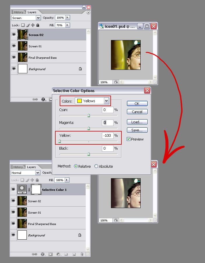
Now as I said, the Selective Color changes each individual color in your icon. Let's look at the example below:
>>> Selective Color: Yellow
As you can see the most prominent colors of the base are yellow and beige (or in other words, red mixed with yellow).
A Little tip: the Eyedropper Tool can help you a lot if you want to identify colors, don't be afraid to use it!
In the example I wanted to see whether the icon would benefit from less Yellow, so I chose the color Yellow in the drop down menu ("Yellows") of the Selective Color panel and I slid the arrow on the Yellow to the left so as to lower the amount of Yellow in my icon (did I say we're talking about Yellow? Lol!). When it's down to -100% the Yellow has been completely removed. The result as you can see isn't bad but it's a little boring. If you want to change the color of the icon completely, you could build up from this and the result would be quite different. However, I usually like as many colors in my icons as possible so I'm going to keep the Yellow.
Now, changing color isn't just copying a bunch of numbers, you have to experiment with it and slide the arrows up and down until you get the color you want. Of course, it helps if you know what you're doing when you move the arrows: the names of the colors aren't there for nothing, just identify the colors you see, think of the colors you WANT and then start tweaking.
It is also a good thing to keep in mind the subject of your icon. If it's a human being, you want to keep his or her skin as human-looking as possible. Of course, lots of times the light on the base will decide the color of the skin: In this icon the original light is very yellow so the fact that your subject's face is yellow isn't really an issue. In this icon however the light is much more subtle so if your subject's face was this color, it wouldn't really work that well (that doesn't mean it doesn't work at all, it just means that the color isn't as natural as I would like it to be).
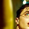
In the following example, I wanted Ginny's face to look a bit more "healthy"; that means adding a bit more red and a bit more yellow. I also noticed that there was some blue and some cyan in the background and in the light falling over Ginny's head. I love blue light so I tried to make it clearer, more pronounced.
>>> See the process in this example with Ginny
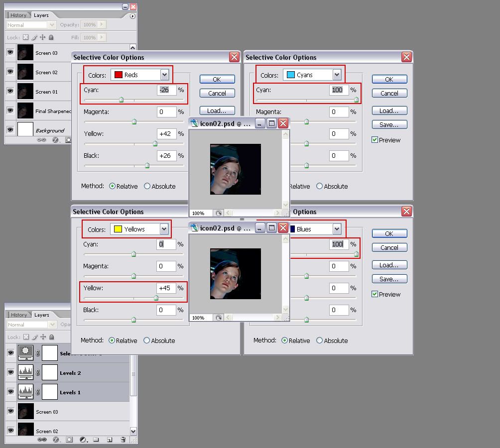
A lot of times, after you use the Screen Layers, your icon's colors tend to wash down a lot. So the Selective Color layer is very useful to bring them out again. In the next example, you can see that the icon is bright enough but the colors, I feel, are not good enough. The shirts that Ron and Hermione are wearing for example should have green and magenta stripes, but you can barely see them. So my solution is to raise the level of greens and magentas a lot, and then erase the parts I don't want.
>>> You can see how I do it with this example with Ron and Hermione
I want the colors to be much, much more pronouced so instead of just going to the Magentas and sliding the arrow to 100%, I will go to the Neutrals and do it there (the Neutrals work a little bit like the Color Balance, they will raise the amount of one color on the whole icon, regardless of whether that color already exists in the icon).
Now with mask layers, instead of using the Eraser tool, you have to use the Brush tool. As you can see, next to the Selective Color square is another white one. If you pick a brush, set the foreground color to black and paint over it, it will work as an eraser. If you erase too much, just change the foreground to white and paint over it (that's the beauty of Masks!).
In the example, I have already added some coloring (mostly Yellow and Red for the skin, Ron's shirt and their hair and Cyan and Blue for the background, pants and light) but now I really want the magenta stripes to stand out so that's what I do.
A Little Tip: In order to keep my layers organized, I like to Group them. That way I can keep track of them more easily and move them around all at once.
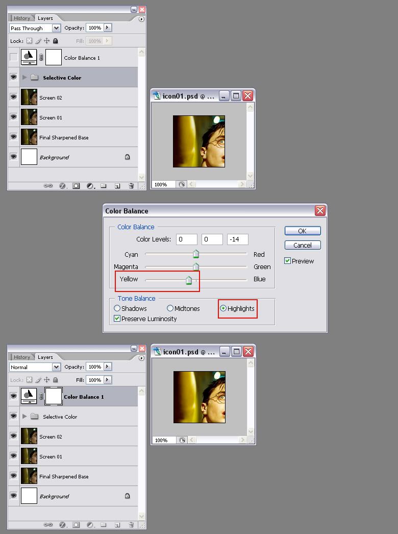
Color Balance
The great thing about the Color Balance layer is that you can choose where you want to change the color: the Highlights, the Midtones or the Shadows. Personally, I use it to compensate for another color, or add some light. Take the next example; I wanted to add a bit of brightness to the icon, so I created a new Color Balance layer and increased the amount of yellow in the Highlights. The result is not dramatic by any means, but it does help illuminate the icon a bit.
>>> You can see an example of this here
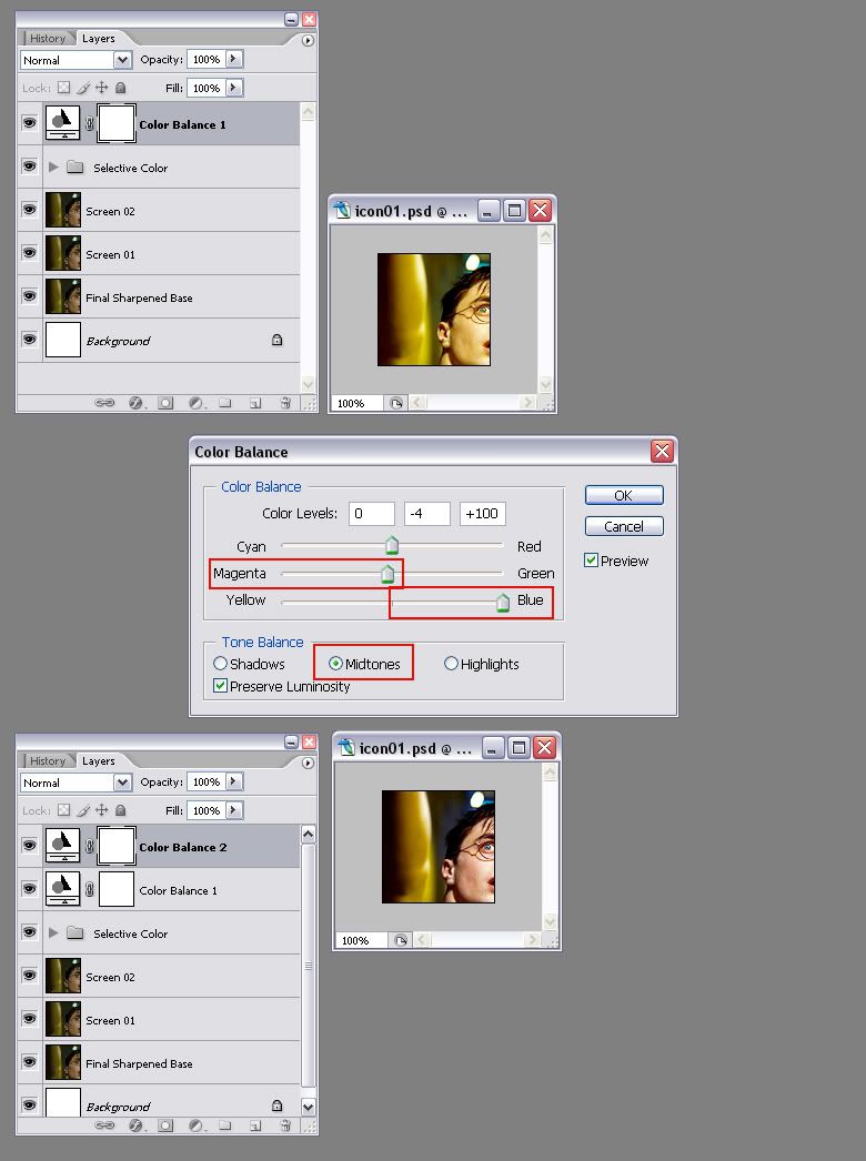
I also use it to compensate: in an icon which has too much yellow, like the one in the example below, adding a good amount of blue in the midtones will compensate for the yellow and give the icon a much more natural color. The thing with that is that in this particular case, I like both versions: one has the original color highlighted and looks good because the yellow color is clearly the result of the film's own photography, and the other is a nice take on the original and with the colors changed it looks very different but still good.
>>> You can see an example of this here
And that's pretty much all I do color-wise! Granted, I still have a card or two up my sleeve but it's nothing fancy, I assure you ;)
The Cropping
For a lot of people, myself included, cropping is as important as color in an icon. Look at the Harry Potter fandom: millions of icons, all made using the same pictures, and the same screencaps; what sets most of them apart is the cropping (not ONLY the cropping, but mainly I'd say).
Personally I'm a big fan of the "dramatic crop". I love an icon that has been dramatically cropped so that you can see enough of the subject to know what it is, but it leaves enough out so that you can imagine the rest. There are very few iconists who can actually get away with this kind of cropping; I'm not bold enough to be one of them but I will try to give you examples of what this kind of cropping looks like to me.
The Dramatic Crop
First of all, I use the Crop Tool
to crop my icons. It sounds obvious but when I started making icons I used the Rectangular Marquee tool because it felt more familiar for some reason. Also, I didn't learn what the Crop Tool was for until embarassingly late. The good thing about the Crop Tool, if you haven't used it yet, is that it allows you to actually see what the crop looks like before you do it. So I create a square in the screencap/photo and basically just move it around to see how it looks like everywhere. But beware, a square of 500 x 500 px is not necessarily the same as a 100 x 100 px one! What is clear as the sun in the big one might not be seen at all in the small one.
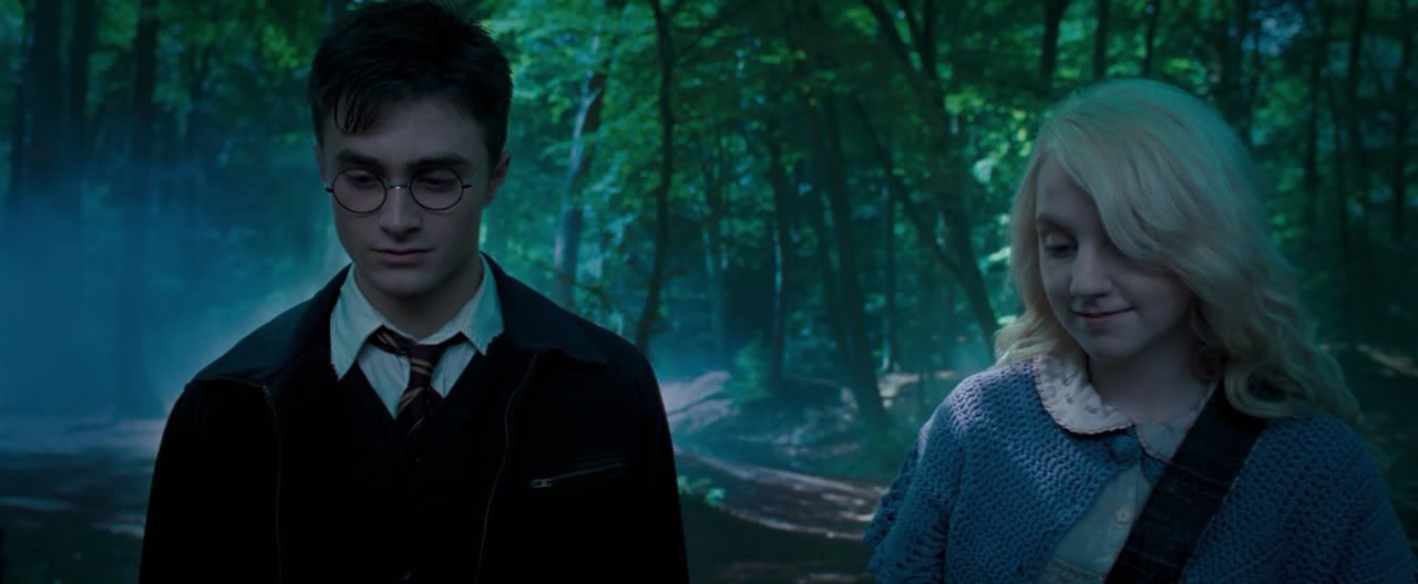
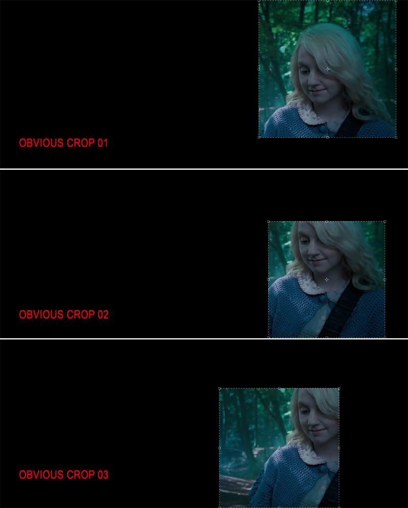
Let's take this Order of the Phoenix screencap (courtesy of Fez at HarryandGinny.org) for example. The first thing I ask myself before I crop my picture is "What do I want the subject of my icon to be?". Once I have picked a clear subject, in this case, Luna (and not Harry) then I try the more obvious crops, which would be the following (in my opinion):
>>> Obvious crops with Miss Lovegood
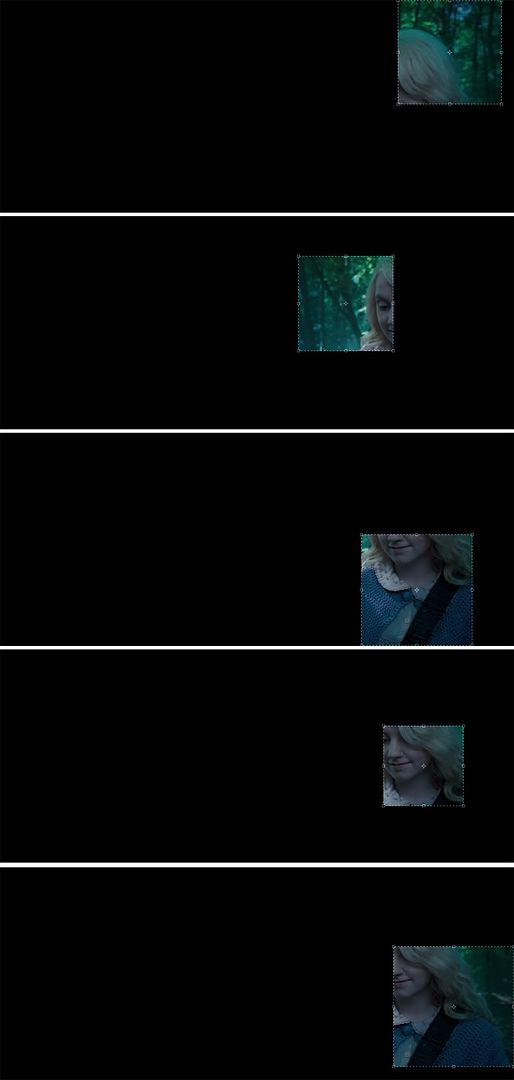
So then I go for the more dramatic ones. As I said, I'm not brave enough to be a good dramatic cropper; so these are the crops I've tried next:
>>> Dramatic crops with Luna Lovegood.
They are not too much over-the-top, except maybe the first one in which you can't really see anything but hair. The important thing with these crops is that while being original, they must be clear on the subject: you have to be able to know what the subject is (and preferably who, although if you're not a Harry Potter fan and have not seen the movies, then it doesn't matter what the crop is like, you won't recognize the character either way).
It has happened to me more than once that I have had to sit and stare at an icon for 10 minutes because I couldn't for the life of me make out what the icon was picturing (is it a hand? A foot? A bald guy?)! In this case I have chosen the last crop, although I like the others as well. I think the last one will work better for me and will look better as a 100 x 100 square. But as I said before, there's no accounting for taste and most of you would have probably chosen a different crop ;)
Here is how the last crop looks as an icon after I'm done with it: Finished Icon
>>> And here are a few more examples of my (attempted) dramatic crops.
The Center Crop
As much as I love my dramatic crops, I am also very fond of a good old center crop. I know it's not original and it's not "fresh" but I do think that it can be very beautiful when it's done right. My personal rules for using this crop are these: it must feature the profile or the front of the subject's head preferably and the background must be very appealing: it can be lots of things, from a neutral grey backrgound in a promo (which can be tweaked later and made to look pink or something), to a beautiful landscape with clouds and grass. Here are a few examples in which I think the center crop works:
>>> See here some examples of the center crop.
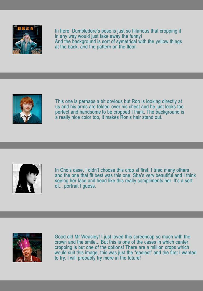
The Cheated Crop
Wow, I am really great an naming things aren't I? Lol!
Well the cheated crop is what I call an icon in which I have to manipulate the image in order to make the crop that I want. It usually implies putting characters together (because in the original picture they were too far apart and didn't fit in the icon), and most times it means creating a new background or enlarging the existing one. It's a bit hard to explain like this so I think it best if you just check the examples I made.
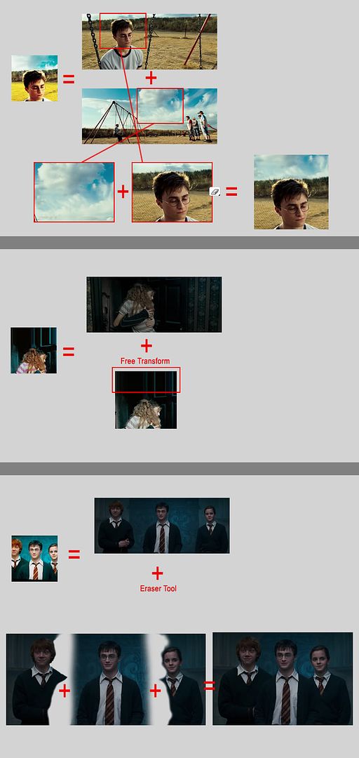
>>> See here three examples of cheated crops
As you can see, in the first example I liked the center crop but the screencap didn't show the sky, which is a pity. So I took some sky from the second screencap and just blended it. As easy as that!
In the second example, again I wanted to have a bit more background on the upper part of the icon so I used the Single Row Marquee Tool, selected it on the upper part of the icon, hit Ctrl + T and then just expanded it upwards! You can't always do this of course, only when the base is a regular pattern, or vertical lines like in this case.
And in the third icon I just cut the three kids into three layers, blended them closer and cropped them to make the icon. As you can see it's pretty easy and the result is always nice (if it's properly done, I imagine it wouldn't look so good if you could see the parts that were manipulated together).
So, there you have it. That's pretty much all I can think of about making icons. Of course there is more to icon making, such as textures and brushes, but I haven't used a brush on any of my icons in a long time, and I do use textures sometimes but not nearly as much as I did before. There is also text obviously, but I'm rubbish at it so I wouldn't be of much help there Lol!
I'll finish with a bit of advice though: don't take icons seriously! They're just little squares of fun Lol!