#19. Tut, tut!
Tutorial requested by ea_missalice

to
Program: Adobe Photoshop CS3
Tools:
- Curves
- Color Balance
- Gradient and color fill
- Brightness/Contrast
Texture:

By cielo_gris @ velvetb0x
Steps: 16
Layer order: Provided
STEP 1: resize and crop
I'm used to work on 100x100 canvases because I find it easier to create good icons and to make sure the captures will work fine on one. So the first thing I always do is copy and paste the screen capture on the icon canvas. Then I resize the capture (Ctrl+T) and play around with it a little bit to find a suitable crop.
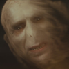
I came up with the size and crop below. As you can see it is not interesting at all, it's boring and all the focus of the icon is in the center. We will solve this a few steps forward, so don't worry.
STEP 2: Curves
The icon is supposed to be orange following the rules of 20inspirations round #6. From now on we will be working on layers that help us to achieve that purpose.
Like almost every screen cap, this one is too dark. To add some more light to captures I always use Curves because I find it really useful to control the power of colors and light.
Layer > New Adjustment Layer > Curves
RGB:
First point: Input - 37 Output - 48
Second point: Input - 104 Output - 168
RED:
Input - 255 Output - 255
GREEN:
Input - 255 Output - 255
BLUE:
Input - 191 Output - 195
It should look like THIS.
STEP 3: Color Balance
This layer will add more orange and contrast to the icon.
Layer > New Adjustment Layer > Color Balance
Midtones: +5, +3, -9
Shadows: -12, -9, +1
Highlights: +1, -5, +5
STEP 4: Composition
I wanted to try something more complex because the crop as it was, wasn't enough.
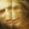
Create a new layer (Mayus + Ctrl + N), apply the image on it (Image > Apply) and then moved this layer to the left.
It wasn't looking good so I decided to erase a little bit more than a half of the capture. After that I placed the new layer just next to the eye of the base to make visible Voldy's eye.
To make softer the cut between the two images, select the right side of the duplicated base. Go to: Filter > Blur > Gaussian Blur. Don't make the radius be over 1.4 pixels.
This is how your icon should look like:
STEP 5: Gradient fill
To add more contrast to the icon I created black and white gradient.
Layer >New Fill Layer > Gradient
Select a black and white gradient, with lineal style and a 90º angle. Set it to soft light 100% opacity.
As you can see the upper side of the icon looks brighter than the lower one, that should be darker because of the effect of the gradient.
From this layer on, I focused on the orange coloring that I wanted the icon to have for the challenge, but still tried to take care of the contrast and light.
STEP 6: Color fill
We're going to add some more orange to the icon using a Color Fill layer.
Layer >New Fill Layer > Full Color
I chose #df9d35 that is not a very powerful orange but it adds the necessary touch of color that the screen cap needs.
Set it to soft light. 60% opacity.
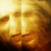
The icon so far should look like this:
STEP 7: Color Balance
In this step we are adding more contrast in the darkest parts of the icon and we are making the orange look darker too.
Layer > New Adjustment Layer > Color Balance
Midtones: -9, -7, +2
Shadows: -3, -10, +8
Highlights: +3, -5, 0
STEP 8: Color Fill
Step seven makes the icon lose its orange touch so I added a new color fill layer to bring that out again. I also tried the color of the result of the last step to be softer.
Layer > New Fill Layer > Full Color
I chose #c8b147 (a soft yellow) and set the layer to soft light, 30% opacity.
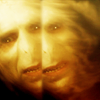
After this step the icon should look like this:
STEP 9: Gradient Fill
We're adding more orange since the icon doesn't looked orange enough for me and the result I wanted to achieve.
Layer >New Fill Layer > Gradient
Chose THIS ONE and set it to soft light, 22% opacity.
It brings out some red and a way more powerful orange.
STEP 10: Gaussian Blur
Here, we are going to add more contrast using a gaussian blur layer.
Create a new layer (Mayus + Ctrl + N), apply the image on it (Image > Apply).
Then go to Filter > Blur > Gaussian Blur. You won't need to change any setting because you should have them saved because we used Gaussian Blur some steps before. Click OK and set the layer to soft light, 15% opacity.
Yellows pop out and the black parts of the icon become more powerful.
STEP 11: Gradient fill
This layer adds atmosphere to the icon and intensifies the colors.
Layer >New Fill Layer > Gradient
Select a black and white gradient, lineal style and a 90º angle. Set it to soft light, 75% opacity.
STEP 12: Sharpening
The icon looks too blurry. To solve this all we have to do is sharpen it a little bit.
Create a new layer (Mayus + Ctrl + N), apply the image on it (Image > Apply).
Filter > Sharpen > Sharpen
Lower the opacity of this layer set to normal to 80%.
This should be your result:

STEP 13: Texture
It's time to use the texture.
Copy and paste it on the icon, place it where the two base layers are split and set it to Screen, 100% opacity.
Duplicate the texture and lower the opacity to 28%.
You can erase some parts of the texture copy if it is making the icon look too white.
STEP 14: Brightness/Contrast
To get back to the contrast that the icon had before using the texture I used a Brightness/Contrast layer that brings out the color again.
Brightness: +8
Contrast: +9
STEP 15&16: Color Fill+Gaussian Blur
Blacks are too dark so I used a Color fill layer and a Gaussian Blur layer to lower their power.
15: Layer >New Fill Layer > Full Color
#2f2f2f set to Lighten, 30% opacity makes the darkest parts of the icon become a dark grey that unifies the color tone of the icon.
16: Create a new layer (Mayus + Ctrl + N), apply the image on it (Image > Apply).
Filter > Blur > Gaussian Blur
Set the layer to soft light, 25% opacity.
And we're done! This is the final result after that insane amount of layers:

LAYER ORDER
My English is not perfect but I tried to explain myself the best I could and it's been ages since the last time I wrote a tutorial. If you don't understand any step let me know, please.
I hope you enjoy and find this tutorial useful.
I'll be back soon with tutorials for the two icons below and a new batch:


You can make your own requests HERE if you are interested. I will be very pleased to help.

to

Program: Adobe Photoshop CS3
Tools:
- Curves
- Color Balance
- Gradient and color fill
- Brightness/Contrast
Texture:

By cielo_gris @ velvetb0x
Steps: 16
Layer order: Provided
STEP 1: resize and crop
I'm used to work on 100x100 canvases because I find it easier to create good icons and to make sure the captures will work fine on one. So the first thing I always do is copy and paste the screen capture on the icon canvas. Then I resize the capture (Ctrl+T) and play around with it a little bit to find a suitable crop.
I came up with the size and crop below. As you can see it is not interesting at all, it's boring and all the focus of the icon is in the center. We will solve this a few steps forward, so don't worry.

STEP 2: Curves
The icon is supposed to be orange following the rules of 20inspirations round #6. From now on we will be working on layers that help us to achieve that purpose.
Like almost every screen cap, this one is too dark. To add some more light to captures I always use Curves because I find it really useful to control the power of colors and light.
Layer > New Adjustment Layer > Curves
RGB:
First point: Input - 37 Output - 48
Second point: Input - 104 Output - 168
RED:
Input - 255 Output - 255
GREEN:
Input - 255 Output - 255
BLUE:
Input - 191 Output - 195
It should look like THIS.
STEP 3: Color Balance
This layer will add more orange and contrast to the icon.
Layer > New Adjustment Layer > Color Balance
Midtones: +5, +3, -9
Shadows: -12, -9, +1
Highlights: +1, -5, +5
STEP 4: Composition
I wanted to try something more complex because the crop as it was, wasn't enough.
Create a new layer (Mayus + Ctrl + N), apply the image on it (Image > Apply) and then moved this layer to the left.
It wasn't looking good so I decided to erase a little bit more than a half of the capture. After that I placed the new layer just next to the eye of the base to make visible Voldy's eye.
To make softer the cut between the two images, select the right side of the duplicated base. Go to: Filter > Blur > Gaussian Blur. Don't make the radius be over 1.4 pixels.
This is how your icon should look like:

STEP 5: Gradient fill
To add more contrast to the icon I created black and white gradient.
Layer >New Fill Layer > Gradient
Select a black and white gradient, with lineal style and a 90º angle. Set it to soft light 100% opacity.
As you can see the upper side of the icon looks brighter than the lower one, that should be darker because of the effect of the gradient.
From this layer on, I focused on the orange coloring that I wanted the icon to have for the challenge, but still tried to take care of the contrast and light.
STEP 6: Color fill
We're going to add some more orange to the icon using a Color Fill layer.
Layer >New Fill Layer > Full Color
I chose #df9d35 that is not a very powerful orange but it adds the necessary touch of color that the screen cap needs.
Set it to soft light. 60% opacity.
The icon so far should look like this:

STEP 7: Color Balance
In this step we are adding more contrast in the darkest parts of the icon and we are making the orange look darker too.
Layer > New Adjustment Layer > Color Balance
Midtones: -9, -7, +2
Shadows: -3, -10, +8
Highlights: +3, -5, 0
STEP 8: Color Fill
Step seven makes the icon lose its orange touch so I added a new color fill layer to bring that out again. I also tried the color of the result of the last step to be softer.
Layer > New Fill Layer > Full Color
I chose #c8b147 (a soft yellow) and set the layer to soft light, 30% opacity.
After this step the icon should look like this:

STEP 9: Gradient Fill
We're adding more orange since the icon doesn't looked orange enough for me and the result I wanted to achieve.
Layer >New Fill Layer > Gradient
Chose THIS ONE and set it to soft light, 22% opacity.
It brings out some red and a way more powerful orange.
STEP 10: Gaussian Blur
Here, we are going to add more contrast using a gaussian blur layer.
Create a new layer (Mayus + Ctrl + N), apply the image on it (Image > Apply).
Then go to Filter > Blur > Gaussian Blur. You won't need to change any setting because you should have them saved because we used Gaussian Blur some steps before. Click OK and set the layer to soft light, 15% opacity.
Yellows pop out and the black parts of the icon become more powerful.
STEP 11: Gradient fill
This layer adds atmosphere to the icon and intensifies the colors.
Layer >New Fill Layer > Gradient
Select a black and white gradient, lineal style and a 90º angle. Set it to soft light, 75% opacity.
STEP 12: Sharpening
The icon looks too blurry. To solve this all we have to do is sharpen it a little bit.
Create a new layer (Mayus + Ctrl + N), apply the image on it (Image > Apply).
Filter > Sharpen > Sharpen
Lower the opacity of this layer set to normal to 80%.
This should be your result:

STEP 13: Texture
It's time to use the texture.
Copy and paste it on the icon, place it where the two base layers are split and set it to Screen, 100% opacity.
Duplicate the texture and lower the opacity to 28%.
You can erase some parts of the texture copy if it is making the icon look too white.
STEP 14: Brightness/Contrast
To get back to the contrast that the icon had before using the texture I used a Brightness/Contrast layer that brings out the color again.
Brightness: +8
Contrast: +9
STEP 15&16: Color Fill+Gaussian Blur
Blacks are too dark so I used a Color fill layer and a Gaussian Blur layer to lower their power.
15: Layer >New Fill Layer > Full Color
#2f2f2f set to Lighten, 30% opacity makes the darkest parts of the icon become a dark grey that unifies the color tone of the icon.
16: Create a new layer (Mayus + Ctrl + N), apply the image on it (Image > Apply).
Filter > Blur > Gaussian Blur
Set the layer to soft light, 25% opacity.
And we're done! This is the final result after that insane amount of layers:

LAYER ORDER
My English is not perfect but I tried to explain myself the best I could and it's been ages since the last time I wrote a tutorial. If you don't understand any step let me know, please.
I hope you enjoy and find this tutorial useful.
I'll be back soon with tutorials for the two icons below and a new batch:


You can make your own requests HERE if you are interested. I will be very pleased to help.