Tutorial
fight_luser asked me to do a tutorial of an icon I made so I said "Sure why not? It's not everyday I have people asking me to do a tutorial for them."
From this:
To this:

In Paint Shop Pro Photo X2. I'm sure it's translatable for other programs.
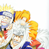
1. Start with this base:
2. Duplicate the image (Layers--> Duplicate). Set the layer to Multiply 100%
3. Duplicate the background copy again. Set this layer to Soft Light 100%
4. Merge all the layers. (Layers--> Merge--> Merge All)
5. Add a new Raster Layer. (Layers--> New Raster Layer). Set the mode to Soft Light 75%)
6. Fill the Raster Layer with 128, 128, 255 (#8080ff). Merge this layer down.
7. To adjust hue, saturation, and lightness we go to Adjust--> Hue and Saturation--> Hue/Saturation/Lightness.
8. In the window that pops up I have in Master: Hue:0, Saturation: 40, Lightness:5
9. Copy and Paste (as a new layer) this texture:
by xxaibaxl0v3xx onto the icon.
10. Set the texture to Screen 80%. Move it around until you like how it looks. I moved it just a little to focus around Naruto's hand and face.
11. Open a new image at 100x15 pixels and fill it with 219, 219, 219(#dbdbdb). Copy and paste it on the icon.
12. Use the Straighten Tool and angle the gray box at about 345. Move it until it looks right. Then merge it down.
13. For the font I used Andalus in font size 11. For the color of the font I used 28, 60, 125(#1c3c7d).
14. Type in the first line of text and then rotate it till it fits the gray box. I left the top part of the text outside the box on purpose. Merge that text box down. Then repeat for the second line of text.
Now you're done!
Note: This is as close to the original icon I made as I possibly could. So I'm sorry if it's not exact but I generally did the same methods.
From this:

To this:

In Paint Shop Pro Photo X2. I'm sure it's translatable for other programs.
1. Start with this base:
2. Duplicate the image (Layers--> Duplicate). Set the layer to Multiply 100%
3. Duplicate the background copy again. Set this layer to Soft Light 100%
4. Merge all the layers. (Layers--> Merge--> Merge All)
5. Add a new Raster Layer. (Layers--> New Raster Layer). Set the mode to Soft Light 75%)
6. Fill the Raster Layer with 128, 128, 255 (#8080ff). Merge this layer down.
7. To adjust hue, saturation, and lightness we go to Adjust--> Hue and Saturation--> Hue/Saturation/Lightness.
8. In the window that pops up I have in Master: Hue:0, Saturation: 40, Lightness:5
9. Copy and Paste (as a new layer) this texture:

by xxaibaxl0v3xx onto the icon.
10. Set the texture to Screen 80%. Move it around until you like how it looks. I moved it just a little to focus around Naruto's hand and face.
11. Open a new image at 100x15 pixels and fill it with 219, 219, 219(#dbdbdb). Copy and paste it on the icon.
12. Use the Straighten Tool and angle the gray box at about 345. Move it until it looks right. Then merge it down.
13. For the font I used Andalus in font size 11. For the color of the font I used 28, 60, 125(#1c3c7d).
14. Type in the first line of text and then rotate it till it fits the gray box. I left the top part of the text outside the box on purpose. Merge that text box down. Then repeat for the second line of text.
Now you're done!
Note: This is as close to the original icon I made as I possibly could. So I'm sorry if it's not exact but I generally did the same methods.