assignment 4: save, prevent, kill...
this assignment was to produce an A3 sized poster that would effectively convey its theme. the theme is meant to be influential (read: influence ppl to take some sort of action) and i did mine on genocide, after much consideration. the others on my list of finalists for my theme were: save electricity (boring), save the trees (also boring), stop domestic violence (too complicated).
genocide wasn't exactly a very simple theme either, but i feel very strongly about it so i went with it. i'm not so sure i love what i've come up with, but let me know ur comments! (that is, if anyone reads this blog... hahahaha)
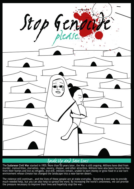
basically, what i envisioned was a woman carrying her baby or a kid sister carrying a younger brother in front of a landscape full of refugee camp makeshift houses. i wanted specifically, a high emotional appeal, so i researched on the refugees and their conditions, and it was not difficult to find such photos for reference, especially with the woman appearing sad, forlorn or despondent. i also wanted a landscape of makeshift houses to reflect on the lacking conditions that the refugees have to live with every single day. of course, as you can see, i was not able to successfully capture the real lack of hygiene, gloom etc of real refugee camps, but the point is not to be too distracting with details anyway. i purposely wanted it to be black and white, so that the blood splatter would stand out and convey the impact of the words "genocide" and "please". i use two other colours besides black and white, which were red, obviously there's no other colour for blood, and aqua, which, as martha stewart has frequently pointed out, quite a harmonious pair of colours, to soften the morbidity of the blood, and of course, stand out from the black.
much research was also done on the sudanese civil war, so i could write a solid copy on that. i wanted to stay as true to the topic as possible, and also, the research was what made me decide that genocide was the theme i wanted. we all know that there is global warming, shortage of fuel, etc etc, but we live side by side with genocide, and we also KNOW it happens, but it's just there, part of our everyday subconscious, and yet we do less about it than the other abovementioned issues.
use of principles:
contrast: use of black and white, and then aqua and red to stand out from the monochrome colour scheme. the most striking colour is red, so i placed the blood next to the title to purposely grab the attention of the onlooker first and foremost. with so many details in the poster, the minimal use of colours also contribute to the flow of attention.
alignment of text & balance: the title was placed in a centralised position because i wanted the impact to be straight on. at the same time, i put the additional information at the bottom to balance out with the title at the top.
controlling flow of attention: the parts that i wanted attention to be directed to (ie. the text) were contrasted with the monochrome scheme by highlighting them with aqua and red. the "please" in aqua is also meant to convey a softer, pleading tone.
use of fonts: i actually downloaded about 8 fonts for the title itself, and came to the conclusion that what i ended up using was optimal because it was sharp and also slightly slanting, to give it that impactful and yet soft emotional appeal. for the additional info, i used a sans serif font for easy reading.
use of frame: i used the border to control attention and concentrate it to within the border.
genocide wasn't exactly a very simple theme either, but i feel very strongly about it so i went with it. i'm not so sure i love what i've come up with, but let me know ur comments! (that is, if anyone reads this blog... hahahaha)
basically, what i envisioned was a woman carrying her baby or a kid sister carrying a younger brother in front of a landscape full of refugee camp makeshift houses. i wanted specifically, a high emotional appeal, so i researched on the refugees and their conditions, and it was not difficult to find such photos for reference, especially with the woman appearing sad, forlorn or despondent. i also wanted a landscape of makeshift houses to reflect on the lacking conditions that the refugees have to live with every single day. of course, as you can see, i was not able to successfully capture the real lack of hygiene, gloom etc of real refugee camps, but the point is not to be too distracting with details anyway. i purposely wanted it to be black and white, so that the blood splatter would stand out and convey the impact of the words "genocide" and "please". i use two other colours besides black and white, which were red, obviously there's no other colour for blood, and aqua, which, as martha stewart has frequently pointed out, quite a harmonious pair of colours, to soften the morbidity of the blood, and of course, stand out from the black.
much research was also done on the sudanese civil war, so i could write a solid copy on that. i wanted to stay as true to the topic as possible, and also, the research was what made me decide that genocide was the theme i wanted. we all know that there is global warming, shortage of fuel, etc etc, but we live side by side with genocide, and we also KNOW it happens, but it's just there, part of our everyday subconscious, and yet we do less about it than the other abovementioned issues.
use of principles:
contrast: use of black and white, and then aqua and red to stand out from the monochrome colour scheme. the most striking colour is red, so i placed the blood next to the title to purposely grab the attention of the onlooker first and foremost. with so many details in the poster, the minimal use of colours also contribute to the flow of attention.
alignment of text & balance: the title was placed in a centralised position because i wanted the impact to be straight on. at the same time, i put the additional information at the bottom to balance out with the title at the top.
controlling flow of attention: the parts that i wanted attention to be directed to (ie. the text) were contrasted with the monochrome scheme by highlighting them with aqua and red. the "please" in aqua is also meant to convey a softer, pleading tone.
use of fonts: i actually downloaded about 8 fonts for the title itself, and came to the conclusion that what i ended up using was optimal because it was sharp and also slightly slanting, to give it that impactful and yet soft emotional appeal. for the additional info, i used a sans serif font for easy reading.
use of frame: i used the border to control attention and concentrate it to within the border.