Round 3 Challenge 10 Results
we really should start pimping the vote more, more votes are better than less, right? I don't know, I'm awake at 7 AM on Saturday...as with all lims, sadly, we must say farewell to another icon-maker.
Eliminated with -4 votes:
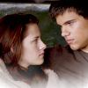


by phantomberkanna
I'm so sorry to see you go, hun!
People's Choice tie with +2 votes:
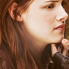


by good_memories and
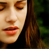

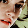
by blue_emotion
tallies:
Circle: -4 = -4
Square: +3 / -1 = +2
Triangle: +1 / -1
Rectangle: +2
Needs Improvement:
Circle:
Circle - The icons are a bit too dark and they need to be sharpened.
Circle: icons 1 & 3 could do with a little more contrast
circle, over all the icons are quite dull - they lask interesting colouring or editing. The last icon washes out the image alltogether, while I like the crop on the firstm the texture seems random + too bright.
Circle - the overall colouring seems flat/dull, and in icon two she seems to have demon-eyes
Square:
square...the first icon could be cropped better, second and third are really nice.
Triangle:
Triangle - Some of the icons are pixilated and blurry.
Faboo:
Square:
Square - Great colouring on all the icons.
square - crisp colours + beautiful crops
Square - Nicely cropped icons.
Triangle:
Triangle: interesting cropping on all icons, and icon 2 is stunning!
Rectangle:
Rectangle - love the soft coloring and crops
rectangle...simple, with nice coloring
Eliminated with -4 votes:
by phantomberkanna
I'm so sorry to see you go, hun!
People's Choice tie with +2 votes:


by good_memories and
by blue_emotion
tallies:
Circle: -4 = -4
Square: +3 / -1 = +2
Triangle: +1 / -1
Rectangle: +2
Needs Improvement:
Circle:
Circle - The icons are a bit too dark and they need to be sharpened.
Circle: icons 1 & 3 could do with a little more contrast
circle, over all the icons are quite dull - they lask interesting colouring or editing. The last icon washes out the image alltogether, while I like the crop on the firstm the texture seems random + too bright.
Circle - the overall colouring seems flat/dull, and in icon two she seems to have demon-eyes
Square:
square...the first icon could be cropped better, second and third are really nice.
Triangle:
Triangle - Some of the icons are pixilated and blurry.
Faboo:
Square:
Square - Great colouring on all the icons.
square - crisp colours + beautiful crops
Square - Nicely cropped icons.
Triangle:
Triangle: interesting cropping on all icons, and icon 2 is stunning!
Rectangle:
Rectangle - love the soft coloring and crops
rectangle...simple, with nice coloring