Round 3 Challenge 9 Results
we could have used some more votes this week, but enough to post the results.
Eliminated with -7 votes:
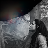
by sweetnessarose
Sorry to see you go hun!
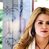
People's Choice with +4:
by good_memories
tallies:
1 & 4: +5 / -1 = +4
2 & 3: +4 / -3 = +1
3 & 2: +5 / -2 = +3
4 & 1: -8 = -8
Needs Improvement:
1 & 4:
001- Emmett and Rosalie look a little too saturated.
2 & 3:
002, icon is very oversharpened
003 - great crop but icon is very oversharped
2 - the icon is a little sharp
3 & 2:
02 - The icon is too dark and it has too much contrast.
002- Oversaturated.
4 & 1:
04 - The icon is a bit too dark.
1 - the icon could use a little more contrast
4 crop is a bit off, cutting her one eye in half
04-Nice cropping but the initials detract from the icon slightly
1 texture totally overpowers the icon
01-The black and white is nice, but the light texture is a bit out of place
04: the ornament in the background doesn't compliment the rest of the picture
01: the black splotch on the top seems out of place and overall the icon seems a bit dark.
Faboo:
1 & 4:
004 - great tones
1 - nice soft coloring
4 - nicely cropped and colored
1 simple, nice color
4 very pretty coloring
2 & 3:
03 - Great cropping
003- I love the coloring
3 & 2:
03 - Great colouring
003, brilliant composition
003- I really like the choice of texture on the bottom.
03-Gorgeous! Nice use of textures and colours
02-Rich colouring
Eliminated with -7 votes:
by sweetnessarose
Sorry to see you go hun!
People's Choice with +4:
by good_memories
tallies:
1 & 4: +5 / -1 = +4
2 & 3: +4 / -3 = +1
3 & 2: +5 / -2 = +3
4 & 1: -8 = -8
Needs Improvement:
1 & 4:
001- Emmett and Rosalie look a little too saturated.
2 & 3:
002, icon is very oversharpened
003 - great crop but icon is very oversharped
2 - the icon is a little sharp
3 & 2:
02 - The icon is too dark and it has too much contrast.
002- Oversaturated.
4 & 1:
04 - The icon is a bit too dark.
1 - the icon could use a little more contrast
4 crop is a bit off, cutting her one eye in half
04-Nice cropping but the initials detract from the icon slightly
1 texture totally overpowers the icon
01-The black and white is nice, but the light texture is a bit out of place
04: the ornament in the background doesn't compliment the rest of the picture
01: the black splotch on the top seems out of place and overall the icon seems a bit dark.
Faboo:
1 & 4:
004 - great tones
1 - nice soft coloring
4 - nicely cropped and colored
1 simple, nice color
4 very pretty coloring
2 & 3:
03 - Great cropping
003- I love the coloring
3 & 2:
03 - Great colouring
003, brilliant composition
003- I really like the choice of texture on the bottom.
03-Gorgeous! Nice use of textures and colours
02-Rich colouring