Round 2 Challenge 10 Results
The voting was all over the place this week, but this is as close to clear-cut as I can get them, while still asking for extra votes...with so many good icon-makers now...
Eliminated with -2 votes:


by blue_emotion
I'm really sorry to see you go, hun! I hope you continue to vote!
People's Choice with +3:


by poker_boy
tallies:
Red: +2 / -2 = 0
Yellow: +1 / -1 = 0
Blue: +3 / +3
Green: +2 / -3 = -1
Purple: -2
Needs Improvement:
Red:
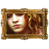
Red: Although icons 02, and 03 are nice I chose this set because 01 looks like there hadn't been done a lot with the coloring or anything else.
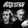
Red - I can respect the attempt at originality of icon 3 but the execution just isn't completely there. As for icon 1 the negative space is very overwhelming and ends up drowning out the icon.
Yellow:
yellow: Hermione in the first icon is very elongated, it's important to make sure the proportion is kept at the correct ratio. In the third icon, the cut-out of Hermione is a little too obvious, perhaps it could have used a blur tool on the side of her hair.
Green:
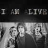
green: the two first icons have a very similar coloring and texture use and it doesn't look amazing. 01 has too much blue in it, and the use of textures doesn't work well (they don't drive attention to the subject). 02 is oversharpened and would look prettier without the text texture. 02 has a very lovely coloring. 03 is very very pretty and i think it's cute to show hoe harry and ron grow up.
Green: The blue textures are a bit too bright and draw my focus away from the images
Green. Overall the colour is amazing but the icons are very sharp + the textures overpowering. The light blob on 3 would look better blend in more + the text textures on 1 + 2 while looking ok, would probably look better lighter or completely not there on 1.
Purple:
Purple- The large border around 01 takes away from the simplicity and emotion of the image. The text, specifically the alive part, on 02 is kinda hard to read.
purple,
the picture frame on the first icon is pretty, but it doesn't work with the chosen crop/cap.
Faboo:
Red:
Red:Really nice icons, all three have stunning use of textures and cropping
Yellow:
Yellow - while the cut out job on 1 is a bit poor (on her face) the chosen blend on 3 is amazing. Overall the colour + feel of the icons is warm + beautiful.
Blue:
blue (hm, can i just say one thing? the icon maker could try variate the font of choice, it'd add so much to the set!)
blue: I don't know if I have to have a reason for this, but I'll give it anyway. ;-) I love the use of text, especially in the second and third icons. The subtle use of a texture at the bottom of the second icon is nice too.
Blue - Really nice use of text and some unique and pleasant cropping. The text in icon two along with the cut is especially enjoyable and incredibly fitting.
Green:
Green Overall I love the coloring on all the icons especially the blue in 01 and the brownish coloring in 03.
Green: I like the blueish coloring of 01, the bright colors and the cropping of 02, and the whole idea of 03, those caps that were used fit together very well :)
Eliminated with -2 votes:
by blue_emotion
I'm really sorry to see you go, hun! I hope you continue to vote!
People's Choice with +3:


by poker_boy
tallies:
Red: +2 / -2 = 0
Yellow: +1 / -1 = 0
Blue: +3 / +3
Green: +2 / -3 = -1
Purple: -2
Needs Improvement:
Red:
Red: Although icons 02, and 03 are nice I chose this set because 01 looks like there hadn't been done a lot with the coloring or anything else.
Red - I can respect the attempt at originality of icon 3 but the execution just isn't completely there. As for icon 1 the negative space is very overwhelming and ends up drowning out the icon.
Yellow:
yellow: Hermione in the first icon is very elongated, it's important to make sure the proportion is kept at the correct ratio. In the third icon, the cut-out of Hermione is a little too obvious, perhaps it could have used a blur tool on the side of her hair.
Green:
green: the two first icons have a very similar coloring and texture use and it doesn't look amazing. 01 has too much blue in it, and the use of textures doesn't work well (they don't drive attention to the subject). 02 is oversharpened and would look prettier without the text texture. 02 has a very lovely coloring. 03 is very very pretty and i think it's cute to show hoe harry and ron grow up.
Green: The blue textures are a bit too bright and draw my focus away from the images
Green. Overall the colour is amazing but the icons are very sharp + the textures overpowering. The light blob on 3 would look better blend in more + the text textures on 1 + 2 while looking ok, would probably look better lighter or completely not there on 1.
Purple:
Purple- The large border around 01 takes away from the simplicity and emotion of the image. The text, specifically the alive part, on 02 is kinda hard to read.
purple,
the picture frame on the first icon is pretty, but it doesn't work with the chosen crop/cap.
Faboo:
Red:
Red:Really nice icons, all three have stunning use of textures and cropping
Yellow:
Yellow - while the cut out job on 1 is a bit poor (on her face) the chosen blend on 3 is amazing. Overall the colour + feel of the icons is warm + beautiful.
Blue:
blue (hm, can i just say one thing? the icon maker could try variate the font of choice, it'd add so much to the set!)
blue: I don't know if I have to have a reason for this, but I'll give it anyway. ;-) I love the use of text, especially in the second and third icons. The subtle use of a texture at the bottom of the second icon is nice too.
Blue - Really nice use of text and some unique and pleasant cropping. The text in icon two along with the cut is especially enjoyable and incredibly fitting.
Green:
Green Overall I love the coloring on all the icons especially the blue in 01 and the brownish coloring in 03.
Green: I like the blueish coloring of 01, the bright colors and the cropping of 02, and the whole idea of 03, those caps that were used fit together very well :)