Round 2 Challenge 8 Results
Unfortunately we have to say farewell to another fab icon-maker:
Eliminated with -6 votes:
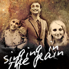
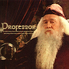
by mlledefer
I'm sorry to see you go, hun!
There was a three-way tie for People's Choice with +2 votes:
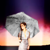
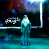
by shorecallssea and


by miss_half_way and
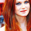

by blue_emotion
tallies:
Icons 4 & 8: -6 = -6
Icons 8 & 3: +2 = +2
Icons 2 & 5: +2 / -1 = +1
Icons 6 & 1: +1 = +1
Icons 3 & 4: +1 / -1 = 0
Icons 5 & 7: +3 / -1 = +2
Icons 7 & 2: +2 = +2
Icons 1 & 9: +1 / -2 = -1
Icons 9 & 6: +2 / -3 = -1
Needs Improvement:
Icons 4 & 8:
008 - Text doesn't seem to fit, coloring is off
4: I love the idea behind it, but the texture used is too overwhelming
#004 - You can barely recognize the people and I can´t tell what the text says. It´s also a bit over-sharpened.
04-the images are a bit grainy, and the font doesn't really fit
8- the dots under the font detract from the icon
004 - cute idea but the grouping doesn't work and texture use is too "grungy" looking.
Icons 2 & 5:
005 - it's too blurry, some contrast and\or sharpening could improve this icon
Icons 3 & 4:
004 akward crop + the texture used seems out of place
Icons 5 & 7:
#007 - I can´t really tell why but I think it is the sharpness of the icon that makes Dumbledore look like an action figure. And the negative space does not work that well on the icon.
Icons 1 & 9:
09: I know this was probably hard to color, but Dumbledore is still waaaay too green.
009 - Too blue, I'm sure the original image had the bluish tint but maybe the icon would've worked better as b&w
Icons 9 & 6:
009 - the coloring is too distracting
009 - Texture overpowers the icon, can't really tell who the subject of the icon is
009 the texture is overpowering + doesn't compliment the image
Faboo:
Icons 2 & 5:
002 - simple and good
002 - wonderful composition, simple yet beautiful.
Icons 7 & 2:
002 - great crop!
002 - good cropping
Icons 3 & 4:
003 - Great crop, interesting texture
Icons 5 & 7:
007 - Great use of texture, not too overpowering
#005 - I really like the coloring and the lightning.
Icons 1 & 9:
#009 - I love the style and the coloring
Icons 8 & 3:
008 great cropping
Icons 9 & 6:
006 lovely sharp colours
06-good use of textures
Icons 6 & 1:
06-Nice colouring
Eliminated with -6 votes:
by mlledefer
I'm sorry to see you go, hun!
There was a three-way tie for People's Choice with +2 votes:
by shorecallssea and


by miss_half_way and
by blue_emotion
tallies:
Icons 4 & 8: -6 = -6
Icons 8 & 3: +2 = +2
Icons 2 & 5: +2 / -1 = +1
Icons 6 & 1: +1 = +1
Icons 3 & 4: +1 / -1 = 0
Icons 5 & 7: +3 / -1 = +2
Icons 7 & 2: +2 = +2
Icons 1 & 9: +1 / -2 = -1
Icons 9 & 6: +2 / -3 = -1
Needs Improvement:
Icons 4 & 8:
008 - Text doesn't seem to fit, coloring is off
4: I love the idea behind it, but the texture used is too overwhelming
#004 - You can barely recognize the people and I can´t tell what the text says. It´s also a bit over-sharpened.
04-the images are a bit grainy, and the font doesn't really fit
8- the dots under the font detract from the icon
004 - cute idea but the grouping doesn't work and texture use is too "grungy" looking.
Icons 2 & 5:
005 - it's too blurry, some contrast and\or sharpening could improve this icon
Icons 3 & 4:
004 akward crop + the texture used seems out of place
Icons 5 & 7:
#007 - I can´t really tell why but I think it is the sharpness of the icon that makes Dumbledore look like an action figure. And the negative space does not work that well on the icon.
Icons 1 & 9:
09: I know this was probably hard to color, but Dumbledore is still waaaay too green.
009 - Too blue, I'm sure the original image had the bluish tint but maybe the icon would've worked better as b&w
Icons 9 & 6:
009 - the coloring is too distracting
009 - Texture overpowers the icon, can't really tell who the subject of the icon is
009 the texture is overpowering + doesn't compliment the image
Faboo:
Icons 2 & 5:
002 - simple and good
002 - wonderful composition, simple yet beautiful.
Icons 7 & 2:
002 - great crop!
002 - good cropping
Icons 3 & 4:
003 - Great crop, interesting texture
Icons 5 & 7:
007 - Great use of texture, not too overpowering
#005 - I really like the coloring and the lightning.
Icons 1 & 9:
#009 - I love the style and the coloring
Icons 8 & 3:
008 great cropping
Icons 9 & 6:
006 lovely sharp colours
06-good use of textures
Icons 6 & 1:
06-Nice colouring