LIMS: Challenge #3 Results
We I'd like to thank all our participants this week. We had a really good turnout and lots of votes :) Although we planned to vote off Five Icon Makers there was a three way tie, so only three people have been eliminated this week.
ELIMINATED PARTICIPANTS
truthfull_lies
_staticicons
mana1023

:( We're really sorry to see you guys go!
We also had a tie for the people's choice icon, so this week, we have two :)
FAVES, MODS CHOICES & BEST USE OF THEME
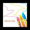
People's Choice 1
abrokenangel
People's Choice 2
deztripping
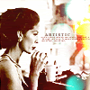
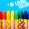
Mod's Choice:
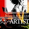
Emma-Jane
goingooo
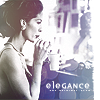
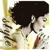
Mod's Choice:
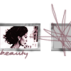
Daphne
monster
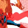
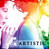
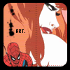
Best use of
theme
lookingatbird

ICONS + VOTING BREAKDOWN
01
02
03
04
05
06
07
08
09
10
11
12
13
14
15
16
17
18
19
20

21
22
23
24
If your icon is not listed below, you did not receive any votes (good or bad)
Bad Votes
02. 4
04. 8
05. 6
06. 1
07. 1
08. 4
09. 1
10. 3
12. 1
13. 2
14. 6
15. 2
16. 9
17. 5
18. 1
19. 6
20. 1
21. 1
22. 2
23. 11
24. 5
Good Votes
01. 1
03. 1
06. 5
09. 5
13. 1
18. 1
21. 1
22. 1
Positive comments
The positive comments don't match the 'good' vote counts, since a lot of people don't comment on their favorite icon, and I'm also listing the 'best use of theme' comments :)
03. This one just caught my eyes with its brilliant creativity.
06. Original cropping and really nice text.
06. The only word I can use to describe it: cute. It has good colouring, and I love the font. The wiggly tiny text lines just complete its look.
06. The cropping, the sideways tilt, the gradient, the adorable little font... what's NOT to love?
09. The colors are incredible, the pic is really well used and it fits the theme perfectly!
09. absolutely amazing. The colors, the brushes, the different modes used just completely work. Beautiful.
09. Stunning!
09. it's very creative, I like the coloring and the use of color
09. Going along with your text I guess, you added a ton of color to your image, and I love it. I would think that the unaturallness of the colors and the complexity of the image would make it really awful looking, but you somehow pulled it off and it just looks vibrant. Congratulations!
09. The colors used, the composition, and the text are all perfect.
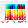
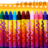
13. It's so original it hurts!
13. Dude. Duh. That's freaking cool.
13. I can't think of anything that suits "creativity" more than what you did with the crayons. A lot of concept pieces don't work out, but yours looks great. Good job!
13. I am in absolute awe of what you did with those crayons!
If you wish to see your comments, please comment in this post with the number of your icon. I will add them in a reply and then delete it, so you have to have email notification to read them. If you don't, please let me know you'd rather receive them by email (and give me your email addy).
Thank you guys for participating, challenge #3 will be posted tomorrow :)