002 Tutorial: Mandy Moore
It's nearly 12:30 am and I'm writing a tutorial. Woot @ Me. Anyhoo, here's a tutorial. Because I like to do things in themes (remember my Carrie tutorial after my Carrie icon post?) this tutorial is to go along side the new 10variations claim I made of Mandy Moore.

TO
I use PSP8, however this is (or should be) transferrable. I do have PS CS (though I don't use it that often), so if you have a questions about transferring it, I should be able to help. If anyone has any questions period, please feel free to ask. I'd love to see what everyone comes up with.
01. Grab your base and prep it. I'm not even going to tell you how I get my bases to be bases because you'll just point and laugh. Just do whatever you're comfortable with. If you'd just like to follow along, feel free to grab mine.
02. Go to ADJUST >> COLOR BALANCE >> COLOR BALANCE. Put in the
following settings. Make sure "Preserve Luminance" is checked.
Midtones: -60, -20, 60
Shadows: -45, -15, 25
Highlights: -15, -15, -20

03. Duplicate your base, and set it to SOFTLIGHT.

04. Make a new layer in between your Soft Light Layer and your Background.
Flood fill it with a Dark Blue (#0E0B35) and set it to Exclusion 70%.

>>
05. Make a new layer. Flood fill it with a Pale Pink (#F8E2EE) and set it to
Soft Light 40%.

>>
06. Make a new layer. Flood fill with a Peach/Beige (#F6E6CE) and set it to
Burn 100%.

>>
.07 Duplicate the Peach Burn layer (it wasn't dark enough for me), and bring the opacity down to 40%.
>>
.08 At this point I think I made it too dark. Select your Soft Lighted
Duplicated Base Layer (third from bottom), and go to ADJUST >> BRIGHTNESS & CONTRAST >> LEVELS. Put in the following settings.
RBG: 0, 1.35, 255
>>
.09 Now, at this point I don't see enough vividness. Everything looks a little faded. So, select your Background Layer and go to ADJUST >> HUE & SATURATION >> HUE/SAT/LIGHTNESS. Put in the following settings.
Saturation: +15
.10 Repeat this step with your Soft Lighted Duplicated Base Layer (third from bottom).
>>
.11 Merge all your layers.
.12 Now, this is just a personal preference. You could stop right here and it'll be fine. However, I have a thing w/ icons not being contrasted enough. So I'm going to go to ADJUST >> BRIGHTNESS/CONTRAST >> BRIGHTNESS/CONTRAST and put in the following settings.
Brightness: -7
Contrast: 7
There isn't a huge difference, but there's a slight one.
>>
And there you have it. Here's another icon made with slight modifications. If you're wondering what the minor adjustments were (since I always do, and wish people would tell me) I'll tell you. Back at step 8, I made the settings 0, 2.0, 255. And at step 12, I made the settings B:0, C: 10.

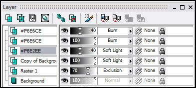
For those that need it, here's my layer palette. It includes all the steps with the exception of step 12, because remember we merged to do that step.
Like I said, if you have any questions because I didn't explain something clearly enough, please please please let me know. Don't forget to fiddle around with the settings so it ends up to your liking. Afterall, each picture and person's preference is different.
TO
I use PSP8, however this is (or should be) transferrable. I do have PS CS (though I don't use it that often), so if you have a questions about transferring it, I should be able to help. If anyone has any questions period, please feel free to ask. I'd love to see what everyone comes up with.
01. Grab your base and prep it. I'm not even going to tell you how I get my bases to be bases because you'll just point and laugh. Just do whatever you're comfortable with. If you'd just like to follow along, feel free to grab mine.
02. Go to ADJUST >> COLOR BALANCE >> COLOR BALANCE. Put in the
following settings. Make sure "Preserve Luminance" is checked.
Midtones: -60, -20, 60
Shadows: -45, -15, 25
Highlights: -15, -15, -20
03. Duplicate your base, and set it to SOFTLIGHT.
04. Make a new layer in between your Soft Light Layer and your Background.
Flood fill it with a Dark Blue (#0E0B35) and set it to Exclusion 70%.
>>
05. Make a new layer. Flood fill it with a Pale Pink (#F8E2EE) and set it to
Soft Light 40%.
>>
06. Make a new layer. Flood fill with a Peach/Beige (#F6E6CE) and set it to
Burn 100%.
>>
.07 Duplicate the Peach Burn layer (it wasn't dark enough for me), and bring the opacity down to 40%.
>>
.08 At this point I think I made it too dark. Select your Soft Lighted
Duplicated Base Layer (third from bottom), and go to ADJUST >> BRIGHTNESS & CONTRAST >> LEVELS. Put in the following settings.
RBG: 0, 1.35, 255
>>
.09 Now, at this point I don't see enough vividness. Everything looks a little faded. So, select your Background Layer and go to ADJUST >> HUE & SATURATION >> HUE/SAT/LIGHTNESS. Put in the following settings.
Saturation: +15
.10 Repeat this step with your Soft Lighted Duplicated Base Layer (third from bottom).
>>
.11 Merge all your layers.
.12 Now, this is just a personal preference. You could stop right here and it'll be fine. However, I have a thing w/ icons not being contrasted enough. So I'm going to go to ADJUST >> BRIGHTNESS/CONTRAST >> BRIGHTNESS/CONTRAST and put in the following settings.
Brightness: -7
Contrast: 7
There isn't a huge difference, but there's a slight one.
>>
And there you have it. Here's another icon made with slight modifications. If you're wondering what the minor adjustments were (since I always do, and wish people would tell me) I'll tell you. Back at step 8, I made the settings 0, 2.0, 255. And at step 12, I made the settings B:0, C: 10.
For those that need it, here's my layer palette. It includes all the steps with the exception of step 12, because remember we merged to do that step.
Like I said, if you have any questions because I didn't explain something clearly enough, please please please let me know. Don't forget to fiddle around with the settings so it ends up to your liking. Afterall, each picture and person's preference is different.