001 Tutorial: Carrie Underwood
I got bored, so here's a tutorial. Features Carrie Underwood, and it's pretty much the format I used for most of the Carrie icons in my latests icon post.
to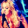
I use PSP8, and while I have PS CS, I wouldn't know if it's transferrable. I figure it would though. If you have any questions, please ask. I'd love to see what everyone comes up with.
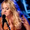
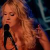
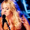
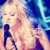
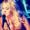
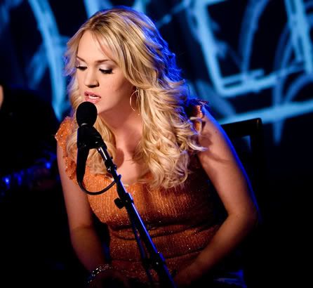
..01 Go ahead and get a base. If you'd like to follow along, just grab mine. Here's the original picture, if you'd like to crop your own base from it.
..02 Don't Sharpen.
..03 New Layer (Layers >> New Raster Layer).
..04 Flood fill with #CA8863. Set to Multiply.

>>
..05 Duplicate the base twice. Bring one of the duplicated bases above the Multiplied layer. Set the one above the multiplied layer to Screen. Set the one below the Multiplied layer (closest to the base), to Soft Light.
It should look like this: (from bottom to top)
Copy of Background 2 (Screen)
Raster 1 #CA8863 (Multiply)
Copy of Background 1 (Soft Light)
Base (Normal)
..06 Make Two new layers (Layers >> Raster Layer).
- Flood fill the first Raster Layer (Raster Layer 2) with #000040 (Dark Blue). Set this to Exclusion.
- Flood fill the second Raster Layer (Raster Layer 3) with #D7F3F7 (Light Blue). Set this to Soft Light.
It should look like this: (from bottom to top)
Raster 3 #D7F3F7 (Soft Light)
Raster 2 #000040 (Exclusion)
Copy of Background 2 (Screen)
Raster 1 #CA8863 (Multiply)
Copy of Background 1 (Soft Light)
Base (Normal)

+
=
..07 Make a New Adjustment Layer (Layers >> New Adjustment Layer >> Curves).
Make a point, anywhere on the line. Set the Input and Output (RBG Setting) to the following:
I: 123 O:81
Leave this Layer at Normal.
Notes: I don't even remember how I even came about this step, but I must say I use it very frequently. I don't know how, but I like how bright blue the icon is after the soft light layer, and then once you darken up the icon with the Curves setting, it warms everything up. You could leave it at this.
..08 Make a New Adjustment Layer (Layers >> New Adjustment Layer >> Color Balance).
Make the following settings in each category: (Preserve Luminance Checked)
Shadows: -40, 0, 20
Midtones: 10, 0, 0
Highlights: 0, 0, 0
Leave this Layer at Normal.
Notes: I know you can't even see a diffrence, but I could. The icon seemed to glow a little too red for me. Which is why I upped the Cyan (or lowered the Red, depending in which way you look at it) in the Shadows section to darken it up. Same goes for the Blue. If you don't believe that there even was a difference made, open up both bases (Step 7 and 8), put 8 in a new layer above Step 7. Use the Eye Tool to make step 8 invisble, keep clicking between the two (now you see me, now you dont!). See? I told you.
..09 Make a New Adjustment Layer (Layers >> New Adjustment Layer >> Hue & Saturation).
Make the following settings in each category, if the category isn't mentioned, leave it at it's default:
Master Saturation: +20
Blues: +17
Leave this Layer at Normal.
Notes: I upped the blue because while most people would find the blue concert lights from behind annoying ... I actually liked them. So unless there's blue in your icon, there's really no need for upping the blue. But say there's some Green (grass for example) in your icon that you want to make pop, just Up the Green.
..10 Make a New Adjustment Layer (Layers >> New Adjustment Layer >> Levels).
Make the following settings in each category, if the category isn't mentioned, leave it at it's default:
Channel: RGB: Input Levels : 0, 2, 255
Chennel: Red: Input Levels: 0, 2, 255
Set this layer to Soft Light, 50%.
Notes: No notes, I really don't even know why I did this step. So I pretty much just fiddled with the Adjustment layers until I found something I liked. I guess I was looking for a way to brighten up my icon.
..11 So now, because of my experimenting, things seemed a little too bright, and not warm enough / contrasted enough, I duplicated the Adjustment layer I just made (the Levels one), dragged it down between my Curves and Color Balance Adjustment Layers, and set it to Burn at 20%.

Notes: See. Warmer.
..12 Just to add some contrast, New Adjustment Layer (Layers >> New Adjusment Layer >> Brightness and Contrast).
Set your contrast to 6.
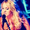
..13 Merge all your layers. (Layers >> Merge All).
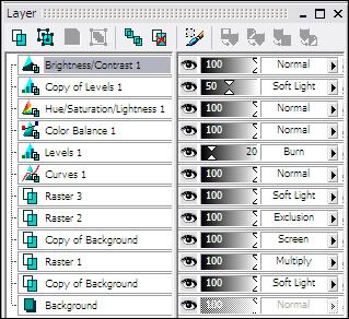
For those that need it, here's how my layers look.
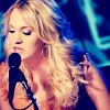
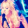
And now we are done. From here you can add text, or whatever. But since I am awful at text, I leave it as it.
Like I said, if you have any questions because I didn't explain something clearly enough, please please please let me know. Don't forget to fiddle around with the settings so it ends up to your liking. Afterall, each picture and person's preference is different.
Feel free to friend this journal to keep up with the icon updates, or tutorial updates. Also, if you see an icon that I made that you're curious as to what I did, feel free to ask me about it. No promises I'll make an entire tutorial, but you never know!
to
I use PSP8, and while I have PS CS, I wouldn't know if it's transferrable. I figure it would though. If you have any questions, please ask. I'd love to see what everyone comes up with.
..01 Go ahead and get a base. If you'd like to follow along, just grab mine. Here's the original picture, if you'd like to crop your own base from it.
..02 Don't Sharpen.
..03 New Layer (Layers >> New Raster Layer).
..04 Flood fill with #CA8863. Set to Multiply.
>>
..05 Duplicate the base twice. Bring one of the duplicated bases above the Multiplied layer. Set the one above the multiplied layer to Screen. Set the one below the Multiplied layer (closest to the base), to Soft Light.
It should look like this: (from bottom to top)
Copy of Background 2 (Screen)
Raster 1 #CA8863 (Multiply)
Copy of Background 1 (Soft Light)
Base (Normal)
..06 Make Two new layers (Layers >> Raster Layer).
- Flood fill the first Raster Layer (Raster Layer 2) with #000040 (Dark Blue). Set this to Exclusion.
- Flood fill the second Raster Layer (Raster Layer 3) with #D7F3F7 (Light Blue). Set this to Soft Light.
It should look like this: (from bottom to top)
Raster 3 #D7F3F7 (Soft Light)
Raster 2 #000040 (Exclusion)
Copy of Background 2 (Screen)
Raster 1 #CA8863 (Multiply)
Copy of Background 1 (Soft Light)
Base (Normal)
+
=
..07 Make a New Adjustment Layer (Layers >> New Adjustment Layer >> Curves).
Make a point, anywhere on the line. Set the Input and Output (RBG Setting) to the following:
I: 123 O:81
Leave this Layer at Normal.
Notes: I don't even remember how I even came about this step, but I must say I use it very frequently. I don't know how, but I like how bright blue the icon is after the soft light layer, and then once you darken up the icon with the Curves setting, it warms everything up. You could leave it at this.
..08 Make a New Adjustment Layer (Layers >> New Adjustment Layer >> Color Balance).
Make the following settings in each category: (Preserve Luminance Checked)
Shadows: -40, 0, 20
Midtones: 10, 0, 0
Highlights: 0, 0, 0
Leave this Layer at Normal.
Notes: I know you can't even see a diffrence, but I could. The icon seemed to glow a little too red for me. Which is why I upped the Cyan (or lowered the Red, depending in which way you look at it) in the Shadows section to darken it up. Same goes for the Blue. If you don't believe that there even was a difference made, open up both bases (Step 7 and 8), put 8 in a new layer above Step 7. Use the Eye Tool to make step 8 invisble, keep clicking between the two (now you see me, now you dont!). See? I told you.
..09 Make a New Adjustment Layer (Layers >> New Adjustment Layer >> Hue & Saturation).
Make the following settings in each category, if the category isn't mentioned, leave it at it's default:
Master Saturation: +20
Blues: +17
Leave this Layer at Normal.
Notes: I upped the blue because while most people would find the blue concert lights from behind annoying ... I actually liked them. So unless there's blue in your icon, there's really no need for upping the blue. But say there's some Green (grass for example) in your icon that you want to make pop, just Up the Green.
..10 Make a New Adjustment Layer (Layers >> New Adjustment Layer >> Levels).
Make the following settings in each category, if the category isn't mentioned, leave it at it's default:
Channel: RGB: Input Levels : 0, 2, 255
Chennel: Red: Input Levels: 0, 2, 255
Set this layer to Soft Light, 50%.
Notes: No notes, I really don't even know why I did this step. So I pretty much just fiddled with the Adjustment layers until I found something I liked. I guess I was looking for a way to brighten up my icon.
..11 So now, because of my experimenting, things seemed a little too bright, and not warm enough / contrasted enough, I duplicated the Adjustment layer I just made (the Levels one), dragged it down between my Curves and Color Balance Adjustment Layers, and set it to Burn at 20%.
Notes: See. Warmer.
..12 Just to add some contrast, New Adjustment Layer (Layers >> New Adjusment Layer >> Brightness and Contrast).
Set your contrast to 6.
..13 Merge all your layers. (Layers >> Merge All).
For those that need it, here's how my layers look.
And now we are done. From here you can add text, or whatever. But since I am awful at text, I leave it as it.
Like I said, if you have any questions because I didn't explain something clearly enough, please please please let me know. Don't forget to fiddle around with the settings so it ends up to your liking. Afterall, each picture and person's preference is different.
Feel free to friend this journal to keep up with the icon updates, or tutorial updates. Also, if you see an icon that I made that you're curious as to what I did, feel free to ask me about it. No promises I'll make an entire tutorial, but you never know!