14 Tutorial | Mandy Moore
So I was browsing through my icon journal, going through past entries and such, when I wondered when the last time I wrote a tutorial was ... January of last year!!!, it's been nearly over a year since my last tutorial! Yeesh. With a little more browsing I realized that the first tutorial ever here at likedejavu reached 127 comments, that's insane but oh so cool. My last one reached a whopping 95 comments, nearly triple digits, nifty! Anyway, if you haven't gotten the point, I bring you a tutorial today.
• As always, I use PSP9, no worries selective coloring hasn't swayed me.
• Should be translatable, to other versions of PSP anyway. PS users may be able to translate except for the author's notes.
• Semi-image heavy.
• Text Heavy.
• Intermediate-Advance.
• Any questions? Please ask!
• JOIN to keep up with updates.
• Request for tutorials can be made HERE.
Note: As per my last tutorial you won't be getting exact numbers. I'll be rounding all my numbers to the nearest 10th-ish, seeing as each image is different this is the best way I think that will get you to play around with your image and the settings. Everything that is in Italics are my little notes, ..... there are a lot of Italics.

TO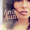
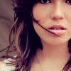
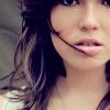
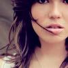
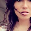
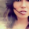
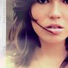
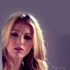
..01 Grab your picture, mine is a scan featuring Mandy Moore, you can find the full size image here. Resize and crop to your liking. At this point I went ahead and lightened it just a tad with a curves adjustment (the Lighten Preset under Curves, lowering the opacity).
..02 New adjustment layer. Layers >> New Adjustment Layer >> Color Balance. My settings were in the range of:
Midtones: -5, 5, 10
Shadows: 25, -5, 35
Highlights: 0, 20, -5
Preserve Luminance Checked
For those that have insanely photogenic memories, yes this is based off of the first step of the Ashley Olsen tutorial mentioned above. Why fix what's not broken, amirite?
..03 New adjustment layer. Layers >> New Adjustment Layer >> Color Balance. My settings were in the range of:
Midtones: -40, 0, 0
Preserve Luminance Checked
Set this layer to Lighten - 100%.
>>
In this case I want to soften/lessen some of the Magenta/Redness, especially in the darker aspects of the icon (hair, eyes, etc shadows). By setting the layer to Lighten it focus' on counterbalancing the Magentas in the shadows by adding Cyan, all the while also lightening the entire base.
..04 New Adjustment layer. Layers >> New Adjustment Layer >> Hue/Saturation/Lightness. My Settings were in the range of (only messing with the Saturations of each, if it isn't mentioned - leave it be):
Reds: +10
Yellows: +15
Set this layer to Saturation (L) - 70%.
One thing I notice people don't mess with enough are the layer settings when doing an adjustment layer. This is one of my favorite things to tinker with, color layers are not the other things that need to be adjusted. Generally when doing a Color Balance layer I automatically go straight to setting the adjustment layer to Color of Color Legacy (or setting a Hue/Sat layer to Saturation or Saturation Legacy) and it'll accentuate the color adjustments even more naturally.
At this point I'm almost done with the coloring and this is when I would add my Brightness/Contrast layer as I end every tutorial with, however this time I'd like a little more control so I'll be making a Curves Adjustment instead.
..05 New Adjustment Layer. Layers >> New Adjustment Layer >> Curves. My settings were in the range of:
RGB | Point One: 235,245. Point Two: (Don't make a new point, just grab the most lower point on the left side and drag to the right) 10,0. (Visual).

The lowest point on the lower left controls the darkest aspects of the icon (shadows), by tinkering with that point I am only adjusting said shadows. By adjusting the higher points located in the top right I am adjusting the lightest aspect (highlights). If I wanted to contrast the overall icon (midtones) I'd make a point in the middle of the grid and adjust accordingly. This can also be adjusted with Levels which I found easier to apply when learning about contrast.
..06 Flood fill with #e4f2f8 and set to Darken.

>>
Said layer can also be set to Multiply or Burn depending how drastic you would want the adjustment to be. I only wanted the light blue color to appear in the highly contrasted (white) areas, thus I set it to Darken. If I wanted to darken the entire icon with the color I would set it to Multiply. FYI, the inverse is true for dark colors set to Lighten vs Screen. If you want it to lighten only the dark areas of the icon, set it to Lighten, if you want it to lighten the entire icon, set it to Screen.
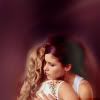
..07 At this point coloring-wise I'm done. I'm just going to add some final touches. I'll just skim this part and won't go into details (as much anyway). For the most part, this is just for aesthetics.
- I went back to my base layer and made a new layer right above it. I grabbed the Airbrush tool and chose a peachy color from the icon and made splotches in the lower left side. I used the Motion blur on it. Kept layer at Normal.
- New layer. Grabbed Airbrush tool and chose a lighter peach and repeated above step on the top left side. Kept layer at Normal.
- New layer. Grabbed Airbrush tool and chose a darker purple and repeated above steps on left of icon. Set layer to Lighten.
>>
Background of light "textures" layer isn't white, it's transparent. Only put on white background to illustrate example. Motion blur isn't required, same can be done through the smudge tool.
- I grabbed a polaroid texture by gender, resized, rotated and erased some of it leaving just the left side and set it to Lighten.

>>
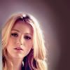
- Add text if preferred. Done!
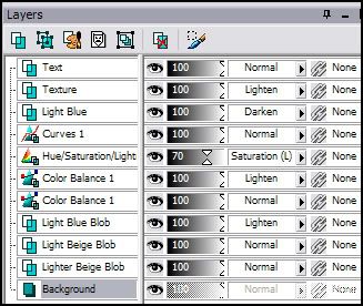
Layer Palette
Author Notes:
Remember in my last Veronica Mars tutorial I talked about Cool Tones and Warm Tones? Well with this coloring (I won't say tutorial because it didn't affect anything in this case), the same logic applies seeing as we are working with a coloring between the Cool/Warm tones (aka blues/reds = magentas). If you finish the coloring and find out that your icon is a lot more red/magenta than you were hoping for or doesn't have enough of it, go back to your base layer and duplicate. Then go to my favorite Automatic Color Balance and do the reverse of whatever effect you've ended up with.
Example # 1: (Problem) You're using the coloring on a screencap, even after adding a screen layer it's still dark and saturated in Magenta. (Solution) Duplicate the screen layer once more, go to Automatic Color Balance. Put your Strength @ 100, Check Remove Color Cast, and set the temperature a little towards the warmer side (5220).
>>
Example # 2: (Problem) You're using a photoshoot picture and the icon is already contrasted enough, you deleted the curves layer but it's still overly contrasted and not enough blue is in the icon. (Solution} Duplicate your base layer. Go to Adjust >> Photo Fix >> Backlighting (PSP9+ only, everything else use Shadows/Midtones/Hilights and adjust the Shadows). Set it around 30. Duplicate layer again and go to Automatic Color Balance. Strength 1, Remove Color Cast UNchecked, and Temperature nearer to the cooler side (7940).

>>
>>
More Examples!


This tutorial is a lot more text heavy than most of mine, but if you think I didn't example something that well just let me know and I'll try to do better. I just never got the point tutorials that only provide numbers and that's it. Plus with the lack of PSP tutorials I feel like I have double my one tutorial to make up for it, heh.
• As always, I use PSP9, no worries selective coloring hasn't swayed me.
• Should be translatable, to other versions of PSP anyway. PS users may be able to translate except for the author's notes.
• Semi-image heavy.
• Text Heavy.
• Intermediate-Advance.
• Any questions? Please ask!
• JOIN to keep up with updates.
• Request for tutorials can be made HERE.
Note: As per my last tutorial you won't be getting exact numbers. I'll be rounding all my numbers to the nearest 10th-ish, seeing as each image is different this is the best way I think that will get you to play around with your image and the settings. Everything that is in Italics are my little notes, ..... there are a lot of Italics.
TO
..01 Grab your picture, mine is a scan featuring Mandy Moore, you can find the full size image here. Resize and crop to your liking. At this point I went ahead and lightened it just a tad with a curves adjustment (the Lighten Preset under Curves, lowering the opacity).
..02 New adjustment layer. Layers >> New Adjustment Layer >> Color Balance. My settings were in the range of:
Midtones: -5, 5, 10
Shadows: 25, -5, 35
Highlights: 0, 20, -5
Preserve Luminance Checked
For those that have insanely photogenic memories, yes this is based off of the first step of the Ashley Olsen tutorial mentioned above. Why fix what's not broken, amirite?
..03 New adjustment layer. Layers >> New Adjustment Layer >> Color Balance. My settings were in the range of:
Midtones: -40, 0, 0
Preserve Luminance Checked
Set this layer to Lighten - 100%.
>>
In this case I want to soften/lessen some of the Magenta/Redness, especially in the darker aspects of the icon (hair, eyes, etc shadows). By setting the layer to Lighten it focus' on counterbalancing the Magentas in the shadows by adding Cyan, all the while also lightening the entire base.
..04 New Adjustment layer. Layers >> New Adjustment Layer >> Hue/Saturation/Lightness. My Settings were in the range of (only messing with the Saturations of each, if it isn't mentioned - leave it be):
Reds: +10
Yellows: +15
Set this layer to Saturation (L) - 70%.
One thing I notice people don't mess with enough are the layer settings when doing an adjustment layer. This is one of my favorite things to tinker with, color layers are not the other things that need to be adjusted. Generally when doing a Color Balance layer I automatically go straight to setting the adjustment layer to Color of Color Legacy (or setting a Hue/Sat layer to Saturation or Saturation Legacy) and it'll accentuate the color adjustments even more naturally.
At this point I'm almost done with the coloring and this is when I would add my Brightness/Contrast layer as I end every tutorial with, however this time I'd like a little more control so I'll be making a Curves Adjustment instead.
..05 New Adjustment Layer. Layers >> New Adjustment Layer >> Curves. My settings were in the range of:
RGB | Point One: 235,245. Point Two: (Don't make a new point, just grab the most lower point on the left side and drag to the right) 10,0. (Visual).
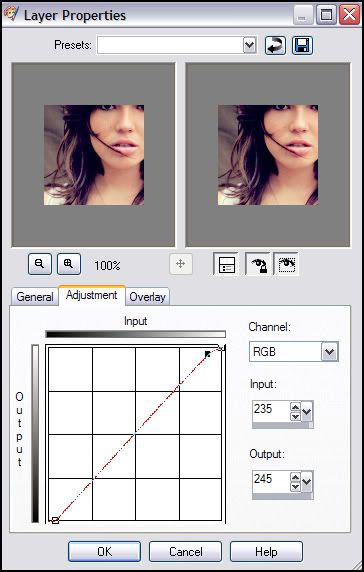
The lowest point on the lower left controls the darkest aspects of the icon (shadows), by tinkering with that point I am only adjusting said shadows. By adjusting the higher points located in the top right I am adjusting the lightest aspect (highlights). If I wanted to contrast the overall icon (midtones) I'd make a point in the middle of the grid and adjust accordingly. This can also be adjusted with Levels which I found easier to apply when learning about contrast.
..06 Flood fill with #e4f2f8 and set to Darken.
>>
Said layer can also be set to Multiply or Burn depending how drastic you would want the adjustment to be. I only wanted the light blue color to appear in the highly contrasted (white) areas, thus I set it to Darken. If I wanted to darken the entire icon with the color I would set it to Multiply. FYI, the inverse is true for dark colors set to Lighten vs Screen. If you want it to lighten only the dark areas of the icon, set it to Lighten, if you want it to lighten the entire icon, set it to Screen.
..07 At this point coloring-wise I'm done. I'm just going to add some final touches. I'll just skim this part and won't go into details (as much anyway). For the most part, this is just for aesthetics.
- I went back to my base layer and made a new layer right above it. I grabbed the Airbrush tool and chose a peachy color from the icon and made splotches in the lower left side. I used the Motion blur on it. Kept layer at Normal.
- New layer. Grabbed Airbrush tool and chose a lighter peach and repeated above step on the top left side. Kept layer at Normal.
- New layer. Grabbed Airbrush tool and chose a darker purple and repeated above steps on left of icon. Set layer to Lighten.
>>
Background of light "textures" layer isn't white, it's transparent. Only put on white background to illustrate example. Motion blur isn't required, same can be done through the smudge tool.
- I grabbed a polaroid texture by gender, resized, rotated and erased some of it leaving just the left side and set it to Lighten.
>>
- Add text if preferred. Done!
Layer Palette
Author Notes:
Remember in my last Veronica Mars tutorial I talked about Cool Tones and Warm Tones? Well with this coloring (I won't say tutorial because it didn't affect anything in this case), the same logic applies seeing as we are working with a coloring between the Cool/Warm tones (aka blues/reds = magentas). If you finish the coloring and find out that your icon is a lot more red/magenta than you were hoping for or doesn't have enough of it, go back to your base layer and duplicate. Then go to my favorite Automatic Color Balance and do the reverse of whatever effect you've ended up with.
Example # 1: (Problem) You're using the coloring on a screencap, even after adding a screen layer it's still dark and saturated in Magenta. (Solution) Duplicate the screen layer once more, go to Automatic Color Balance. Put your Strength @ 100, Check Remove Color Cast, and set the temperature a little towards the warmer side (5220).
>>
Example # 2: (Problem) You're using a photoshoot picture and the icon is already contrasted enough, you deleted the curves layer but it's still overly contrasted and not enough blue is in the icon. (Solution} Duplicate your base layer. Go to Adjust >> Photo Fix >> Backlighting (PSP9+ only, everything else use Shadows/Midtones/Hilights and adjust the Shadows). Set it around 30. Duplicate layer again and go to Automatic Color Balance. Strength 1, Remove Color Cast UNchecked, and Temperature nearer to the cooler side (7940).
>>
>>
More Examples!
This tutorial is a lot more text heavy than most of mine, but if you think I didn't example something that well just let me know and I'll try to do better. I just never got the point tutorials that only provide numbers and that's it. Plus with the lack of PSP tutorials I feel like I have double my one tutorial to make up for it, heh.