11 Tutorial | Mary Kate & Ashley Olsen
New tutorial. This one tied for third in the Poll (for those that voted for the Charmed coloring, turns out all you have to do is set the Color Balance layer in my Ashley Olsen tutorial to Luminance). Plus, I wanted to do this one since there aren't that many Selectice Coloring-esque tutorials for PSP, and I know someone people have trouble converting them. Hope someone finds it useful!
• I use PSP8. However, it is translateable (at least with PS).
• Not image heavy.
• Semi-Beginner Friendly (Levels).
• Any questions? Please ask!
• JOIN to keep up with updates.
• Request for tutorials can be made HERE.
TO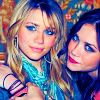
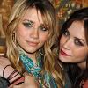
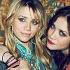
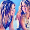
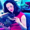
..01 Grab your picture and crop to your liking, mine is of the Olsen twins. I picked them because I wanted to be able to show all in one how this tutorial turns out with Brunettes and Blondes. That, and I don't see what so many people have against tutorial that feature them. *shrugs* Moving along though ...
..02 If your base isn't light enough, now would be the time to duplicate it and set it to Screen. If your base is too light, duplicate it and set it to Multiply. In my case, it was just fine. So I just duplicated it and set it to Soft Light - 100%.

..03 Flood fill with a dark blue (#090B21) and set to Exclusion - 70%.
..04 Flood fill with a light light biege (#FBF6EF) and set it to Burn - 100%.
..05 Flood fill with a light blue (#AFE7F5) and set it to Soft Light - 100%.
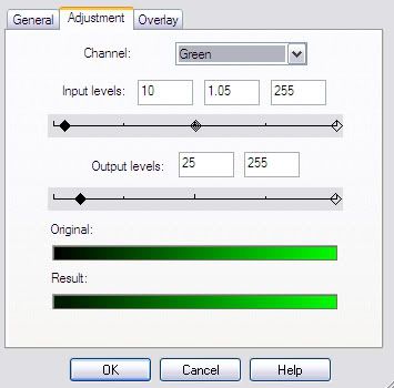
..06 New Adjustment Layer. Layers >> New Adjustment Layer >> Levels. Put in the following settings (if it isn't mentioned, leave it as is):
Red || Input: 0, 1, 255 - Output: 5, 255
Green || Input: 10, 1.05, 255 - Output: 25, 255
Blue || Input: 0, 1.55, 245 - Output: 20, 240
I know it's kind of confusing, so let me know if there's anything I can do to make it easier to understand. Here's a visual example for one of the settings.
..07 Set the Adjustment Layer in Step6 to Color (L) - 100%.
..08 New Adjustment Layer. Layers >> New Adjustment Layer >> Hue/Saturation. Put in the following settings:
Master: +60
Set this to Saturation (L) - 100%.
..09 New Adjustment Layer. Layers >> New Adjustment Layer >> Brightness/Contrast. Put in the following settings:
Contrast: +10
You're done!
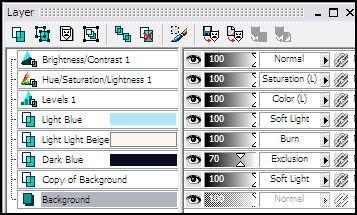
For those that need it, My Layers:
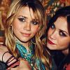
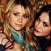
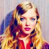
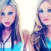
And different outcomes using different pictures. The last one is using a screencap, so make note that you will need to prepare your base beforehand with Screen layers and the like.
Last of all, remember to experiment. This won't work exactly the same in every picture, so just play around with Opacities.
For those that visit for my icons, expect an update tomorrow later today! =o)
• I use PSP8. However, it is translateable (at least with PS).
• Not image heavy.
• Semi-Beginner Friendly (Levels).
• Any questions? Please ask!
• JOIN to keep up with updates.
• Request for tutorials can be made HERE.
TO
..01 Grab your picture and crop to your liking, mine is of the Olsen twins. I picked them because I wanted to be able to show all in one how this tutorial turns out with Brunettes and Blondes. That, and I don't see what so many people have against tutorial that feature them. *shrugs* Moving along though ...
..02 If your base isn't light enough, now would be the time to duplicate it and set it to Screen. If your base is too light, duplicate it and set it to Multiply. In my case, it was just fine. So I just duplicated it and set it to Soft Light - 100%.
..03 Flood fill with a dark blue (#090B21) and set to Exclusion - 70%.
..04 Flood fill with a light light biege (#FBF6EF) and set it to Burn - 100%.
..05 Flood fill with a light blue (#AFE7F5) and set it to Soft Light - 100%.
..06 New Adjustment Layer. Layers >> New Adjustment Layer >> Levels. Put in the following settings (if it isn't mentioned, leave it as is):
Red || Input: 0, 1, 255 - Output: 5, 255
Green || Input: 10, 1.05, 255 - Output: 25, 255
Blue || Input: 0, 1.55, 245 - Output: 20, 240
I know it's kind of confusing, so let me know if there's anything I can do to make it easier to understand. Here's a visual example for one of the settings.
..07 Set the Adjustment Layer in Step6 to Color (L) - 100%.
..08 New Adjustment Layer. Layers >> New Adjustment Layer >> Hue/Saturation. Put in the following settings:
Master: +60
Set this to Saturation (L) - 100%.
..09 New Adjustment Layer. Layers >> New Adjustment Layer >> Brightness/Contrast. Put in the following settings:
Contrast: +10
You're done!
For those that need it, My Layers:
And different outcomes using different pictures. The last one is using a screencap, so make note that you will need to prepare your base beforehand with Screen layers and the like.
Last of all, remember to experiment. This won't work exactly the same in every picture, so just play around with Opacities.
For those that visit for my icons, expect an update tomorrow later today! =o)