Tutorial for Icon Making
Here's a tutorial for you guys about making icons, this is also a very subjective area, but I'll just share what I know and maybe get some of you guys started making epic LOM iconage.
The program I'm using is of course Photoshop CS2

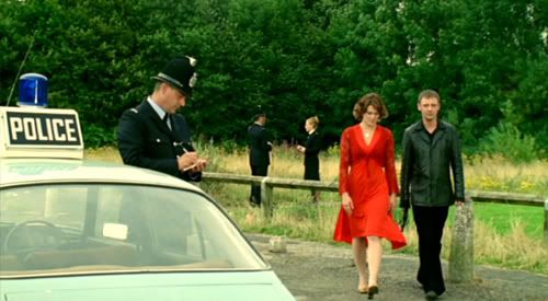
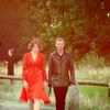
Firstly choose your image, I choose this one of Sam and Annie capped by webeh because I made this icon for a challenge, and part of the challenge was using the colour red
1. Cropping:
With cropping try to be as creative as you can, it's up to your own personal style, I personally like to crop icons either close into the subject (ie: right on someone's face) or far back from the subject (focusing on the scenery and composition of the shot where the main characters aren't the entire subject... if that makes sense)
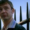
The aim to making funky icons is to be as creative as you can. For example if your croping this image of Sam (caped also by webeh) don't go straight on, try croping half his face out, or starting for his eyes down instead of the top of his head.
ORIGINAL

EXAMPLES
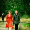
Straight on cropping:

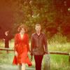
Creative cropping:


Once you have you base, it's time to make the icon.
I make very simple icons, because a lot of the time I think simple is best, but also some of the time I'm too lazy XD
To show some techniques, I'll take you through the process of making the icon that I made for the challenge.
original (after cropping... I went for the far back from the subject method)

2. Lightening the base:
This base didn't need lightening but most do, the best way to do that is this.
In the layers box right click on the background layer
~ click duplicate layer
~ click on the new layer and select "screen" as the blending style
~ when you done go layer/flatten image or ctrl+e
~ done
Some images will be darker will need you to create another a duplicate layer on top of the other layer with the screen blending style
If it's too bright lower the opacity of the offening layer as desired.

Original

Lightened version
3. Colouring:
This is a step that's sometimes over looked, but it's really important and makes your icon much better.
I prefer using the selective colour feature, there are other ways, but that's just me.
~ image/adjustments/selective colour
This colour combo is my fav, I always use it. I actually got it from a tutorial by lilyrose_icons but then changed it a little till I got what I liked
Red
Cyan -100 | 0 Magenta | +100 Yellow | 0 Black
Yellow
Cyan -100 | 0 Magenta | +100 Yellow | 0 Black
Blue
Cyan +100 | +100 Magenta | -100 Yellow | 0 Black
Adjust to suit the image, but basically using this feature just heightens the colour (makes the reds redder the blues bluer etc) and just looks better
For this icon I used:
Red
Cyan -94 | 0 Magenta | +30 Yellow | 0 Black
Yellow
Cyan -19 | 0 Magenta | +23 Yellow | 0 Black
Blue
Cyan +100 | +100 Magenta | -100 Yellow | 0 Black
Before

After
4. Textures:
Textures are the easiest way to give depth to an icon, it's all up to you how you use them.
You can deep etch the characters and use the icon as a replacement background (which takes alot longer) or use the texture as a blending layer (which is what I usually do)
Which ever texture you choose, I suggest going for something simple, like textured paper or a gradient, otherwise the icon becomes cluttered.
You can find many textures from texturize
With this icon, because I want to keep it simple, I went for a simple gradient type texture from LilCosette on DA

I set blending style to Soft Light
Then I added another texture, this one from below_blues going with the red theme

I set the blending style to lighten, then lowered the opacity to 60%
At this stage the colouring wasn't doing it for me so I went back to selective colour and changed the background layer a bit
Red
Cyan -100 | 0 Magenta | +26 Yellow | 0 Black
Yellow
Cyan 0 | 0 Magenta | -63 Yellow | 0 Black
5. Text
Now text is an option in my opinion... I rarely make icons with text mainly because it's not really my forte, plus I never really know what to write on icons.
But with text same thing really applys to textures, find some nice plain simple fonts and play around with colours and blending styles... that's all the advice I can really give on text I'm afraid, because I'm not a master of it in anyway.
6. Finished!
I flattened the icon and added about +9 on the Contrast and I'm happy with it.
Done
Final result:
Hope you guys found this tutorial helpful, had never done one before XD
The program I'm using is of course Photoshop CS2
Firstly choose your image, I choose this one of Sam and Annie capped by webeh because I made this icon for a challenge, and part of the challenge was using the colour red
1. Cropping:
With cropping try to be as creative as you can, it's up to your own personal style, I personally like to crop icons either close into the subject (ie: right on someone's face) or far back from the subject (focusing on the scenery and composition of the shot where the main characters aren't the entire subject... if that makes sense)
The aim to making funky icons is to be as creative as you can. For example if your croping this image of Sam (caped also by webeh) don't go straight on, try croping half his face out, or starting for his eyes down instead of the top of his head.
ORIGINAL
EXAMPLES
Straight on cropping:
Creative cropping:
Once you have you base, it's time to make the icon.
I make very simple icons, because a lot of the time I think simple is best, but also some of the time I'm too lazy XD
To show some techniques, I'll take you through the process of making the icon that I made for the challenge.
original (after cropping... I went for the far back from the subject method)
2. Lightening the base:
This base didn't need lightening but most do, the best way to do that is this.
In the layers box right click on the background layer
~ click duplicate layer
~ click on the new layer and select "screen" as the blending style
~ when you done go layer/flatten image or ctrl+e
~ done
Some images will be darker will need you to create another a duplicate layer on top of the other layer with the screen blending style
If it's too bright lower the opacity of the offening layer as desired.
Original
Lightened version
3. Colouring:
This is a step that's sometimes over looked, but it's really important and makes your icon much better.
I prefer using the selective colour feature, there are other ways, but that's just me.
~ image/adjustments/selective colour
This colour combo is my fav, I always use it. I actually got it from a tutorial by lilyrose_icons but then changed it a little till I got what I liked
Red
Cyan -100 | 0 Magenta | +100 Yellow | 0 Black
Yellow
Cyan -100 | 0 Magenta | +100 Yellow | 0 Black
Blue
Cyan +100 | +100 Magenta | -100 Yellow | 0 Black
Adjust to suit the image, but basically using this feature just heightens the colour (makes the reds redder the blues bluer etc) and just looks better
For this icon I used:
Red
Cyan -94 | 0 Magenta | +30 Yellow | 0 Black
Yellow
Cyan -19 | 0 Magenta | +23 Yellow | 0 Black
Blue
Cyan +100 | +100 Magenta | -100 Yellow | 0 Black
Before
After
4. Textures:
Textures are the easiest way to give depth to an icon, it's all up to you how you use them.
You can deep etch the characters and use the icon as a replacement background (which takes alot longer) or use the texture as a blending layer (which is what I usually do)
Which ever texture you choose, I suggest going for something simple, like textured paper or a gradient, otherwise the icon becomes cluttered.
You can find many textures from texturize
With this icon, because I want to keep it simple, I went for a simple gradient type texture from LilCosette on DA
I set blending style to Soft Light
Then I added another texture, this one from below_blues going with the red theme
I set the blending style to lighten, then lowered the opacity to 60%
At this stage the colouring wasn't doing it for me so I went back to selective colour and changed the background layer a bit
Red
Cyan -100 | 0 Magenta | +26 Yellow | 0 Black
Yellow
Cyan 0 | 0 Magenta | -63 Yellow | 0 Black
5. Text
Now text is an option in my opinion... I rarely make icons with text mainly because it's not really my forte, plus I never really know what to write on icons.
But with text same thing really applys to textures, find some nice plain simple fonts and play around with colours and blending styles... that's all the advice I can really give on text I'm afraid, because I'm not a master of it in anyway.
6. Finished!
I flattened the icon and added about +9 on the Contrast and I'm happy with it.
Done
Final result:
Hope you guys found this tutorial helpful, had never done one before XD