(no subject)
Here are week five's winners. :D
1st place // kerilu

2nd place // anniereckless
3rd place // raven353

Best interpretation of the theme // farfallanera
No mods because we only had eight icons. :(
Criticism
#1
Cropping is nice, and so is coloring, but it seems a little too sharp and pixelly. A brush placed in the icon would make it seem more...gentle and soft (?)
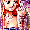
#2
Was it saved in a .jpg? Seems like it. There's a nice, exotic feel to it, with the Henna on the hand and stuff, but seems busy with the multiple patterns in it.
The icon looks unfinished because there isnt a border. Its pretty, but it doesn't look like much was done with it besides crop it.
The icon seems really busy and a bit too plain. There's just the picture and nothing else, really.
#3
The heart gets a little lost in the background. It could benefit from something that would give it a little more contrast.
The background matches the hair a little too well; maybe a gradient blend of colors would do the trick. The purple heart kinda jumps out at you.
The image looks sort of grainy and rough, so try to make it more smooth next time.
#4
I like what you did the the image and icon. I just think that the background overpowers Ino a little bit. Maybe make the background not quite as bright next time.
The purple background doesn't really compliment the icon. If it were a darker purple, like a plum or violet, it would match the bathing suit. And a pale, light blue would really look nice, placed somewhere in the background.
#5
The border doesnt really fit the icon. Its too dark and big, taking up more space than it should. next time try to keep the image inside of the border, rather than having it sort of split the image
The border to too bleh to match the icon. Is very grey, while the icon is much more colorful. A mask placed over the icon would look nicer.
#6
The bright light in the top right corner of your icon seems a little harsh/too bright in comparison with the rest of your icon's soft feeling.
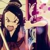
#7
The brush in the bottom right corner seems a little out there, and there is a black line near Kairi's leg.
It just seems sort of plain, with no border. it looks like a brush was tried on the bottom, but you can barely see it, and it doesnt fit real well. Try to do a bit more with it next time.
Congrats to the winners, and thanks for first place! Bannermaker for this week is farfallanera.
1st place // kerilu
2nd place // anniereckless
3rd place // raven353
Best interpretation of the theme // farfallanera
No mods because we only had eight icons. :(
Criticism
#1
Cropping is nice, and so is coloring, but it seems a little too sharp and pixelly. A brush placed in the icon would make it seem more...gentle and soft (?)
#2
Was it saved in a .jpg? Seems like it. There's a nice, exotic feel to it, with the Henna on the hand and stuff, but seems busy with the multiple patterns in it.
The icon looks unfinished because there isnt a border. Its pretty, but it doesn't look like much was done with it besides crop it.
The icon seems really busy and a bit too plain. There's just the picture and nothing else, really.
#3
The heart gets a little lost in the background. It could benefit from something that would give it a little more contrast.
The background matches the hair a little too well; maybe a gradient blend of colors would do the trick. The purple heart kinda jumps out at you.
The image looks sort of grainy and rough, so try to make it more smooth next time.
#4
I like what you did the the image and icon. I just think that the background overpowers Ino a little bit. Maybe make the background not quite as bright next time.
The purple background doesn't really compliment the icon. If it were a darker purple, like a plum or violet, it would match the bathing suit. And a pale, light blue would really look nice, placed somewhere in the background.
#5
The border doesnt really fit the icon. Its too dark and big, taking up more space than it should. next time try to keep the image inside of the border, rather than having it sort of split the image
The border to too bleh to match the icon. Is very grey, while the icon is much more colorful. A mask placed over the icon would look nicer.
#6
The bright light in the top right corner of your icon seems a little harsh/too bright in comparison with the rest of your icon's soft feeling.
#7
The brush in the bottom right corner seems a little out there, and there is a black line near Kairi's leg.
It just seems sort of plain, with no border. it looks like a brush was tried on the bottom, but you can barely see it, and it doesnt fit real well. Try to do a bit more with it next time.
Congrats to the winners, and thanks for first place! Bannermaker for this week is farfallanera.