Week 35 Winners
Here are this week's winners. Thank you to all voters and participants :D
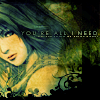
1st
_blurplinkle_
2nd
desibabycakes
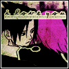
3rd
chemical_alice
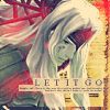
Mod's Choice
faintscribbles
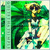
Best Colouring
astrokittie

01 - the green shade is a little green but overall I really like the icon. Nice cropping and composition.
02 - Frankly, it's a little boring. It looks like the picture was just cropped out and set over the texture. The text placement is nice, but a different font or some decorations around it could have been used.
02 - the cropping of the icon is a little awkward
03 - normally I'm not fond of primarily green tones, but this icon just looks really good with those shades :D
05 - the icon seems very busy.
09 - the texture is just kind of there. It doesn't really seem to serve a purpose other to be placed there. And the coloring of the icon doesn't really flow well together.
10 - I like how vibrant it is without being glaring\
11 - It's kind of hard to make out Fuu's details; she's a little oversaturated and there wasn't much care taken in making sure she didn't come out blurry.
12 - I really like the muted tones of this icon; the red splotches aren't over done either.
+Banners will be done by moonshadow_nal Please comment if you would like one.
--------------------------------
Next theme should be posted this weekend, by ariake.
1st
_blurplinkle_
2nd
desibabycakes
3rd
chemical_alice
Mod's Choice
faintscribbles
Best Colouring
astrokittie
01 - the green shade is a little green but overall I really like the icon. Nice cropping and composition.
02 - Frankly, it's a little boring. It looks like the picture was just cropped out and set over the texture. The text placement is nice, but a different font or some decorations around it could have been used.
02 - the cropping of the icon is a little awkward
03 - normally I'm not fond of primarily green tones, but this icon just looks really good with those shades :D
05 - the icon seems very busy.
09 - the texture is just kind of there. It doesn't really seem to serve a purpose other to be placed there. And the coloring of the icon doesn't really flow well together.
10 - I like how vibrant it is without being glaring\
11 - It's kind of hard to make out Fuu's details; she's a little oversaturated and there wasn't much care taken in making sure she didn't come out blurry.
12 - I really like the muted tones of this icon; the red splotches aren't over done either.
+Banners will be done by moonshadow_nal Please comment if you would like one.
--------------------------------
Next theme should be posted this weekend, by ariake.