dos
I know... I know... it's been a while. BUT I'm going to try and make it up to you by posting aaaaaaaaall the things I owe you one after the other. That would be: four more tutorials, the requests (which are still open here) and the most amazing Doctor Who icon battle EVER (hosted at absolutelybatty's very own reflexive_verb).
If things go according to plan (which they so rarely do) I should complete most of these within the next month... We'll see how I do. For now, here go the first couple tutorials:
>>
firstillusion asked me for some insight on how to do this icon...
TUTORIAL #2
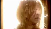
Unlike most caps, I chose this one because I liked the scene (Bad Wolf = ♥) and not because I thought the screencap itself had potential. On the contrary, it goes against most of the things I'd choose in a cap. The tough bit about it is that it has an extremely bright background with a very dark subject, so it's hard to find a balance that works for both without things going to pixely hell. Here's what I did...
1. Brightness/Contrast
>>
Base >> Screen
First, I tried to even out her face with the background (make her features more bright and visible), for that I just copied the base and set it to screen (Fill: 100%). Like I said, the balance between too dark and too light is very thin with a cap like this, so I decided to go with something basic and leave it at that.
2. Colouring
>>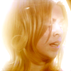
Hue/Saturation (0/+16/+6) >> Color Balance
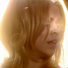
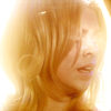
Next step was colouring. Since this cap is so "monochromatic" it was hard to do colouring aside from light effects, because in the end there isn't much you can do but work with the one colour that's there. However, after a first Hue/Saturation layer (my mandatory colouring first step), I did try to bring out colours other than yellow with a Color Balance layer set like this: Shadows (+8/0/-11); Midtones (-11/0/+10); Highlights (-9/0/+26). As you can see the change is very subtle (anything more drastic would have ruined the icon's quality) so I just went with the yellow.
>>
>>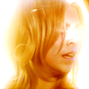
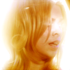
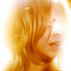
Soft Light >> Hue/Saturation (0/+10/0) >> Brightness/Contrast (0/+9)
So all that was there for me to do was try to emphasize the yellow. I copied the result and set it to Soft Light (Fill: 65%), plus a Hue/Saturation layer and a Brightness/Contrast layer. I liked that, if I wasn't going to get anything but yellow, at least now it had a bit of an orange-ish twist to break the monotony. That's actually what I love so much about Hue/Saturation layers, it always makes the colours look richer and it brings out other shades that might be hidden within it.
3. Cropping
Can't really say much about cropping because this is one of those caps that you just have to crop the one way. I did try to focus more on her face, but with so much light over it the result was hard to make out. Then I tried to make a closer cap on her hair, but it would overpower her face. So I went with a basic, centred crop that everyone would understand and that would leave out the boring white all around her.
4. Textures/Composition
>>
>> Soft Light
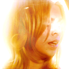
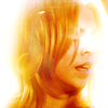
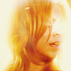
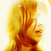
I'm not good at using textures with a light background. Some people can manage it wonderfully, I just can't work it out. So I used just one texture (done by slayground @ tumblr), set to Lighten, in an attempt to bring some of the light into her hair and lower the contrast between the background and the subject. Once that was done I copied the result and set it to soft light, because in my experience textures usually blend in better when I do this.
>>
>>
>> Brightness/Contrast >>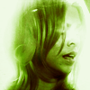
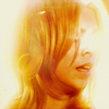
And then, since I thought all the white in the background was taking away from her face, I tried to make it darker. So first, I created a new layer, filled it with #E0DCB2 and set it to Multiply (Fill: 50%). But as you can see, now it was too dark. So I tried to add some of the contrast (+13/-7) back but there wasn't much I could do without it going to pixel hell.
What I did next is hard to explain, so bear with me. You see, at this point I had been working on this for hours and hours and I had loads and loads of "residual" layers that I had tried out but hadn't worked out. Whenever I get so badly stuck, I try to "reuse" those layers and see if any will work with what I've got. It's not really a technique, more like a desperate attempt to salvage what's left of it. Sometimes it works, sometimes it doesn't...
In this case it did work. That green layer you can see above, set to Soft Light, gave me the right balance between a brightly coloured subject and a background that wasn't too light, nor too dark. Plus, it added a new shade of colour, which you can only notice if you see the previous stage, but gives the yellow a nice twist. Thing is... I'm not really sure how that green layer came to be, it was just laying around. But I've tried to recreate it for this tutorial and what you can do is this:
1- After the Brightness/Contrast layer, add a new layer filled with #313E00 and set it to Hue.
2- Then copy the result and set it to Multiply.
3- Then another layer filled with #587701 and set to Hue.
4- And finally a Selective Colouring layer with this settings: Green: +22/+58/-31/+37 -- Black: 0/+23/0/0
5. Final Touches

>>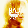
The colouring finally looked good, but I thought the icon looked a bit empty. I had recently seen someone use this texture (also by slayground) as a replacement for text, so I thought this would be a good time to try it out. I wrote "BAD" in Aubrey (text settings) and pasted the texture below, setting it to Lighten. Aaaaand... voilà!
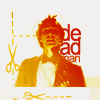
>>
word_never_said requested tips or a tutorial for this icon...
This icon was harddddd... I started out with a lot of ideas, but I never realized getting rid of that boring blue would be so difficult. In a way I had the same problem of the previous icon: monochromatic hell. Except this time the background was just like the subject, so it was hard to make the figure stand out without the background taking over. Since this was such a complicated icon to make, I'm going to do a hybrid between tips and tutorial, something too detailed would make it an endless read...
1. Brightness/Contrast
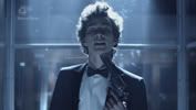
>>
>>
>>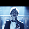
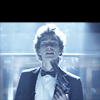
Base >> Screen (100%) >> Screen (65%) >> Soft Light (100%)
Not sure if you can tell at that size, but I had just started and it was already looking pixelated. Thing is, I had to add all that brightness or else Nathan would merge into the background, yet so much lightness in a dark icon equals... you got it, ridiculously sharp pixels! I couldn't find a way around it, so I left it for the time being.
2. Colouring
>>
>>
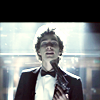
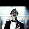
Color balance >> Soft Light (100%) >> Selective colouring
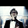
I used to be very afraid of color balance layers when I first started because it made colouring go all funky. Later I learnt I was using them for all the wrong caps. Color balance layers aren't much use for colourful caps, but for monochromatic caps like these they're glorious and you should abuse them as much as you want. Basically, it helps you put colour where there's none. Granted, you need to have a cap with clear enough shadows, midtones and highlights, and in this case the cap wasn't quite there. Now I had no more blue, but it had been replaced mostly by white and there wasn't much I could change without going back to monochrome. Still, it was an improvement, so I decided to work with it.
Color balance
Shadows: +11/-6/-20
Midtones: +9/0/-40
Highlights: +32/0/-29
Selective colouring
Reds: 0/0/+68/0
Whites: 0/+28/+59/-33
Blacks: 0/0/0/+14
3. Cropping
My original intention had been to do a close crop on his face and his "I'm crazier than you could possibly imagine" eyes, but it was hard to do it and keep the gun in frame, if the gun wasn't in frame it was hard to tell it was a gun, and without the gun the scene didn't make much sense. So I took out as much background as a I could and decided to fill in the missing bit some other way.
4. Textures/Composition
>>
Marquee tool >> Smudge tool
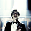
I won't go into detail as to how I did these steps because in the end I went a different way (if you want to know how to do it, I'll link you to some tutorials). In fact, you can easily see that none of the things I had done so far had really worked out. In the end it's just an over-sharpened icon with bland colouring and a wacky background.
Instead, what I'm trying to show is that this is a veeeeeery loooooong process of trial and error, and some times it's not about knowing this or that trick, but rather about stepping out of the box and trying something completely different. Or maybe just banging your head against the keyboard long enough so that you can't tell the difference anymore. XD
>>
>>
>>
>>
Free Transform >> Colour layer >> Texture >> Multiply (100%) >> Multiply (40%)
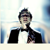
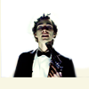
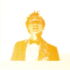
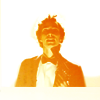
Anyway, like I said, the logical solution was to get rid of the background, after the smudge tool it looked funny and it was getting distracting. I erased it with a mask (another cool trick I can link you to) and put a #F8F6E4 layer underneath. With this new background the subject looked to be sort of floating, which was pretty cool, so I emphasized it by lifting him towards the center. I also decided to take things a step further and do colouring all over. I took this texture by -redux @ tumblr, cropped it like this and set it to screen. And then just a couple adjustments to make the colour stronger. So now I had a pretty decent, minimalistic icon.
5. Final Touches
>>
>>
>>
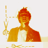
Brightness/Contrast >> Selective Coloring >> Textures >> Text
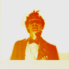
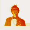
Unfortunately, I can't do minimalistic. I always feel there's something missing, even if the icon works perfectly fine. So I decided to add a few more details.
First I emphasized the orange, and then I added some textures and finally some text. The scissors on the side came from a texture also by -redux @ tumblr. I used the Magic Wand tool to select the bits I wanted and then pasted them on a white background, which I placed below the orange layer (so that it had a matching color). Finally I copied what I had and turned it on a 90º angle to add the same scissors at the bottom. And we're done!
I still feel like I ramble a lot when I write these, so if things don't make sense or if I left something unexplained just leave me a comment and I'll explain better!
If things go according to plan (which they so rarely do) I should complete most of these within the next month... We'll see how I do. For now, here go the first couple tutorials:


>>

firstillusion asked me for some insight on how to do this icon...
TUTORIAL #2
Unlike most caps, I chose this one because I liked the scene (Bad Wolf = ♥) and not because I thought the screencap itself had potential. On the contrary, it goes against most of the things I'd choose in a cap. The tough bit about it is that it has an extremely bright background with a very dark subject, so it's hard to find a balance that works for both without things going to pixely hell. Here's what I did...
1. Brightness/Contrast

>>

Base >> Screen
First, I tried to even out her face with the background (make her features more bright and visible), for that I just copied the base and set it to screen (Fill: 100%). Like I said, the balance between too dark and too light is very thin with a cap like this, so I decided to go with something basic and leave it at that.
2. Colouring

>>

Hue/Saturation (0/+16/+6) >> Color Balance
Next step was colouring. Since this cap is so "monochromatic" it was hard to do colouring aside from light effects, because in the end there isn't much you can do but work with the one colour that's there. However, after a first Hue/Saturation layer (my mandatory colouring first step), I did try to bring out colours other than yellow with a Color Balance layer set like this: Shadows (+8/0/-11); Midtones (-11/0/+10); Highlights (-9/0/+26). As you can see the change is very subtle (anything more drastic would have ruined the icon's quality) so I just went with the yellow.

>>

>>

Soft Light >> Hue/Saturation (0/+10/0) >> Brightness/Contrast (0/+9)
So all that was there for me to do was try to emphasize the yellow. I copied the result and set it to Soft Light (Fill: 65%), plus a Hue/Saturation layer and a Brightness/Contrast layer. I liked that, if I wasn't going to get anything but yellow, at least now it had a bit of an orange-ish twist to break the monotony. That's actually what I love so much about Hue/Saturation layers, it always makes the colours look richer and it brings out other shades that might be hidden within it.
3. Cropping
Can't really say much about cropping because this is one of those caps that you just have to crop the one way. I did try to focus more on her face, but with so much light over it the result was hard to make out. Then I tried to make a closer cap on her hair, but it would overpower her face. So I went with a basic, centred crop that everyone would understand and that would leave out the boring white all around her.
4. Textures/Composition

>>


>> Soft Light
I'm not good at using textures with a light background. Some people can manage it wonderfully, I just can't work it out. So I used just one texture (done by slayground @ tumblr), set to Lighten, in an attempt to bring some of the light into her hair and lower the contrast between the background and the subject. Once that was done I copied the result and set it to soft light, because in my experience textures usually blend in better when I do this.

>>

>>


>> Brightness/Contrast >>

And then, since I thought all the white in the background was taking away from her face, I tried to make it darker. So first, I created a new layer, filled it with #E0DCB2 and set it to Multiply (Fill: 50%). But as you can see, now it was too dark. So I tried to add some of the contrast (+13/-7) back but there wasn't much I could do without it going to pixel hell.
What I did next is hard to explain, so bear with me. You see, at this point I had been working on this for hours and hours and I had loads and loads of "residual" layers that I had tried out but hadn't worked out. Whenever I get so badly stuck, I try to "reuse" those layers and see if any will work with what I've got. It's not really a technique, more like a desperate attempt to salvage what's left of it. Sometimes it works, sometimes it doesn't...
In this case it did work. That green layer you can see above, set to Soft Light, gave me the right balance between a brightly coloured subject and a background that wasn't too light, nor too dark. Plus, it added a new shade of colour, which you can only notice if you see the previous stage, but gives the yellow a nice twist. Thing is... I'm not really sure how that green layer came to be, it was just laying around. But I've tried to recreate it for this tutorial and what you can do is this:
1- After the Brightness/Contrast layer, add a new layer filled with #313E00 and set it to Hue.
2- Then copy the result and set it to Multiply.
3- Then another layer filled with #587701 and set to Hue.
4- And finally a Selective Colouring layer with this settings: Green: +22/+58/-31/+37 -- Black: 0/+23/0/0
5. Final Touches

>>

The colouring finally looked good, but I thought the icon looked a bit empty. I had recently seen someone use this texture (also by slayground) as a replacement for text, so I thought this would be a good time to try it out. I wrote "BAD" in Aubrey (text settings) and pasted the texture below, setting it to Lighten. Aaaaand... voilà!

>>

word_never_said requested tips or a tutorial for this icon...
This icon was harddddd... I started out with a lot of ideas, but I never realized getting rid of that boring blue would be so difficult. In a way I had the same problem of the previous icon: monochromatic hell. Except this time the background was just like the subject, so it was hard to make the figure stand out without the background taking over. Since this was such a complicated icon to make, I'm going to do a hybrid between tips and tutorial, something too detailed would make it an endless read...
1. Brightness/Contrast

>>

>>

>>

Base >> Screen (100%) >> Screen (65%) >> Soft Light (100%)
Not sure if you can tell at that size, but I had just started and it was already looking pixelated. Thing is, I had to add all that brightness or else Nathan would merge into the background, yet so much lightness in a dark icon equals... you got it, ridiculously sharp pixels! I couldn't find a way around it, so I left it for the time being.
2. Colouring

>>

>>

Color balance >> Soft Light (100%) >> Selective colouring
I used to be very afraid of color balance layers when I first started because it made colouring go all funky. Later I learnt I was using them for all the wrong caps. Color balance layers aren't much use for colourful caps, but for monochromatic caps like these they're glorious and you should abuse them as much as you want. Basically, it helps you put colour where there's none. Granted, you need to have a cap with clear enough shadows, midtones and highlights, and in this case the cap wasn't quite there. Now I had no more blue, but it had been replaced mostly by white and there wasn't much I could change without going back to monochrome. Still, it was an improvement, so I decided to work with it.
Color balance
Shadows: +11/-6/-20
Midtones: +9/0/-40
Highlights: +32/0/-29
Selective colouring
Reds: 0/0/+68/0
Whites: 0/+28/+59/-33
Blacks: 0/0/0/+14
3. Cropping
My original intention had been to do a close crop on his face and his "I'm crazier than you could possibly imagine" eyes, but it was hard to do it and keep the gun in frame, if the gun wasn't in frame it was hard to tell it was a gun, and without the gun the scene didn't make much sense. So I took out as much background as a I could and decided to fill in the missing bit some other way.
4. Textures/Composition

>>

Marquee tool >> Smudge tool
I won't go into detail as to how I did these steps because in the end I went a different way (if you want to know how to do it, I'll link you to some tutorials). In fact, you can easily see that none of the things I had done so far had really worked out. In the end it's just an over-sharpened icon with bland colouring and a wacky background.
Instead, what I'm trying to show is that this is a veeeeeery loooooong process of trial and error, and some times it's not about knowing this or that trick, but rather about stepping out of the box and trying something completely different. Or maybe just banging your head against the keyboard long enough so that you can't tell the difference anymore. XD

>>

>>

>>

>>

Free Transform >> Colour layer >> Texture >> Multiply (100%) >> Multiply (40%)
Anyway, like I said, the logical solution was to get rid of the background, after the smudge tool it looked funny and it was getting distracting. I erased it with a mask (another cool trick I can link you to) and put a #F8F6E4 layer underneath. With this new background the subject looked to be sort of floating, which was pretty cool, so I emphasized it by lifting him towards the center. I also decided to take things a step further and do colouring all over. I took this texture by -redux @ tumblr, cropped it like this and set it to screen. And then just a couple adjustments to make the colour stronger. So now I had a pretty decent, minimalistic icon.
5. Final Touches

>>

>>

>>

Brightness/Contrast >> Selective Coloring >> Textures >> Text
Unfortunately, I can't do minimalistic. I always feel there's something missing, even if the icon works perfectly fine. So I decided to add a few more details.
First I emphasized the orange, and then I added some textures and finally some text. The scissors on the side came from a texture also by -redux @ tumblr. I used the Magic Wand tool to select the bits I wanted and then pasted them on a white background, which I placed below the orange layer (so that it had a matching color). Finally I copied what I had and turned it on a 90º angle to add the same scissors at the bottom. And we're done!
I still feel like I ramble a lot when I write these, so if things don't make sense or if I left something unexplained just leave me a comment and I'll explain better!